Showing posts with label NIfTI. Show all posts

Friday, January 10, 2025

intro to working with volume and surface brain data

When preparing to update my surface (gifti) tutorial knitr, I realized that some of the confusion I was trying to address wasn't due to the code so much as the general differences between volume and surface datasets. This post tries to fill in some of those gaps for people using my R scripts. Much of the information in this post is general, but there are many topics I am not going to cover at all - what I describe here is not the only way to work with fMRI brain data; there are many other file formats and software packages.

first, volumes.

Volumetric brain data files are first, both historically (all fMRI analyses were originally volumetric) and fundamentally: we (including our brains) are physically in three dimensions, as is the data that comes off the scanner (often as DICOM files, which neuroimagers usually promptly convert to NIfTI, such as via dcm2niix when making a BIDS dataset).

Consider a standard anatomical image, such as the HCP 1200 Group Average, which makes a good default underlay for adult MNI datasets (S1200_AverageT1w_81x96x81.nii.gz is a downsampled version used in my tutorials). Opening S1200_AverageT1w_81x96x81.nii.gz with MRIcron shows us slices  for each of the three planes (below left), and the schematic at right is how the data comes out of a NIfTI image:


This image's data is a big cube subdivided into a grid of little cubes (voxels; volumetric pixels), each 2.4 mm on a side. It has 81 voxels along the i axis, 96 along the j, and 81 along the k, for 81*96*81 = 629,856 voxels total. There is a number in every one of these 629,856 voxels: the voxels fill the entire cube, not just the brain part in the middle. Thus, when you plot slices through a NIfTI it hopefully makes a brain-shaped picture, but that's not guaranteed - you can put any shape you want into a NIfTI file. (And hence why you should always include a "does it look like a brain" QC step.)

The code below opens the NIfTI in R with the splendid RNifti package and shows us the same information as the MRIcron screen capture above: the voxel under the cursor (at 25, 56, 37; red scribble) has value 605.887 (green scribble). (Warning: these match since both R and MRIcron are 1-based; if using something 0-based like afni or python you will need to shift indices.)
 library(RNifti); # package for NIfTI image reading https://github.com/jonclayden/RNifti  
   
 fname <- paste0(in.path, "S1200_AverageT1w_81x96x81.nii.gz");  # https://osf.io/6hdxv/  
 if (file.exists(fname)) { under.img <- readNifti(fname); } else { stop(paste("missing:", fname)); }  
   
 str(under.img)  
 # 'niftiImage' num [1:81, 1:96, 1:81] 0 0 0 0 0 0 0 0 0 0 ...  
 # - attr(*, "pixdim")= num [1:3] 2.4 2.4 2.4  
 # - attr(*, "pixunits")= chr [1:2] "mm" "Unknown"  
 # - attr(*, ".nifti_image_ptr")=<externalptr>   
 # - attr(*, ".nifti_image_ver")= int 2  
   
 under.img[25,56,37]  
 # [1] 605.887  
Note that under.img is a 3d array of numbers with various attributes; its pixdim and pixunits match those in the MRIcron "NIfTI Header Information" dialog in the screen capture (open with Window -> Information). There are many more NIfTI header fields; the header information is what makes it possible for software like MRIcron to match the 3d array of numbers in the NIfTI with actual space. 

We don't need to implement every NIfTI header field or work out warping and realigning on our own, thankfully! The key is to think of the volumetric images as a 3d (or 4d, if functional timeseries - lots of 3d images stuck together along the 4th dimension) array of numbers with important properties attached. If  you have multiple NIfTI files you can treat them as normal arrays of numbers, so long as all the files have matching properties (same voxel sizes, orientation, etc. - compatible headers). Thankfully, all the main fMRI software programs have functions for making image properties match; here's my afni example.

why surfaces?

I wrote above that neuroimaging data (and our brains!) start in 3d volume space; why would we want to think about it any other way? Well, when doing fMRI the goal is often to analyze the cortical grey matter BOLD signal, and we know the human cortex is physically a folded sheet (cortical "ribbon"); a convoluted surface.

Figure 2 from doi:10.1007/s00429-012-0411-8, PMID: 22488096 (below) shows a cortical surface (lots more info in the paper and elsewhere); the blue scribble I added to pane c follows the grey matter ribbon.


In principle, if the preprocessing algorithms find this grey matter ribbon we can concentrate our analyses there and have better precision and stronger results. There are a lot of complications in finding and transforming the grey matter ribbon of any particular person into a surface (a few of my musings; Andrew Jahn's), but we won't explore any of those here. The explanations below use standard images from FreeSurfer; to get a surface version of a new dataset I recommend preprocessing with software (e.g., fmriprep) which will output gifti files (or whatever format you want) directly (don't, for example, preprocess completely as volumes and then convert to surfaces for analysis).

introduction to gifti files

A single NIfTI file is enough for an entire brain, but not a single gifti file: gifti files come in paired sets (see also). The "paired" is because each gifti file has info for one hemisphere only: for the whole cortex you need a pair of files, one left and one right. And the "sets" is because gifti files come in multiple types, labeled by the bit of the filename before the .gii. Here we'll only use two types: .surf.gii surface "underlay" images, and .label.gii parcel labels.

For my gifti knitr tutorial I shared several sets of paired gifti files; here we'll look at the Schaefer2018 parcellation fsaverage5 ones in R, using the gifti library's readGIfTI function. (I converted the original files to gifti using FreeSurfer's mris_convert function.)

First, read four files: a pair each of .surf.gii and .label.gii:
 library(gifti);  # for readGIfTI  https://github.com/muschellij2/gifti  
   
 # surface "underlay anatomy"  
 fname <- paste0(in.path, "fsaverage5_lh.inflated_avg.surf.gii");  # https://osf.io/nxpa7/  
 if (file.exists(fname)) { surf.L <- readGIfTI(fname); } else { stop("can't find fsaverage5_lh.inflated_avg.surf.gii"); }  
 fname <- paste0(in.path, "fsaverage5_rh.inflated_avg.surf.gii");  # https://osf.io/24y9q/  
 if (file.exists(fname)) { surf.R <- readGIfTI(fname); } else { stop("can't find fsaverage5_rh.inflated_avg.surf.gii"); }  
    
 # Schaefer parcellation "overlay" surfaces for each hemisphere   
 fname <- paste0(in.path, "Schaefer2018_400Parcels_7Networks_order_10K_L.label.gii");  # https://osf.io/7wk8v/  
 if (file.exists(fname)) { parcels.L <- readGIfTI(fname); } else { stop(paste("missing:", fname)); }  
 fname <- paste0(in.path, "Schaefer2018_400Parcels_7Networks_order_10K_R.label.gii");  # https://osf.io/7tms8/  
 if (file.exists(fname)) { parcels.R <- readGIfTI(fname); } else { stop(paste("missing:", fname)); }   
   

The next code looks a bit at the list objects made with readGIfTI(). For plotting we only need the $data fields, but I suggest investigating the other entries as well to gain a sense of the type of information in them.

 str(surf.L$data);  
 # List of 2  
 # $ pointset: num [1:10242, 1:3] -0.685 22.359 41.099 9.658 -36.773 ...  
 # $ triangle: int [1:20480, 1:3] 0 0 0 0 0 3 3 3 4 4 ...  
   
 str(surf.R$data)  
 # List of 2  
 # $ pointset: num [1:10242, 1:3] -5.74 8.43 43.5 12.6 -40.33 ...  
 # $ triangle: int [1:20480, 1:3] 0 0 0 0 0 3 3 3 4 4 ..  
   
 str(parcels.L$data)  
 # List of 1  
 # $ labels: int [1:10242, 1] 57 81 49 180 40 132 14 22 0 143 ...  
   
 str(parcels.R$data)  
 # List of 1  
 # $ labels: int [1:10242, 1] 61 81 46 110 111 200 21 95 104 119 ...  
Notice that the two surf objects each have two subpart arrays ($pointset and $triangle), while each parcel object only has a vector of integers. The parcel vectors' lengths are 10,242, which matches the number of rows in the surface pointset arrays; for plotting, the gifti data sizes must match like this. Why 10,242? That's the number of vertices per hemisphere in fsaverage5; other surface spaces have a different number of vertices.

Triangles and vertices? These terms come from how surface meshes can be represented in computer science: points (vertices, orange arrow) connected by edges of specific lengths, making lots of little triangles, as in this part of the FreeSurfer website brain I enlarged:


using and plotting giftis

The key idea when working with gifti images using my scripts is that we manipulate the vectors of vertex-wise data, not the .surf.gii files (nor any other spatial information). In a given surface space (here, freesurfer5) the location of each vertex as ordered in the 10,242-element vectors is fixed, so we can manipulate its value as needed, as shown in the next examples.

This code produces the image below. The left hemisphere is blank: all its vertices (vals.L) are 0. For the right I again started with a vector of 10,242 0s, but then changed its 1,800th entry to 1, producing a brain picture with a red splotch at the location of vertex 1800. 
 vals.L <- rep(0, 10242); # start with all vertices 0  
 map.L <- gifti.map(surf.L.infl$data$pointset, surf.L.infl$data$triangle, vals.L); # map vals.L onto left surface  
   
 vals.R <- rep(0, 10242); # start with all vertices 0  
 vals.R[1800] <- 1; # change vertex 1800 to 1  
 map.R <- gifti.map(surf.R.infl$data$pointset, surf.R.infl$data$triangle, vals.R);  # map vals.R onto right surface  
   
 # plot lateral and medial of both hemispheres  
 plot.surface(map.L, ttl="left hemisphere, blank (all vertices 0)", pos.lims=c(0.5,5.5), which.surface='fsaverage5');   
 plot.surface(map.R, ttl="right hemisphere, vertex 1800 in red", pos.lims=c(0.5,5.5), which.surface='fsaverage5');   


And a final example (more are in the knitr tutorial and other demo code): the next code plots (Schaefer 400x7) parcel 60 on the left hemisphere, and all 200 parcels on the right hemisphere. How to know which of the 10,242 vertices correspond to left hemisphere parcel 60? The key is parcels.L (created above from Schaefer2018_400Parcels_7Networks_order_10K_L.label.gii), which has a 10,242-element vector of parcel labels: we just need to find the 60s.

 vals.L <- rep(0, 10242); # start with all vertices 0  
 inds <- which(parcels.L$data[[1]] == 60); # find indices; where 60s are in the 10,242-element vector parcels5.L$data  
 vals.L[inds] <- 4;  # change indices in vals.L for parcel 60 to 4  
 map.L <- gifti.map(surf.L.infl$data$pointset, surf.L.infl$data$triangle, vals.L);  # map vals.L onto left surface  
 map.R <- gifti.map(surf.R.infl$data$pointset, surf.R.infl$data$triangle, parcels.R$data[[1]]); # map all parcels.R vertices onto right surface  
   
 # plot lateral and medial of both hemispheres  
 plot.surface(map.L, ttl="left hemisphere, parcel 60 in orange", pos.lims=c(0.5,5.5), which.surface='fsaverage5'); # plot lateral and medial, left  
 plot.surface(map.R, ttl="right hemisphere, parcels 1 to 200", pos.lims=c(0.5,200.5), which.surface='fsaverage5'); # plot lateral and medial, right  


Tuesday, June 25, 2024

tutorial: making new versions of NIfTI parcellation files

This post is a tutorial on making new versions of NIfTI files, particularly parcellation images. For example, suppose you ran an analysis using a set of parcels from the Schaefer 400x7 volumetric parcellation, and you want to make a figure showing just those parcels. One way to make such a figure is to write a new NIfTI image the same size and shape as the full parcellation, but with only the parcels you want to show, and then display it as an overlay in a visualization program or via code.

Or, suppose you want to make a parcel-average timecourse using afni's 3dROIstats function, but of a group of parcels together, not each parcel individually. If you make a new mask image with the same number to all the voxels in all the parcels you want treated as a group, 3dROIstats will average them together into a single timecourse.

The final example assigns a new value to each parcel, such as to show the t-values resulting from a statistical test run on each parcel individually.

The code below uses the same files as my NIfTI knitr tutorialSchaefer2018_400x7_81x96x81.nii.gz  and  S1200_AverageT1w_81x96x81.nii.gz. To run the code, save the two files somewhere locally, and then change path to their location.

new NIfTI with one parcel only

This first block of code sets the variables for all examples, and then makes a new NIfTI file, p24.nii.gz, which has all the voxels in parcel 24 set to 1, and all the other voxels set to 0. 
 library(RNifti); # package for NIfTI image reading https://github.com/jonclayden/RNifti  
   
 rm(list=ls()); # clear memory  
 path <- "//storage1.ris.wustl.edu/tbraver/Active/MURI/BraverLab/JoWorking/tutorial/"; # path to input images  
 p.img <- readNifti(paste0(path, "Schaefer2018_400x7_81x96x81.nii.gz"));  # read the parcellation image  
   
 # make a new nifti with only parcel 24   
 new.img <- array(0, dim(p.img));  # blank "brain" of zeros, same size as p.img  
 new.img[which(p.img == 24)] <- 1;  # voxels with value 24 in p.img set to 1 
 writeNifti(new.img, paste0(path, "p24.nii.gz"), template=paste0(path, "Schaefer2018_400x7_81x96x81.nii.gz"));  
 # note the template= in the writeNifti function: it specifies that the new file should have the same 
 # header settings as the original parcellation image; important for both to match properly.  
Below are two MRIcron windows, both with S1200_AverageT1w_81x96x81.nii.gz as the anatomical underlay. At left is p24.nii.gz; the title bar text giving the value of the voxel under the crosshairs as 1. The right pane overlay is Schaefer2018_400x7_81x96x81.nii.gz, and the voxel under the crosshairs has the value 24, as expected.


new NIfTI with several parcels given the same value

This code is very similar to the first, but instead of only setting the voxels in parcel 24 to 1, it changes the values of the voxels in all the parcels listed in p.ids to 1 (effectively, making a new parcel out of the previous four):
 # make a new nifti with parcels 24, 26, 370, and 231 all given the value 1.  
 p.ids <- c(24, 26, 231, 360);    # parcel ids we want to combine  
 
 new.img <- array(0, dim(p.img));  # blank "brain" of zeros, same size as p.img  
 for (i in 1:length(p.ids)) { new.img[which(p.img == p.ids[i])] <- 1; }  # set voxels in p.ids to 1   
 writeNifti(new.img, paste0(path, "four.nii.gz"), template=paste0(path, "Schaefer2018_400x7_81x96x81.nii.gz"));  
   

new NIfTI with unique numbers for each parcel

To give different numbers to each parcel, loop over all the parcels and assign the corresponding value:
 # assign a value to each parcel, such as from the results of a statistical test performed on each parcel individually.  
 # note: 400 is the total number of parcels in the example parcellation. It is usually best not to hard-code  
 # the number of parcels, but it is here to keep the code as short as possible.  
 stat.vals <- rnorm(400); # random numbers to plot, one for each parcel
   
 new.img <- array(0, dim(p.img));  # blank "brain" of zeros, same size as p.img  
 for (i in 1:400) { new.img[which(p.img == i)] <- stat.vals[i]; }  # set voxels in parcel i to stat.value i  
 writeNifti(new.img, paste0(path, "stat.nii.gz"), template=paste0(path, "Schaefer2018_400x7_81x96x81.nii.gz"));  
Below are views of four.nii.gz (left) and stat.nii.gz (right). Since the vector of "statistics" for each parcel in the example code is random, it will be different each time, but the extreme positive and negative values were plotted below in hot and cool colors as is usual for fMRI statistical images. 


Friday, March 31, 2023

bugfix for niftiPlottingFunctions.R, plot.volume()

If you use or adapted the my plot.volume() function from niftiPlottingFunctions.R, please update your code with the version released 30 March 2023. This post illustrates the bug (reversed color scaling for negative values) below the jump; please read it if you've used the function, and contact me with any questions. 

Huge thanks to Tan Nguyen for spotting and reporting the color discrepancy! 

Friday, June 18, 2021

DMCC55B supplemental as tutorial: basic fMRI QC: temporal mean, SD, and tSNR

This is the fourth post in a series describing the DMCC55B supplemental files. The first introduces the dataset, the second questionnaire data, and the third motion. Here I'll highlight another basic fMRI QC practice: creating and checking temporal mean, standard deviation, and tSNR images. For background on these types of QC images I suggest starting with this post, especially the multiple links in the first sentence.

For DMCC55B, we preprocessed the images as both volume and surface, so the QC was also both volume and surface. I generally find QC easier to judge with unmasked volumes, but if surface analysis is planned, the surface representations must be checked as well.

During DMCC data collection we create a QC summary file for each individual participant (example here), with volumes, surfaces, and motion (realignment parameters) for every run. A first QC check for (unmasked) volume images is straightforward: do they look like brains? This ("got brains?") check doesn't apply to surfaces, since any valid gifti image will be brain-shaped. Instead, our first QC pass for the surface images is to check the temporal mean for "tiger stripes" around the central sulcus. Below is the vertex-wise means for Bas Stern AP from the example, with the blue lines pointing to the stripes. If these stripes are not visible, something likely went wrong with the preprocessing.


For ease of group comparison, the DMCC55B QC supplemental files are split by type rather than participant: QC_SD_surface.pdf for vertex-wise temporal standard deviation, QC_tSNR_surface.pdf for vertex-wise tSNR; QC_SD_volume.pdf and QC_tSNR_volume.pdf for the corresponding voxel-wise images. With eight runs for each of 55 participants these QC summary files are still rather long, but the consistent scaling (same intensity used for all participants when plotting) makes it possible to scroll through and spot trends and oddities. Such group review can be very beneficial, especially before embarking on statistical analyses.

For example, the SD images for some participants/runs are much brighter and fuzzier than others (compare f2157me and f2499cq on page 8). Broadly, the more the temporal SD images resemble maps of brain vessel density, the better the quality, though of course the resolution will vary with fMRI acquisition parameters (e.g., in the 2.4 mm isotropic DMCC images the Circle of Willis should be clearly visible). Artifacts can also be spotted, such as the ghostly "crescents" in some participant's PA images (e.g., f5001ob).

Implementation notes:

The .rnw file with each (knitr) pdf has the R code to create the temporal statistic images, as well as produce the summary .pdfs. The startup code chunk of each document has the code to make the images (from the 4d niftis and giftis produced by fmriprep), while the later chunk plots the images. 


The volumetric code uses the AFNI 3dTstat and 3dcalc functions (called from R using system2()) to make the temporal mean, standard deviation, and tSNR images, which are written out as NIfTI images. Saving the statistical images is useful for compilation speed, but more importantly, so that they can be examined in 3d if closer checking is needed. I strongly suggest using existing functions from a well-established program (such as AFNI) whenever possible, for clarity and to avoid introducing bugs.

The volumetric images are plotted with base R image() rather than with my volumetric plotting function, because I wanted to plot one slice through each plane. Thus, the _volume 55B supplementals can also serve as an example of simple NIfTI image plotting. (This is my general volume-plotting knitr tutorial.) 

Finally, there is a comment in the volume .rnw files that the input images are already in LPI orientation. I strongly suggest transforming NIfTI images to LPI immediately after preprocessing (e.g., with 3dresample), if they are not already, as this often avoids left/right flipping. 


Unlike volumes, the surface QC code calculates the vertex-wise mean and standard deviation in R, and my gifti plotting functions. Many AFNI functions can work with giftis, but these calculations (mean, standard deviation) are so simple, and plotting surfaces from a vector so straightforward, that I decided to save the images as text rather than gifti.

Friday, March 13, 2020

volume and surface brain plotting knitr tutorial

Here is the second of my pair of posts introducing my updated knitr brain plotting tutorials. The first tutorial describes setting up RStudio for knitr compilation, with base R graphics examples - start there. This post adds a pair of brain plotting tutorials, one for volumetric images and the other for surfaces. The source (knitrIntro_NIfTI.rnw, knitrIntro_gifti.rnw) and image files needed for compilation can be downloaded from the blog osf site, "knitr tutorials" section. The compiled pdfs are included as well, at knitrIntro_NIfTI.pdf and knitrIntro_gifti.pdf.

The surface and volume examples are roughly parallel, covering plotting both continuous statistical overlays and parcellations. The example code includes assigning values to parcels (e.g., to show the results of an analysis), adjusting the plot appearance, and doing math with the images in R. Please read both the text in the pdf and the code comments.


The brain images in the knitrs (a few of which are above) are added with a pair of functions I wrote: plot.volume() and plot.surface(). These are updated versions of the functions in previous posts on this blog, with changes to improve the appearance of the surface images and make the color scaling parameters for volumes more similar to those for surfaces.

My intention is that the plotting functions and usage examples in these knitrs will enable beginners to quickly start making useful (and attractive!) knitr documents to summarize, explore, and describe their own analyses. Please let me know if you encounter any bugs, have a suggestion for an improvement, or have a new feature suggestion.


UPDATE 13 January 2025: I did a major update of knitrIntro_gifti.rnw and replaced the gifti screen capture in this post to match. See also a new blog post introducing volume and surface datasets.

UPDATE 31 March 2023: I uploaded corrected versions of niftiPlottingFunctions.R and knitrIntro_NIfTI.pdf to osf and the volumetric screenshot above. The correction was needed because of a bug in my plot.volume() function causing the negative colors to be reversed: instead of values near zero being dark blue, they were cyan. Major thanks to Tan Nguyen for spotting the unexpected coloring! If you downloaded a copy of niftiPlottingFunctions.R before 30 March 2023, please replace it with this version.

UPDATE 29 June 2021: Changed the volumetric screenshot to show the new (diverging) cool colors (and a legend); niftiPlottingFunctions.R and giftiPlottingFunctions.R now use the same color scales.

Thursday, February 8, 2018

Connectome Workbench: making a surface version of a volumetric image

This is a tutorial for making a surface version of a volumetric (NIfTI) image (e.g., a ROI) for visualizing with the Connectome Workbench. This post replaces a tutorial I wrote back in 2013, and assumes a bit of familiarity with Workbench. If you're using Workbench for the first time I suggest that you complete the tutorial in this post before trying this one.

First, a warning: as advertised, the steps in this post will make a surface version of a volumetric image. However, the surface version will be an approximation, and likely only suitable for visualization purposes (e.g., making an illustration of a set of ROIs for a talk). If you have an entire dataset that you want to prepare for surface analysis (e.g., running GLMs), you need different procedures (e.g., SUMA, FreeSurfer). Again, I suggest the directions in this post (wb_command -volume-to-surface-mapping) be used cautiously, for quick visualizations, and accompanied by careful confirmation that the mapping produced a reasonable result.

needed files

Before we can make a surface version of a volumetric image, we need to know what it's aligned to, so that we can pick the proper corresponding surface template. Recall that gifti surface files (*.surf.gii) are sort of the underlay anatomy for surface images (e.g., in my Getting Started post on Workbench we load surf.gii files to get a blank brain), so we'll need gifti surface files that will work with our volumetric image (and to serve as the underlay when we're ready to plot the converted volumetric ROI).

For this demo, we'll use fakeBrain.nii.gz (it should let you download without signing in; this is the same NIfTI as shown in other posts), which is aligned to MNI. One MNI dataset with the necessary surface files is the HCP 1200 Subjects Group Average Data; this post describes the files and gives the direct ConnectomeDB download link.

The HCP 1200 Subject Group Average download contains multiple *.surf.gii for each hemisphere, including midthickness, pial, and very_inflated. We can use any of these for visualization in Workbench, but which we pick for the volume to surface conversion does make a difference in what the resulting surface image will look like. It seems best to start with the midthickness surface for the conversion, then try others if the projection seems off.

using wb_command

The wb_command -volume-to-surface-mapping function does the conversion. wb_command.exe (on my Windows machine; file extension may vary) should be in the same directory as wb_view.exe, which you use to start the Workbench GUI. Don't double-click wb_command.exe - it's a command line program. Instead, open up a command prompt and navigate to the directory containing wb_command.exe (on my machine, /bin_windows64/). If you  type wb_command at the prompt it should print out some version and help information; if not, check if you're in the correct directory, and try ./wb_command if you're on a linux-type system.

Now we're ready: we give the function our input NIfTI (fakeBrain.nii.gz), our surface gifti (S1200.L.midthickness_MSMAll.32k_fs_LR.surf.gii), the output file we want it to make (demoL.shape.gii), and the options for it to use (-trilinear). Since surface gifti files are just for one hemisphere, we have to do the command twice, once for each. (I included the full path to each file below; update for your machine.)

 wb_command -volume-to-surface-mapping d:/temp/fakeBrain.nii.gz d:/Workbench/HCP_S1200_GroupAvg_v1/S1200.L.midthickness_MSMAll.32k_fs_LR.surf.gii d:/temp/demoL.shape.gii -trilinear  
 wb_command -volume-to-surface-mapping d:/temp/fakeBrain.nii.gz d:/Workbench/HCP_S1200_GroupAvg_v1/S1200.R.midthickness_MSMAll.32k_fs_LR.surf.gii d:/temp/demoR.shape.gii -trilinear  

We now have demoL.shape.gii and demoR.shape.gii, surface versions of fakeBrain.nii.gz, which can be viewed in Workbench (or other gifti-aware programs). Check the surface projection carefully: does the ROI align properly with the anatomy? If not, try a different .surf.gii or fitting option (e.g., -enclosing) in the wb_command call; these can make a big difference.

Below the jump are the surface images from the above commands, plotted on the S1200 midthickness in Workbench.

Monday, April 13, 2015

format conversion: 4dfp to NIfTI, plus setting handedness and headers

This post is a tutorial explaining how to convert fMRI datasets from 4dfp to NIfTI format. Most people not at Washington University in St Louis probably won't encounter a 4dfp dataset, since the format isn't in wide use. But much of the post isn't 4dfp-specific, and goes over ways to check (and correct) the orientation and handedness of voxel arrays. The general steps and alignment tests here should apply, regardless of which image format is being converted to NIfTI.

Converting images between formats (and software programs) is relatively easy ... ensuring that the orientation is set properly in the converted images is sometimes not, and often irritating. But it is very, very worth your time to make sure that the initial image conversion is done properly; sorting out orientation at the end of an analysis is much harder than doing it right from the start.

To understand the issues, remember that NIfTI (and 4dfp, and most other image formats) have two types of information: the 3d or 4d array of voxel values, and how to interpret those values (such as how to align the voxel array to anatomical space, the size of the voxels in mm, etc.), which is stored in a header. This post gives has more background information, as does this one. The NIfTI file specification allows several different ways of specifying alignment, and both left and right-handed voxel arrays. Flexibility is good, I guess, but can lead to great confusion, because different programs have different strategies for interpreting the header fields. Thus, the exact same NIfTI image can look different (e.g. left/right flipped, shifted off center) when opened in different programs. That's what we want to avoid: we want to create NIfTI images that will be read with proper alignment into most programs.

Step 1:  Read the image into R as a plain voxel array

I use the R4dfp R package to read 4dfp images into R, and the oro.nifti package to (read or) write NIfTI images out of R. The R4dfp package won't run in Windows, so needs to be run on a linux box, mac, or within NeuroDebian (oro.nifti runs on all platforms).

 in.4dfp <- R4dfp.Load(paste0(in.path, img.name));  
 vol <- in.4dfp[,,,];  

The 4dfp image fname at location in.path is read into R with the first command, and the voxel matrix extracted with the second. You can check properties of the 4dfp image by checking its fields, such as in.4dfp$dims and in.4dfp$center. The dimension of the extracted voxel array should match the input 4dfp fields (in.4dfp$dims == dim(vol)).

Step 2:  Determine the handedness of the input image and its alignment

Now, look at the extracted voxel array: how is it orientated? My strategy is to open the original image in the program whose display I consider to be the ground truth, then ensure the matrix in R matches that orientation. For 4dfp images, the "ground truth" program is fidl; often it's the program which created the input image. I then look at the original image and find a slice with a clear asymmetry, and display that slice in R with image.


Here's slice k=23 (green arrow) of the first timepoint in the image (blue arrow). The greyscale image is the view in fidl which we consider true: the left anterior structure (white arrow) is "pointy". The R code image(vol[,,23,1])) displays this same slice, using hot colors (bottom right). We can see that it's the correct slice (I truncated the side a bit in the screen shot), but the "pointy" section is at the bottom right of the image instead of the top left. So, the voxel array needs flipped left/right and anterior/posterior.

Step 3:  Convert and flip the array as needed

This doFlip R function reorders the voxel array. It takes and returns a 3d array, so should be run on each timepoint individually. This takes a minute or so to run, but I haven't bothered speeding it up, since it only needs to be run once per input image. If you have a faster version, please share!

 # flip the data matrix in the specified axis direction(s). Be very careful!!!  
 doFlip <- function(inArray, antPost=FALSE, leftRight=FALSE) {  
   if (antPost == FALSE & leftRight == FALSE) { stop("no flips specified"); }  
   if (length(dim(inArray)) != 3) { stop(print("not three dimensions in the array")); }  
   outvol <- array(NA, dim(inArray));  
   IMAX <- dim(inArray)[1];  
   JMAX <- dim(inArray)[2];  
   KMAX <- dim(inArray)[3];  
   for (k in 1:KMAX) {  
     for (j in 1:JMAX) { # i <- 1; j <- 1; k <- 1;  
       for (i in 1:IMAX) {  
         if (antPost == TRUE & leftRight == FALSE) { outvol[i,j,k] <- inArray[i,(JMAX-j+1), k]; }  
         if (antPost == TRUE & leftRight == TRUE) { outvol[i,j,k] <- inArray[(IMAX-i+1),(JMAX-j+1), k]; }  
         if (antPost == FALSE & leftRight == TRUE) { outvol[i,j,k] <- inArray[(IMAX-i+1), j, k]; }  
       }  
     }  
   }  
   return(outvol);  
 }  
  # put the array to right-handed coordinate system, timepoint-by-timepoint.  
  outvox <- array(NA, dim(vol));  
  for (sl in 1:dim(vol)[4]) { outvox[,,,sl] <- doFlip(vol[,,,sl], TRUE, TRUE); }  
  image(outvox[,,23,1])  

The last three code call the function  (TRUE, TRUE specifies flipping both left-right and anterior-posterior), putting the flipped timepoint images into the new array outvox. Now, when we look at the same slice and timepoint with the image command (image(outvox[,,23,1]))), it is orientated correctly.

Step 4:  Write out as a NIfTI image, confirming header information

A 3 or 4d array can be written out as a NIfTI image without specifying the header information (e.g. with writeNIfTI(nifti(outvox), fname), which uses the oro.nifti defaults). Such a "minimal header" image can be read in and out of R just fine, but will almost certainly not be displayed properly when used as an overlay image in standard programs (e.g., on a template anatomy in MRIcroN) - it will probably be out of alignment. The values in the NIfTI header fields are interpreted by programs like MRIcroN and the Workbench to ensure correct registration.

Some of the NIfTI header fields are still mysterious to me, so I usually work out the correct values for a particular dataset iteratively: writing a NIfTI with my best guess for the correct values, then checking the registration, then adjusting header fields if needed.

  out.nii <- nifti(outvox, datatype=64, dim=dim(outvox), srow_x=c(3,0,0,in.4dfp$center[1]),   
      srow_y=c(0,3,0,in.4dfp$center[2]), srow_z=c(0,0,3,in.4dfp$center[3]))   
  out.nii@sform_code <- 1    
  out.nii@xyzt_units <- 2; # for voxels in mm    
  pixdim(out.nii)[1:8] <- c(1, 3,3,3, dim(outvox)[4], 1,1,1);   
   # 1st slot is qfactor, then mm, then size of 4th dimension.   
  writeNIfTI(out.nii, paste0(out.path, img.name))    

These lines of code write out a 4d NIfTI with header values for my example image. The input image has 3x3x3 mm voxels, which is directly entered in the code, and the origin is read out of the input fields (you can also type the numbers in directly, such as srow_x=c(3,0,0,72.3)). The image below shows how to confirm that the output NIfTI image is orientated properly: the value of the voxel under the crosshairs is the same (blue arrows) in the original 4dfp image in fidl, the NIfTI in R, and the NIfTI in MRIcroN. The red arrows point out that the voxel's i,j,k coordinates are the same in MRIcroN and R, and the left-right flipping matches (yellow arrow).


Here's another example of what a correctly-aligned file looks like: the NIfTI output image is displayed here as an overlay on a template anatomy in MRIcroN (overlay is red) and the Workbench (overlay is yellow). Note that the voxel value is correct (blue), and that the voxel's x,y,z coordinates (purple) match between the two programs. If you look closely, the voxel's i,j,k coordinates (blue) are 19,4,23 in MRIcroN (like they were in R), but 18,3,22 in the Workbench. This is ok: Workbench starts counting from 0, R and MRIcroN from 1.


concluding remarks

It's straightforward to combine the R code snippets above into loops that convert an entire dataset. My strategy is usually to step through the first image carefully - like in this post - then convert the images for the rest of the runs and participants in a loop (i.e., everyone with the same scanning parameters). I'll then open several other images, confirming they are aligned properly.

This last image is a concrete example of what you don't want to see: the functional data (colored overlay) is offset from the anatomical template (greyscale). Don't panic if you see this: dive back into the headers.

Friday, December 19, 2014

tutorial: knitr for neuroimagers

NOTICE: this post was replaced by a newer version 13 March 2020. I will leave this post here, but strongly suggest you follow the new version instead.


I'm a big fan of using R for my MVPA, and have become an even bigger fan over the last year because of knitr. I now use knitr to create nearly all of my analysis-summary documents, even those with "brain blob" images, figures, and tables. This post contains a knitr tutorial in the form of an example knitr-created document, and the source needed to recreate it.


What does knitr do? Yihui has many demonstrations on his web site. I use knitr to create pdf files presenting, summarizing, and interpreting analysis results. Part of the demo pdf is in the image at left to give the idea: I have several paragraphs of explanatory text above a series of overlaid brain images, along with graphs and tables. This entire pdf was created from a knitr .rnw source file, which contains LaTeX text and R code blocks.

Previously, I'd make Word documents describing an analysis, copy-pasting figures and screenshots as needed, and manually formatting tables. Besides time, a big drawback of this system is human memory ... "how exactly did I calculate these figures?." I tried including links to the source R files and notes about thresholds, etc, but often missed some key detail, which I'd then have to reverse-engineer. knitr avoids that problem: I can look at the document's .rnw source code and immediately see which NIfTI image is displayed, which directory contains the plotted data, etc.

In addition to (human) memory and reproducibility benefits, the time saved by using knitr instead of Word for analysis summary documents is substantial. Need to change a parameter and rerun an analysis? With knitr there's no need to spend hours updating the images: just change the file names and parameters in the knitr document and recompile. Similarly, the color scaling or displayed slices can be changed easily.

Using knitr is relatively painless: if you use RStudio. There is still a bit of a learning curve, especially if you want fancy formatting in the text parts of the document, since it uses LaTeX syntax. But RStudio takes care of all of the interconnections: simply click the "Compile PDF" button (yellow arrow) ... and it does! I generally don't use RStudio, except for knitr, which I only do in RStudio.


 to run the demo

We successfully tested this demo file on Windows, MacOS, and Ubuntu, always using RStudio, but with whichever LaTeX compiler was recommended for the system.

Software-wise, first install RStudio, then install a LaTeX compiler; if you'll only be using LaTeX with R I suggest using TinyTeX. Within R, you'll, need the knitr and oro.nifti packages (plus tinytex, if using).


Now, download the files needed for the demo (listed below). These are mostly the low-resolution NIfTI files I've used in previous tutorials, with a new anatomic underlay image, and the knitr .rnw demo file itself. Put all of the image files into a single directory. When knitr compiles it produces many intermediate files, so it is often best to put each .rnw file into its own directory. For example, put all of the image files into c:/temp/demo/, then brainPlotsDemo.rnw into c:/temp/demo/knitr/.

Next, open brainPlotsDemo.rnw in RStudio. The RStudio GUI tab menu should look like in the screenshot above, complete with a Compile PDF button. But don't click the button yet! Instead, go through Tools then Global Options in the top RStudio menus to bring up the Options dialog box, as shown here. Click on the Sweave icon, then tell it to Weave Rnw files using knitr (marked with yellow arrow). Then click Ok to close the dialog box, and everything should be ready. In my experience, RStudio just finds the LaTeX installation - you don't need to set the paths yourself.

In the first code block, change the path to point to where you put the image files. Finally, click the Compile PDF button! RStudio should bring up a  running Compile PDF log, finishing with opening the finished pdf in a separate window. A little reload pdf button also appears to the right of the Compile PDF button (red arrow at left). If the pdf viewer doesn't open itself, try clicking this button to reload.

Good luck!

NOTICE: this post was replaced by a newer version 13 March 2020. I will leave this post here, but strongly suggest you follow the new version instead.


UPDATE 15 January 2019: Here is a post with code for plotting surface (gifti) images in knitr (and R).

UPDATE 31 May 2019: Added a copy of the full text of brainPlotsDemo.rnw in below the jump. Note that this includes the make.plots function to plot a row of NIfTI images.

UPDATE 19 July 2019: Added recommendation to use TinyTeX as the LaTeX compiler. After updating R (3.6.0) and RStudio (to 1.2.1335) on my windows computer I was unable to compile to PDF (compilation would start but not complete, leaving empty .synctex(busy) files) with my previous MikTeX setup; switching to TinyTeX fixed the problems. Also slightly edited the demo text and graphs.


Wednesday, October 29, 2014

demo: transforming from MNI to Talairach (or other atlases)

I generally prefer to spatially normalize to an MNI anatomical template, but sometimes need to work with images that were normalized to a Talairach atlas. This post shows how to warp a NIfTI image (such as a ROI mask) from one space to another. Converting coordinates is a different matter; see  Laird et al, 2010 for more details.

Basic strategy: Use the Normalise function in SPM8 (in SPM12, it's Old Normalise, found in the Batch Editor window under Tools -> Old Normalise), with the Template Image the new atlas, the Source Image the existing atlas, and the Images to Write the mask(s). Then, use ImCalc in SPM to change the transformed mask to the needed dimensionality.

Thus, we need atlas images for both the space we're in (e.g. MNI), and the space we're going to (e.g. Talairach). The atlas images don't need to match in voxel size, but should be similar in overall appearance; for example both skull-stripped (or not), and roughly equivalent brightness. Check that the mask is in the proper location when overlaid on the starting (source) atlas image.


First, warp the image to match the new atlas. Select Normalise: Estimate & Write in SPM8 or Old Normalise: Estimate & Write in SPM12, then add a Subject. Set the Source Image to the atlas image that matches the current space of the mask (MNI, in this example), and the Template Image to the atlas image that matches the new space (here, Talairach). Set the Images to Write to the mask (here, aligned to the MNI atlas), and set the Voxel sizes to the desired output size (here, 3x3x3 mm). Running the function produces files named like the Images to Write, but with the Filename Prefix prefixed.

Check that the output image looks approximately like the original mask. If things look very wrong, try changing the Interpolation, check that the atlas images are similar, and check that the mask was plotted properly on the source atlas image.

If the output image looks ok, check the NIfTI header parameters (e.g. in MRIcroN). Most likely, they will not be exactly what you need. For example, I need my Talairach-ed mask to precisely (bounding box, orientation, voxel size) match some functional images. ImCalc in SPM will do this final transformation.

For ImCalc we need an image to match: one with the NIfTI header information we want the mask to have (it's ok if the template is 4d and the mask 3d). In this case, the functional image (aligned to the Talairach atlas) is TAL_template.nii. Set two Input Images: first, the template, then the mask (here wMNI_mask.nii, the output from Normalise); see screenshot. The order is important: ImCalc will change the second image to match the first, writing a new file Output Filename. Set the Expression to i2.

Finally, compare the original and transformed masks for alignment. Here, I show them both on anatomic images. The original mask had integer values, which have been "blurred" by the warping. I generally correct such blurring manually in R, such as by rounding the voxel values, and then changing individual voxel values as needed to fine-tune the transformed mask. How much fine-tuning is needed varies, depending on the degree of transformation required, initial mask image, etc.

I've found that this combination of Normalise (Old Normalise in SPM12) and ImCalc usually transforms masks well enough that relatively little manual adjustment is needed. Please share if you know of any alternative (or better!) procedures.

UPDATE 24 May 2016: afni 3dresample  can also be used.
UPDATE 18 May 2015: wb_command -volume-affine-resample can be used to do resampling.
UPDATE 26 January 2016: Added a note that these instructions show the Normalise function in SPM8, which is Old Normalise in SPM12.

Thursday, September 18, 2014

demo: R code to perform a voxelwise t-test

It's easy to perform a voxelwise t-test (t-test at each voxel individually). Programs for mass-univariate analysis (like SPM and fsl) of course do this (and much more), but sometimes you just want to do a simple t-test across subjects at each voxel.

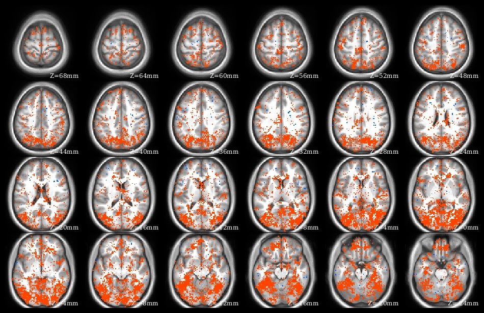
The demo code linked in this post does a voxelwise t-test in R. It takes as input a set of 3d NIfTI files, where each NIfTI is assumed to come from a different person, each voxel of which contains a statistic describing effect strength (for example, accuracy resulting from a searchlight analysis). The code reads the 3d NIfTI images into a 4d array (people in the fourth dimension), then performs a t-test at each voxel, saving the t-values for each voxel in a new NIfTI image. This figure shows the t-value image produced by the demo code.


UPDATE 4 June 2021:

The original version of this post continues below. I wrote a new version of the code to 1) avoid aaply (memory usage a bit better), and 2) use the RNifti instead of oro.nifti library (RNifti functions can be dramatically faster, and have some nice features; I now use RNifti exclusively for nifti image R input/output). I also added the files to the MVPA Meanderings OSF site, under the "voxelwise" subdirectory (direct link to R script).

Both versions of this code loop through all of the image voxels, which is most assuredly not the most efficient (or foolproof) way to perform a voxelwise t-test (I would recommend 3dttest++ instead, perhaps following 3dbucket; calling afni functions directly from R can make things quite smooth for those of us that are not bash fluent). I rewrote rather than removed this demo, however, because sometimes looping through all the voxels like this is the most straightforward way to get something done. 


Friday, March 28, 2014

connectome workbench: working with volumes

I think of plotting surfaces when I think of the Connectome Workbench, but Workbench can do quite a few nice things with volumes as well. If you haven't already read my previous HCP tutorial posts, read those first, because I'm going to be skipping quite a bit of the introductory info. I'm using the most recent version of the Workbench, 0.84.

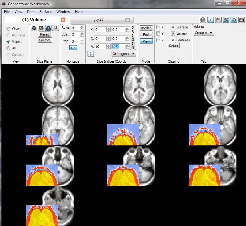
I'm very pleased with these screenshots in this post and will describe how I made them. The pictures show both a surface and volume-slices view of the accuracy map resulting from my searchlight demo.

Before firing up the Workbench, you'll need both the volumetric (NIfTI) and surface (*.shape.gii or *.funct.gii) versions of the file you want to plot, plus the corresponding anatomical underlays. In this case, the demo searchlight accuracy map is aligned to the MNI anatomical template, so we'll use the atlas_Conte69_74k_pals anatomy, as before. Thankfully, the atlas download includes both surface and volumetric versions, so that's ready to go. The demo volumetric NIfTI can be downloaded here, and the wb_command -volume-to-surface-mapping program will create the corresponding *shape.gii file, also as before.

Now that we have all the files we need,we can plot them in Workbench. I started a new .spec file based off the Conte69 anatomy so that I could skip loading the files I didn't need (e.g. borders) and save the ones I do need, but that's not essential (see here for explanation).

Once Workbench is open, we need to load in the images, both volume and surface, that we want to overlay, plus the volume anatomy, since that isn't included in the default Conte69_atlas-v2.LR.32k_fs_LR.wb.spec. These four files (searchlightAccuracies_rad2.nii.gz, Conte69_AverageT1w.nii.gz, searchlight_right.shape.gii, and searchlight_left.shape.gii) can all be loaded (as Volume Files and Metric Files) through repeated use of the File -> Open File dialog.

Finally, we can start making nice pictures. I found it convenient to work with just two Workbench tabs, one for the surface and one for the volume version of the dataset. You can close extra tabs by clicking the little red boxes at the top of each, and open new ones with File -> New Tab.

Go to the first tab and click the "All" radio button in the "View" part of the Toolbar. The window will change to show the surface of both hemispheres, but not the searchlight map; change the bottom two METRIC entries in the Overlay ToolBox to searchlight_right.shape.gii and searchlight_left.shape.gii. You can turn the brain around with the mouse to see the overlay (adjust the color scaling via the little wrench icon). Now, switch the top dropdown box to VOLUME searchlightAccuracies_rad2.nii.gz. This will plot the volume data inside the surface, projected onto planes (twist the brain around to see the planes). You can adjust the planes' location in the "Slice Indices/Coords" part of the Toolbar.

Go to the other tab and click the "Volume" radio button in the "View" part of the Toolbar. Set the bottom dropdown box to VOLUME Conte69_AverageT1w.nii.gz (the anatomic template), then the upper dropdown box to VOLUME searchlightAccuracies_ rad2.nii.gz.When both of these layers are checked On the view should look something like the right side part of this image.

Now we have two tabs open, one with a surface, and one with a volume. To view both side-by-side like in the screenshot, click View -> Enter Tile Tabs. There are a lot of neat things you can do in the "Tile Tabs" view; play around with it and check out the tutorial.

Another feature of the Workbench I really like for volumetric data is making "montages": views of many slices at once, like the top screenshot in this post. To make these, click the "M" button in the "Slice Plane" part of the Toolbar. You can then switch the number of slices shown by adjusting the boxes in the "Montage" part of the Toolbar, and where it starts showing slices in the "Slice Indices/Coords" part of the Toolbar. The montage view doesn't have to be axial slices, but any type - just click the buttons in the Slice Plane part of the toolbar.

So, this was an overview of what I thought was pretty nice when using the Workbench with volumetric images. I did find a few things frustrating, particularly the Yoking; I just couldn't make yoking work. Also, volume-only montage view is rather like MRIcron ... but the view doesn't recenter on clicked coordinates; you adjust the position through the "Slice Indices/Coords" part of the Toolbar. It would also be neat to plot horizontal lines on the surface when viewing data like in the top screenshot, where the horizontal lines indicate the slices shown in the volume montage. But, some nice features, and I'll probably be using the Workbench with volumetric data quite a bit more in the future.

UPDATE (7 May 2014): Tim Coalson told me how to get Workbench to recenter on clicked coordinates: depress the Volume ID button (yellow arrow) in the Information box (red arrow button makes it appear). He said they might make this the default in future versions of Workbench, which would help.

Note that if you click the red-arrow i button again (so it is popped-out, rather than depressed) the Information window won't keep appearing every time you click in the volume.