Saturday, October 19, 2013

nice doughnuts: pretty searchlight quirks

More than a year ago I posted an explanation about how strange ring-type edge effects can show up in searchlight analysis information maps, but this morning I saw the most vivid example of the phenomenon I've ever run across in real data.

These images show slices from two leave-one-subject-out searchlight analyses (linear SVM). The subjects were viewing all sorts of movie stimuli, and for a positive control I classified whether the people were viewing stimuli showing people moving, or whether the stimuli showed still people. This analysis should work very well, reporting massive information (high classification accuracy, in this case) in motor, somatosensory, and visual areas.

At right are a few slices of the information map that results when the examples are normalized within each searchlight (i.e. to a mean of 0, standard deviation of 1). The highest-classifying searchlights are in the proper brain areas (and with properly high accuracies), but in strange, hollow, shapes.


And here's what it looks like when the images are not normalized within each searchlight. The same areas have accurate searchlights, but now they make solid "blobs", with the most highly accurate searchlights (yellow) in the centers - where normalized searchlights had chance accuracy.


Read that previous post for a full explanation. This is the sort of data we'd expect to have the strongest edge/center effects: focal areas with high information, areas large enough to allow searchlights to fit inside the middle of the informative areas. It's also likely that the activations in these areas are all in the same direction (higher activity during the moving stimuli than the non-moving stimuli), creating consistent differences in the amount of BOLD throughout the areas. Normalizing each example within each searchlight removes this consistent BOLD difference, and so classification fails.

Thursday, September 26, 2013

connectome workbench: view subjects' data

In the previous post I described how to import a nifti image into the Connectome Workbench, as well as how to install and get started with the Workbench. In this post I'll describe how to get and view the Human Connectome Project data, in and out of the Workbench. If you know of easier/more reliable/faster ways to do anything I describe here, please let me know.

getting the data

I found downloading the data from the Connectome database quite straightforward. You need to get an account (and agree to usage terms), but it's all quite fast. The datasets are large, so I suggest you just try one person's data to start. To do so, click the "Download Now" button under the "1 subject" box. It won't actually download right away, but rather take you to a screen where you can specify what exactly you want to download. On the second screen, click the "queue for download" buttons next to each sort of file you want. I suggest you pick the preprocessed structural data (e.g. "HCP Q3 Data Release Structural Preprocessed") and some functional data (e.g. "HCP Q3 Data Release Task Motor Skills fMRI Preprocessed"). The click the "Download Packages" button at the bottom of the page to actually start the download.

I was confused the first time because the files went into Aspera Connect's default directory; on my Windows box I right-click the Aspera icon and select Preferences to see (and change) where it puts the files. This thread on the HCP-Users mailing list (and this documentation) talks about their use of Aspera Connect for the downloading.

figuring out the files: task labels and volumetric data

Once you've got the files downloaded, unzip them to somewhere handy. They'll create a big directory structure, with the top directory called the subject's ID code (e.g. 100307_Q3). If you followed my suggestions above, the functional data will be in /MNINonLinear/Results/tfMRI_MOTOR_LR/ and /MNINonLinear/Results/tfMRI_MOTOR_RL/. Two motor (and most task-type) runs are in the HCP protocol, with _LR and _RL referring to the scanner encoding direction used for each run.

The tasks are described in Barch et al. 2013 (that issue of NeuroImage has several articles with useful details about the HCP protocols and data), and the onset times (in seconds) are given in text files in the EVs subdirectories for each run's data, as well as in larger files (eprime output?) in each run directory (e.g. MOTOR_run2_TAB.txt).
I couldn't find a concise key for the task files, but working back and forth between Barch 2013 and the files I figured out that the first column of each EVs file is the onset time of a block, and the second column the block duration, also in seconds (the TR is 720 msec, so it's easy enough to calculate between TR and seconds). rh.txt is the right hand (actually finger) movement, rf.txt the right foot (toe) movement, t.txt the tongue movement, etc.
UPDATE (19 May 2014): The "tfMRI scripts and data files" section Q3_Release_Reference_Manual.pdf describes this a bit better.

Now that we know the onset times for each task block we can do a volumetric analysis in our usual favorite manner, using the preprocessed .nii.gz files in each run directory (e.g. tfMRI_MOTOR_LR.nii.gz). A full description of the preprocessing is in Glasser et al. 2013; motion correction and spatial normalization (to the MNI template) is included.

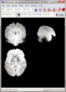
These are pretty functional images; this is one of the functional runs.

figuring out the files: surface-based

The HCP data is not just available in volumes, but surfaces as well (actually, a big focus is on surface-type data, see Glasser 2013), and these files need to be opened with Workbench programs. I certainly don't have all of these figured out, so please send along additional tips or corrections if you have them.
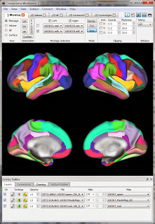
The surface-type functional data is in .dtseries.nii files in each runs' directory (e.g. tfMRI_MOTOR_LR_Atlas.dtseries.nii). As far as I can tell these are not "normal" NIfTI images (despite the .nii suffix) but rather a "CIFTI dense timeseries file". Various wb_command programs can read these files, as well as the Workbench.

So, let's view the functional data in Workbench. My approach is similar to what I described for viewing a NIfTI: first get a blank brain (in this case, the downloaded subject's anatomy), then load in the functional data (in this case, the .dtseries.nii for a motor run). I believe the proper 'blank brain' to use is the one downloaded into the subject's /MNINonLinear/fsaverage_LR32k/ directory; there's only one .spec file in that directory. Opening that .spec file (see the first post for what that means) will bring up a set of labels and surfaces, shown at right.

Now we can open up the functional data. Choose File then Open File in the top Workbench menu, and change the selection to Files of type: "Connectivity - Dense Data Series Files (*.dtseries.nii)". Navigate to the directory for a run and open up the .dtseries.nii (there's just one per run). (aside, the "Connectivity" in the File Type box confuses me; this isn't connectivity data as far as I can tell)

As before, the Workbench screen won't change, but the data should be loaded. Switch to the Charting tab on the bottom of the screen (Overlay ToolBox section), and click the little Graph button to the left of the .dtseries.nii file name (marked with an orange arrow below). Now, if you click somewhere on the brain two windows will appear: one showing the timecourse of the grayordinate you clicked on (read out of the .dtseries.nii) and the usual Information window giving the label information for the grayordinate.

comments

Clicking the Export ... button in the Time Course window will let you save a text file (it says "Dvars Files" but it's plain text) of the time course, but I haven't yet worked out how to extract sets of timecourses, though people are quite helpful on the mailing list. The various .gii and .*.nii files are still rather a black box for me; access appears to be from various wb_command programs.


Friday, September 20, 2013

connectome workbench: plot a NIfTI image

NOTICE (8 February 2018): The material in this post is outdated. I'm leaving it after the jump for archiving, but if you're trying to learn Workbench you should consult this new tutorial for a general introduction, and this one for instructions about creating a surface from a volumetric image.


Monday, September 2, 2013

linear svm behavior: discontinuous information detection

Since starting with MVPA I've struggled with connecting classification accuracy to the properties of the voxels that (as a group) have the accuracy: does the high accuracy mean that all the voxels are informative? Just some of them? How to tell? Even with a linear svm these are not easy questions to answer.

Some of my efforts to figure out what linear SVMs are doing with fMRI data contributed to the examples in my recent paper about searchlight analysis. In this post I'll describe figure 4 in the paper (below); this is in the supplemental as Example 1 (code is example1.R).

The simulated dataset is for just one person, and has a single ROI of 500 voxels, two classes (balanced, so chance is 0.5), and four runs. Classification is with a linear SVM (c=1), averaged over a four-fold cross-validation (partitioning on the runs).

A key for this example is that the 500 voxels were created to be equally informative: the values for each voxel were created by choosing random numbers (from a uniform distribution) for one class' examples, and then adding 0.1 to each value for the examples of the other class. For concreteness, here's Figure 1 from the Supplemental, showing part of the input data:
So, we have 500 voxels, the data for each constructed so that each voxel is equally informative (in the sense of amount of activation difference between the classes). Now, let's classify. As expected, if we classify with all 500 voxels the accuracy is perfect (expected, since we know the classes vary). But what if we use less than all the voxels? I set up the example to classify sequentially larger voxel subsets: each larger subset is made by adding a voxel to the previous subset, so that each subset includes the voxels from all smaller subsets. For example, the two-voxel subset includes voxels 1 and 2, the three-voxel subset has voxels 1, 2, and 3, the four-voxel subset voxels 1, 2, 3, and 4, etc.

Figure 4 in the manuscript (below) shows one happens for one run of the simulation: the number of voxels increases from 1 to 500 along the x-axis, and accuracy from 0.5 (chance) to 1 (perfect) along the y.

In the manuscript I call this an example of discontinuous information detection: the accuracy does not increase smoothly from 0.5 to 1, but rather jumps around. For example, the 42-voxel subset classifies at 0.81. Adding voxels one-at-a-time, we get accuracies of 0.72, 0.75, 0.78, 0.94 ... the accuracy went down abruptly, then back up again. Why? My best guess is that it has to do with the shape of the points in hyperspace; each time we add a voxel we also add a dimension, and so change the point clouds, making it easier (or not) for the linear SVM to separate.

What does this mean in practice? I guess it makes me think of classification accuracies as "slippery": somewhat difficult to grasp and unpredictable, so you need to use extreme caution before thinking that you understand their behavior.

Discontinuous information detection is perhaps also an argument for stability testing. In the Figure 4 run (graph above), the accuracy didn't change much after around 210 voxels: it was consistently very high. It is much easier to interpret our results if we're pretty confident that we're in one of these stable zones. For example, suppose we have an anatomic ROI that classifies well. Now, suppose we add in the border voxels, one at a time, classifying  each "ROI + 1" subset. I'd be a lot more confident that the ROI captured a truly informative set of voxels if the accuracy stayed more-or-less the same as individual voxels were added, than if it had huge variance.

We want to make sure we're on a plateau of high accuracy (robust to minor changes in voxels or processing), not that we happened to land upon a pointy mountain top, such that any tiny variation will send us back to chance. And this example shows that linear SVMs can easily make "pointy mountains" with fMRI data.

Friday, August 30, 2013

What is a support vector machine?

This is one of the most readable, non-mathematical introductions to SVMs I've ever run across in the literature. He uses microarray data for the example, but replace "measured mRNA expression level" with "BOLD activation" and the situation is pretty much the same as in MVPA. 

He includes a description of what it means to have a soft (or hard) margin; I'll add that the conventional c=1 used with linear classifiers for MVPA corresponds to a fairly soft margin: many training points are allowed to be on the 'wrong' side of the decision boundary.


ResearchBlogging.orgWilliam S Noble (2006). What is a support vector machine? Nature Biotechnology, 24, 1565-1567 DOI: 10.1038/nbt1206-1565

Thursday, August 22, 2013

Zhang 2013: response from Jiaxiang Zhang

Jiaxiang Zhang kindly responded to the questions and comments in my previous post, and gave permission to excerpt and summarize our conversation here. Quotes from Jiaxiang are in courier font.

ROI creation

Quite a bit of my commentary was about the ROI creation process. Jiaxiang said that my outline was essentially correct, and provided some additional details and clarification. To make it a bit more readable, here's a new version of the "ROI creation" section from the previous post, answering my questions and adding in his corrections and responses.

  1. Do a mass-univariate analysis, finding voxels with significantly different activity during the chosen and specified contexts. (Two-sided, not "greater activity during the chosen than the specified context" as in my original version.)
  2. Threshold the group map from #1 at p < 0.001 uncorrected, cluster size 35 voxels.
  3. The main univariate analysis (Figure 3A and Table 1) used a FWE-corrected threshold (p<0.05). For ROI definition, a common uncorrected voxelwise threshold (p<0.001) was used, which is more liberal for subsequent MVPA. The cluster extent had very limited effects here, because all the ROIs were much larger than the extent threshold.
  4. Use Freesurfer to make cortical surface maps of the group ROIs, then transform back into each person's 3d space.
  5. We defined the grey-matter ROIs on a cortical surface (in Freesurfer), and then transformed back to the native space in NifTI format (which can be loaded into the Princeton MVPA toolbox).
    I asked if they'd had better results using Freesurfer than SPM for the spatial transformation, or if there was some other reason for their procedure.
    This is an interesting issue. I have not directly compared the two, but I would guess the two methods will generate similar results.
  6. Feature selection: pick the 120 voxels from each person, ROI, and training set with the largest "difference between conditions" from a one-way ANOVA. Concretely, this ANOVA was of the three rules (motion, color, size), performed in each person and voxel separately. I asked why they chose 120 voxels (rather than all voxels or some other subset), and if they'd tried other subset sizes.
  7. We have not tried to use all ROI voxels, because ROIs have different sizes across regions and subjects (e.g., V1). I think it is more appropriate (debatable) to fix the data dimensions. A fixed number of voxels after the feature selection for each participant and each ROI was used, to enable comparisons across regions and participants. 120 voxels were chosen because it was (roughly) the lower limit of all 190 individual ROI’s sizes (19 participants * 10 ROIs). 2 out of the 190 individual ROIs were smaller than 120 voxels (108 and 113 voxels, respectively), for which we used all voxels in that region.
  8. Normalize each example across the 120 voxels (for each person, ROI, and training set).

ROI stability

Several of my previous comments were about what, for lack of a better term, I'll call "ROI stability": were (pretty much) the same 120 voxels chosen across the cross-validation folds within each person, classification, ROI)? Here is our email exchange:
The mean ROI size is 309 ± 134 voxels (±s.d. across ROIs and participants). I did a simple test on our data. Across ROIs and participants, 26.60% ± 19.00% of voxels were not selected in any cross-validations (i.e., “bad” voxels), 10.56% ± 5.36% of voxels were selected only in one fold of cross-validation (i.e., “unstable” voxels), and 48.07% ± 25.34% of voxels were selected in 4 or more folds of cross-validations (i.e., “more stable” voxels). Although this is not a precise calculation of stability, the selected voxels do not change dramatically between cross-validations. It'd be good to know if there are other more established methods to quantify stability.
(my reply:) That is interesting! Unfortunately, I don't know of any "established" methods to evaluate stability in ROI definition procedures like this; yours is the only one I can think of that used a fold-wise selection procedure. Did you look at the location of any of those voxel categories - e.g. are the "bad" voxels scattered around the ROIs or clustered?
I do not see consistent spatial patterns on voxel categories.
I think this idea of stability, both how to measure it and how to interpret different degrees (e.g. what proportion of the voxels should be selected in each fold for a ROI to be considered stable?), is an interesting area and worthy of more attention.

significance testing

My questions about significance testing were more general, trying to understand exactly what was done.

First, about the group-level permutation testing for the ROI analyses:
For each of the 5000 permutations (in each participant and each ROI), classes in the training and test sets were relabelled, and the permuted data was analysed in the same procedure as the observed data. The order of the relabeling in each permutation was kept the same across participants. All the permuted mean accuracies formed the null distributions and were used to estimate the statistical significance of the observed classification accuracy. 
If I understand, is this similar to the "scheme 1 stripes" in http://mvpa.blogspot.com/2012/11/permutation-testing-groups-of-people.html? In other words, you didn't bootstrap for the group null distribution, but rather kept the linking across subjects. Concretely, you calculated 5000 group-level averages for the null distribution, each of the 5000 the across-subjects average after applying the same relabling scheme to each participant. This method of doing the group-level permutation test seems quite sensible to me (when possible), but I haven't run across many examples in the literature.
Yes. Your blog post is clearer on describing this method! 
How to concisely (but clearly) describe group-level permutation schemes (not to mention the impact of choosing various schemes) is another area worthy of more attention.

Next, I'd wondered how the comparisons were made between the searchlight and ROI-based results.
The peak coordinates from searchlight analysis fall within the functional ROIs in PMd, PMv and IPS. I think the similarity between the two analyses, as claimed in our paper, should not be interpreted as “equality” in terms of the blob’s shapes and extents, but their approximate anatomical locations. The two types of analysis are complementary and are based on different assumptions. The searchlight assumes that information is represented in multiple adjacent voxels (as shown in searchlight “blobs”), while the ROI analysis assumes that information is distributed within a spatially bounded region. Therefore, unless a ROI is directly defined from searchlight results, significant classification accuracy in one ROI does not necessary imply that a searchlight blob would perfectly match the spatial distribution of that ROI. 

I absolutely agree that searchlight and ROI-based analyses are complementary, based on different assumptions (and detect different types of information), and shouldn't perfectly overlap. Having the 'peak' searchlight coordinate fall into particular ROIs is a reasonable way to quantify the similarity. This is another area in which there is unfortunately no standard comparison technique (that I know of); I could imagine looking at the percent overlap or something as well.

and the questions

I'd asked three questions at the end of the previous post; here are answers from Jiaxiang for the first two (the third was answered above).

Question 1:
The PEIs for both chosen and specified trials were used in that ROI analysis (no new PEIs were created). 
So there were twice as many examples (all the chosen and all the specified) in the pooled analysis as either context alone.
Yes. 

Question 2:
For the cross-stage classification, chosen and specified trials at the decision stage were modeled separately (chosen and specified trials at the decision stage were averaged together in the univariate analysis and the main MVPA). 
So new PEIs were made, including just the decision time stage or just the maintenance stage?

The new first level model for cross-stage classification include both decision and maintenance stages, as in the main model.

A fascinating study (and methods); thanks again to Jiaxiang for generously answering my questions and letting me share our correspondence here!

Friday, August 9, 2013

indexing woes: FSL and caret

Back in June I shared the story of some headaches caused by inconsistent indexing: R (oro.nifti) and MRIcroN are 1-based, while python is 0-based. I later added SPM (1-based) and afni (0-based) to the collection; now, a kind person contributed images from doing the same test in FSL and caret: they are both 0-based.

As the person who sent the images wrote (I'm assuming wryly), ".... 'proper' programming languages (python, C) start counting/indexing from 0, while maths based applications like R and Matlab start from 1."


In FSL, the voxel at 17,15,20 is number 13 (0-based, like afni and pyMVPA), with voxel 25 at 18,16,21 (click images to enlarge).

And the same (0-based) is the case in caret, as shown in these images: