This post is about timecourses found in our multiband acquisition sequence testing; see the previous post for the introduction and following for respiration recordings. The HCP MOTOR task is good for these tests since the expected effects are clear: left hand movement should cause strong activation in right M1, etc. The plots for one ROI are in this post; plots for hand and visual parcels in each hemisphere are in this pdf. Note also that averaging voxel timecourses within parcels somewhat corrects for the different voxel size (and presumably signal) associated with each acquisition: the number of voxels in each parcel for each acquisition is given in the plot titles (e.g., for parcel 3 below, there are 275 voxels at MB8, 180 at MB4, and 73 at MB0).
The black line in these plots is the average timecourse
for Gordon parcel 3, part of the SMmouthL community, at our three test acquisitions (timecourses extracted from preprocessed images). This parcel should be most responsive to the
tongue-moving task (green blocks). Task-related activity
is indeed apparent with all sequences, but superimposed oscillations are also
apparent (which sort of look like the HCP data), particularly at MB8. By eye, it's harder to separate the task-related activation with the MB8 sequence, which is worrying for our event-related analyses.
Not wanting to visually mistake the difference in sampling frequency for
a smoother signal, I resampled the MB8 timeseries to match the MB4
frequency, shown below (second section
of the pdf). Downsampling does reduce the visual difference between the signals, but by eye, MB4 generally still has a
clearer signal.
The magnitude of the oscillation varies with acquisition: greatest in MB8, then MB4, and smallest in MB0. The movement regressors (from the HCP pipelines for MB8 and MB4, from
SPM for MB0) are shown in light colors on the plots (first column green, second blue, third pink). The oscillation in the activation timecourses looks to be clearly related to the oscillation in the movement lines, which in turn is related to respiration (examples of respiration recordings in the next post, as well as this previous post). An effect of respiration on BOLD is expected and known for a long time; the problem here is that the effect seems larger in
magnitude, and perhaps higher in MB8 than MB4. By my eye, the magnitude of the oscillation doesn't appear totally consistent effect across the brain, making it potentially harder to model
out post-processing; but this variation is simply my impression so far.
I'm happy to share volumes, etc. if any of you have ideas for additional analyses or want to explore further, and appreciate any thoughts. The preprocessing pipelines also generated surface versions of the files, which I am unlikely to be able to look at any time soon.
Friday, September 2, 2016
multiband acquisition sequence testing: introduction
In the previous couple of posts I shared some strange-looking motion regression curves, which turned out to be related to respiration. I also posted examples of average voxel timecourses which I've been looking at to get a feel for the task-related signal in these images, and how it might be impacted by the respiration-related oscillations. Task-related signal is of primary importance to us (e.g., MVPA and FIR analyses), and ideally analysis of single events. So, everything here is through that lens; implications for resting state, functional connectivity analyses, etc. are likely very different, and I'm not going to speculate on that at all.
We've done a lot of analyses this week, and people have been kind enough to share some of their data and thoughts. This is a lot of material and fairly preliminary, but I think will be of great interest to people using multiband sequences and/or HCP data, so I'll put a few posts together, rather than trying to fit everything into one.
Last Sunday we ran a series of test scans, using as participant the lab member with the most prominent oscillations (examples of which are shown here), and the HCP MOTOR task. This task is short (just over 3.5 minutes long), and has blocks of right or left hand movement, right or left foot movement, and tongue movement. I showed example timecourses from the HCP in the previous post; the graphs from our test runs (see this post) are the same, except that I color-coded the task blocks by body type for easier visibility.
We ran three main test sequences, plus a few variations. Acquisition details are below the fold. The three main sequences were:
The functional images we collected with the multiband acquisitions are beautiful. The screenshot above shows a frame from an AP run of each type (the second left-hand movement block, to be precise), before (top) and after (bottom) preprocessing. The MB8 functional images practically look like anatomical images, there's so much detail.
The next few posts will get into the respiration and activity timecourses we found in each.
acquisition details for MB4 and MB0 below the jump; see the previous post for MB8.
We've done a lot of analyses this week, and people have been kind enough to share some of their data and thoughts. This is a lot of material and fairly preliminary, but I think will be of great interest to people using multiband sequences and/or HCP data, so I'll put a few posts together, rather than trying to fit everything into one.
Last Sunday we ran a series of test scans, using as participant the lab member with the most prominent oscillations (examples of which are shown here), and the HCP MOTOR task. This task is short (just over 3.5 minutes long), and has blocks of right or left hand movement, right or left foot movement, and tongue movement. I showed example timecourses from the HCP in the previous post; the graphs from our test runs (see this post) are the same, except that I color-coded the task blocks by body type for easier visibility.
We ran three main test sequences, plus a few variations. Acquisition details are below the fold. The three main sequences were:
- MB8: The same multiband 8 sequence we've been using (described here), except with LeakBlock enabled. TR = 800 msec, acquired voxels 2 x 2 x 2 mm.
- MB4: A new (for us) multiband 4 sequence. TR = 1200 msec, acquired voxels 2.4 x 2.4 x 2.4 mm.
- MB0: A control, non-multiband sequence, the ep2d_bold built-in scanner sequence.TR = 2500 msec, acquired voxels 4 x 4 x 4 mm.
The functional images we collected with the multiband acquisitions are beautiful. The screenshot above shows a frame from an AP run of each type (the second left-hand movement block, to be precise), before (top) and after (bottom) preprocessing. The MB8 functional images practically look like anatomical images, there's so much detail.
The next few posts will get into the respiration and activity timecourses we found in each.
acquisition details for MB4 and MB0 below the jump; see the previous post for MB8.
Friday, August 26, 2016
more motion and activation plotting
After my initial "what is this?" post I've become convinced that the oscillations are due to respiration, both from my own data and others' reports. I'll leave it to the physicists to understand why the patterns are especially prominent in these sequences, but I've been trying to understand their impact for our work: we're collecting task data and want to do event-related and FIR analyses. Is the oscillation something superimposed on (but independent of) our real signal such that we can "ignore" or process it out (maybe with signal separation techniques such FIX ICA) after image collection, or is our event-related BOLD getting lost, and we should change the acquisition parameters?
These images show some of the plots I've been playing with to try evaluating those questions, using HCP data for comparison. The x-axis is frame number, with thick vertical grey lines marking one-minute intervals and thin vertical grey lines marking 30-second intervals. The left-side y-axis is translation in mm (from the Movement_Regressors.txt file), while the right-side y-axis is the average BOLD of the voxels in each parcel (which I generated via afni; details below; these are the minimally preprocessed images). Note that the left y-axis (translation) is fixed in all graphs while the right-side axis (activation) varies.
The first three columns of Movement_Regressors.txt are plotted in light green, light blue, and light red (in that order), with the average activation overlaid in black (right-side axis). The dark blue line that tracks the activation is a lowess smooth. I generated these plots for four HCP people, in each of four Gordon parcels (4, 41, 45, 201), and for six task runs (MOTOR, GAMBLING, and EMOTION, RL and LR of each). I chose those task runs because they all involve hand motion, blocked (MOTOR) or as event responses (GAMBLING and EMOTION). The block or button-push time is shown in the graphs as little tick marks along the x-axis, with R and L marking the right and left-hand block onsets for MOTOR. I picked four parcels of similar size; 45 is in the left-hemisphere and 201 in the right-hemisphere SMhand communities, and should show strong hand-motion-related activation.
Plots for all four people, runs, and parcels are in this pdf, with two sets copied in here. These are plots for the four parcels, the MOTOR_RL run only. The purple lines show when we expect hand-motion task activation to be strongest for parcels 45 and 201, and it is, particularly in the smoothed line (good, signal!). The oscillation is also clearly visible, and related (by my eye, at least) to the pattern in the motion regressors. There are also spikes, some of which I marked with red dots. It's a bit hard to see in these plots, but these spikes strike me as aligned to jags in the motion regressor lines (and presumably, respiration).
Looking at a lot of these plots makes me understand why I've had trouble (in the other dataset as well) with single-TR and short temporal-compression analyses (e.g., averaging 4 or 5 TRs after an event): I'm picking up too much of the oscillation. Signal clearly is present here, but trying to detect it for single (or short) events is proving tricky.
(example afni command after the jump)
These images show some of the plots I've been playing with to try evaluating those questions, using HCP data for comparison. The x-axis is frame number, with thick vertical grey lines marking one-minute intervals and thin vertical grey lines marking 30-second intervals. The left-side y-axis is translation in mm (from the Movement_Regressors.txt file), while the right-side y-axis is the average BOLD of the voxels in each parcel (which I generated via afni; details below; these are the minimally preprocessed images). Note that the left y-axis (translation) is fixed in all graphs while the right-side axis (activation) varies.
The first three columns of Movement_Regressors.txt are plotted in light green, light blue, and light red (in that order), with the average activation overlaid in black (right-side axis). The dark blue line that tracks the activation is a lowess smooth. I generated these plots for four HCP people, in each of four Gordon parcels (4, 41, 45, 201), and for six task runs (MOTOR, GAMBLING, and EMOTION, RL and LR of each). I chose those task runs because they all involve hand motion, blocked (MOTOR) or as event responses (GAMBLING and EMOTION). The block or button-push time is shown in the graphs as little tick marks along the x-axis, with R and L marking the right and left-hand block onsets for MOTOR. I picked four parcels of similar size; 45 is in the left-hemisphere and 201 in the right-hemisphere SMhand communities, and should show strong hand-motion-related activation.
Plots for all four people, runs, and parcels are in this pdf, with two sets copied in here. These are plots for the four parcels, the MOTOR_RL run only. The purple lines show when we expect hand-motion task activation to be strongest for parcels 45 and 201, and it is, particularly in the smoothed line (good, signal!). The oscillation is also clearly visible, and related (by my eye, at least) to the pattern in the motion regressors. There are also spikes, some of which I marked with red dots. It's a bit hard to see in these plots, but these spikes strike me as aligned to jags in the motion regressor lines (and presumably, respiration).
Looking at a lot of these plots makes me understand why I've had trouble (in the other dataset as well) with single-TR and short temporal-compression analyses (e.g., averaging 4 or 5 TRs after an event): I'm picking up too much of the oscillation. Signal clearly is present here, but trying to detect it for single (or short) events is proving tricky.
(example afni command after the jump)
Tuesday, August 16, 2016
that's motion? respiration
In the previous post I showed some motion regressors with very regular oscillations. Several of you pointed towards respiration, and I was able today to extract the signal from a respiration belt for a couple of runs. The respiration signal (black line plots) is not perfectly temporally aligned to the movement regressors, but close enough to convince me that respiration is driving the oscillation. We're still looking into various acquisition details for why it is so prominent in this dataset; I am certainly not an MR physicist, but will summarize when we figure something out.
Friday, August 12, 2016
that's motion?
While my blogging has unfortunately been sparse lately, I've still been doing lots of fMRI analysis and MVPA! One project I'm currently involved with is just starting to collect high spatial (voxels acquired at 2x2x2 mm) and temporal (TR=800 msec) resolution task fMRI data using a simultaneous multi-slice (SMS) EPI on a Siemens Prisma 3T scanner (details below the fold). We've been looking closely at participant motion and signal quality, and trying various control analyses (button pushes detected in motor areas, task vs. rest, etc.).
UPDATE: This pattern is related to respiration.
Some of the participants have an oscillation in the movement regressors, and I would love to get your impressions of the pattern. Below are two runs (encoding directions AP and PA) of a task for the participant with the most striking oscillation. Plotted are the six columns (translation in blue, rotation in pink) generated by our implementation of the HCP processing pipelines (the Movement_Regressors.txt file, to be precise; MCFLIRT produces a nearly identical set of values). Acquisition frames are along the x-axis, with vertical lines marking 1 minute intervals (these runs are a bit more than 12 minutes long), and short tick marks indicating event onsets (the events are in three blocks).
The overall motion is quite small: less than a mm over each run, well under the 2 mm isotropic voxel size. But the second column (blue below) has a very clear oscillation, that strikes me as too regular to be physiological in origin. Below are the same values again, but just the translation columns, zoomed-in.
This movement is not a simple bug in the preprocessing, but is visible in the raw (converted to NIfTI and defaced, but not motion-corrected, spatially normalized, or anything else) image (click here to see a movie of 08's Pro1 run). It's also in the voxel intensities. The graph below has the same column 2 translation values as the Pro1 graph above, with the average frame-to-frame intensity of a 1900-voxel box-shaped ROI I put in the frontal lobe superimposed in pink. The two curves clearly track pretty well.
I've never seen movement like this in non-SMS EPI datasets, and its regularity makes me suspect that it's related to the acquisition somehow. I'm certainly not a physicist, so very much would appreciate any insights, or if you've encountered similar movement.
The person whose images are shown in this post has the largest and most regular oscillation of any person we've scanned yet (around 8 people); check below the fold for a few more examples, along with details of the acquisition sequence.
UPDATE: This pattern is related to respiration.
Some of the participants have an oscillation in the movement regressors, and I would love to get your impressions of the pattern. Below are two runs (encoding directions AP and PA) of a task for the participant with the most striking oscillation. Plotted are the six columns (translation in blue, rotation in pink) generated by our implementation of the HCP processing pipelines (the Movement_Regressors.txt file, to be precise; MCFLIRT produces a nearly identical set of values). Acquisition frames are along the x-axis, with vertical lines marking 1 minute intervals (these runs are a bit more than 12 minutes long), and short tick marks indicating event onsets (the events are in three blocks).
The overall motion is quite small: less than a mm over each run, well under the 2 mm isotropic voxel size. But the second column (blue below) has a very clear oscillation, that strikes me as too regular to be physiological in origin. Below are the same values again, but just the translation columns, zoomed-in.
This movement is not a simple bug in the preprocessing, but is visible in the raw (converted to NIfTI and defaced, but not motion-corrected, spatially normalized, or anything else) image (click here to see a movie of 08's Pro1 run). It's also in the voxel intensities. The graph below has the same column 2 translation values as the Pro1 graph above, with the average frame-to-frame intensity of a 1900-voxel box-shaped ROI I put in the frontal lobe superimposed in pink. The two curves clearly track pretty well.
I've never seen movement like this in non-SMS EPI datasets, and its regularity makes me suspect that it's related to the acquisition somehow. I'm certainly not a physicist, so very much would appreciate any insights, or if you've encountered similar movement.
The person whose images are shown in this post has the largest and most regular oscillation of any person we've scanned yet (around 8 people); check below the fold for a few more examples, along with details of the acquisition sequence.
Tuesday, May 24, 2016
resampling images with afni 3dresample
This is the third post showing how to resample an image: I first covered SPM, then wb_command. afni's 3dresample command is the shortest version yet. I highly suggest you verify that the resampling worked regardless of the method you choose; the best way I know of is simply visually checking landmarks, as described at the end of the SPM post.
The setup is the same as the previous examples:
The command just lists those three files, with the proper flags:
Not being especially linux-savvy (afni does not play nice with Windows, so I run it in NeuroDebian), I sometimes get stuck with path issues when running afni commands. When in doubt, navigate to the directory in which the afni command programs (3dresample, in this case) are located, and execute the commands from that directory, typing./ at the start of the command. You can specify the full paths to images if needed; the example command above assumes 3dresample is on the path and the images are in the directory from which the command is typed. If you're using NeuroDebian, you can add afni to the session's path by typing . /etc/afni/afni.sh at the command prompt before trying any afni commands.
The setup is the same as the previous examples:
- inImage.nii.gz is the image you want to resample (for example, the 1x1x1 mm anatomical image)
- matchImage.nii.gz is the image with the dimensions you want the output image to have - what inImage should be transformed to match (for example, the 3x3x3 mm functional image)
- outImage.nii.gz is the new image that will be written: inImage resampled to match matchImage.
The command just lists those three files, with the proper flags:
3dresample -master matchImage.nii.gz -prefix outImage.nii.gz -inset inImage.nii.gz
Not being especially linux-savvy (afni does not play nice with Windows, so I run it in NeuroDebian), I sometimes get stuck with path issues when running afni commands. When in doubt, navigate to the directory in which the afni command programs (3dresample, in this case) are located, and execute the commands from that directory, typing./ at the start of the command. You can specify the full paths to images if needed; the example command above assumes 3dresample is on the path and the images are in the directory from which the command is typed. If you're using NeuroDebian, you can add afni to the session's path by typing . /etc/afni/afni.sh at the command prompt before trying any afni commands.
Friday, May 6, 2016
"Classification Based Hypothesis Testing in Neuroscience", permuting
My previous post described the below-chance classification part of a recent paper by Jamalabadi et. al; this post will get into the parts on statistical inference and permutation testing.
First, I fully agree with Jamalabadi et. al that MVPA classification accuracy (or CCR, "correct classification rate", as they call it) alone is not sufficient for estimating effect size or establishing significance. As they point out, higher accuracy is better, but it can only be directly compared within a dataset: the number of examples, classifier, cross-validation scheme, etc. all influence whether or not a particular accuracy is "good". Concretely, it is very shaky to interpret a study as "better" if it classified at 84% while a different dataset in a different study classified at 76%; if, however, you find that changing the scaling of a dataset improves classification (of a single dataset) from 76 to 84%, you'd be more justified in calling it an improvement.
The classification accuracy is not totally meaningless, but you need something to compare it to for statistical inference. As Jamalabadi et. al put it (and I've also long advocated), "We propose that MVPA results should be reported in terms of P values, which are estimated using randomization tests."{Aside: I think it's ok to use parametric tests for group-level inference in particular cases and after checking their assumptions, but prefer permutation tests and think they can provide stronger evidence.}
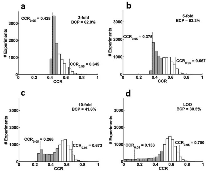
But there's one part of the paper I do not agree with, and that's their discussion of the prevalence of highly non-normal null distributions. The figure at left is Figure 5 from the paper, and are very skewed and non-normal null distributions resulting from classifying simulated datasets in different ways (chance should be 0.5). They show quite a few skewed null distributions from different datasets in the paper, and in the Discussion state that, "For classification with cross-validation in typical life-science data, i.e., small sample size data holding small effects, the distribution of classification rates is neither normal nor binomial."
However, I am accustomed to seeing approximately normal null distributions with MVPA, even in situations with very small effects and sample sizes. For example, below are null distributions (light blue) from eight simulated datasets. Each dataset was created to have 20 people, each with 4 runs of imaging data, each of which has 10 examples of each of 2 classes, and a single 50-voxel ROI. I generated the "voxel" values from a standard normal, with varying amounts of bias added to the examples of one class to allow classification. Classification was with leave-one-run-out cross-validation within each person, then averaging across the runs for the group-level accuracy; 1000 label rearrangements for the permutation test, following a dataset-wise scheme, averaging across subjects like in this demo.
The reddish line in each plot is the accuracy of the true-labeled dataset, which you can see increases from left to right across the simulated datasets, from 0.51 (barely above chance) to 0.83 (well above chance). The permutation test (perm. p) becomes more significant as the accuracy increases, since the true-labeled accuracy shifts to the right of the null distribution.
Note however, that the null distributions are nearly the same and approximately normal for all eight datasets. This is sensible: while the amount of signal in the simulated datasets increases, they all have the same number of examples, participants, classification algorithm (linear SVM, c=1), and cross-validation scheme. The different amounts of signal don't affect the permutation datasets: since the labels were randomized (within each subject and run), all permutation datasets are non-informative, and so produce similar null distributions. The null distributions above are for the group level (with the same dataset-wise permutation relabelings used within each person); I typically see more variability in individual null distributions, but with still approximate normality.
I suspect that the skewed null distributions obtained by Jamalabadi et. al are due either to the way in which the labels were permuted (particularly, that they might not have followed a dataset-wise scheme), or to the way the datasets were generated (which can have a big impact). Regardless, I have never seen as highly-skewed null distributions in real data as those reported by Jamalabadi et. al.
Jamalabadi H, Alizadeh S, Schönauer M, Leibold C, & Gais S (2016). Classification based hypothesis testing in neuroscience: Below-chance level classification rates and overlooked statistical properties of linear parametric classifiers. Human brain mapping, 37 (5), 1842-55 PMID: 27015748
First, I fully agree with Jamalabadi et. al that MVPA classification accuracy (or CCR, "correct classification rate", as they call it) alone is not sufficient for estimating effect size or establishing significance. As they point out, higher accuracy is better, but it can only be directly compared within a dataset: the number of examples, classifier, cross-validation scheme, etc. all influence whether or not a particular accuracy is "good". Concretely, it is very shaky to interpret a study as "better" if it classified at 84% while a different dataset in a different study classified at 76%; if, however, you find that changing the scaling of a dataset improves classification (of a single dataset) from 76 to 84%, you'd be more justified in calling it an improvement.
The classification accuracy is not totally meaningless, but you need something to compare it to for statistical inference. As Jamalabadi et. al put it (and I've also long advocated), "We propose that MVPA results should be reported in terms of P values, which are estimated using randomization tests."{Aside: I think it's ok to use parametric tests for group-level inference in particular cases and after checking their assumptions, but prefer permutation tests and think they can provide stronger evidence.}
But there's one part of the paper I do not agree with, and that's their discussion of the prevalence of highly non-normal null distributions. The figure at left is Figure 5 from the paper, and are very skewed and non-normal null distributions resulting from classifying simulated datasets in different ways (chance should be 0.5). They show quite a few skewed null distributions from different datasets in the paper, and in the Discussion state that, "For classification with cross-validation in typical life-science data, i.e., small sample size data holding small effects, the distribution of classification rates is neither normal nor binomial."
However, I am accustomed to seeing approximately normal null distributions with MVPA, even in situations with very small effects and sample sizes. For example, below are null distributions (light blue) from eight simulated datasets. Each dataset was created to have 20 people, each with 4 runs of imaging data, each of which has 10 examples of each of 2 classes, and a single 50-voxel ROI. I generated the "voxel" values from a standard normal, with varying amounts of bias added to the examples of one class to allow classification. Classification was with leave-one-run-out cross-validation within each person, then averaging across the runs for the group-level accuracy; 1000 label rearrangements for the permutation test, following a dataset-wise scheme, averaging across subjects like in this demo.
The reddish line in each plot is the accuracy of the true-labeled dataset, which you can see increases from left to right across the simulated datasets, from 0.51 (barely above chance) to 0.83 (well above chance). The permutation test (perm. p) becomes more significant as the accuracy increases, since the true-labeled accuracy shifts to the right of the null distribution.
Note however, that the null distributions are nearly the same and approximately normal for all eight datasets. This is sensible: while the amount of signal in the simulated datasets increases, they all have the same number of examples, participants, classification algorithm (linear SVM, c=1), and cross-validation scheme. The different amounts of signal don't affect the permutation datasets: since the labels were randomized (within each subject and run), all permutation datasets are non-informative, and so produce similar null distributions. The null distributions above are for the group level (with the same dataset-wise permutation relabelings used within each person); I typically see more variability in individual null distributions, but with still approximate normality.
I suspect that the skewed null distributions obtained by Jamalabadi et. al are due either to the way in which the labels were permuted (particularly, that they might not have followed a dataset-wise scheme), or to the way the datasets were generated (which can have a big impact). Regardless, I have never seen as highly-skewed null distributions in real data as those reported by Jamalabadi et. al.
Subscribe to:
Posts (Atom)