Friday, December 19, 2014

tutorial: knitr for neuroimagers

NOTICE: this post was replaced by a newer version 13 March 2020. I will leave this post here, but strongly suggest you follow the new version instead.


I'm a big fan of using R for my MVPA, and have become an even bigger fan over the last year because of knitr. I now use knitr to create nearly all of my analysis-summary documents, even those with "brain blob" images, figures, and tables. This post contains a knitr tutorial in the form of an example knitr-created document, and the source needed to recreate it.


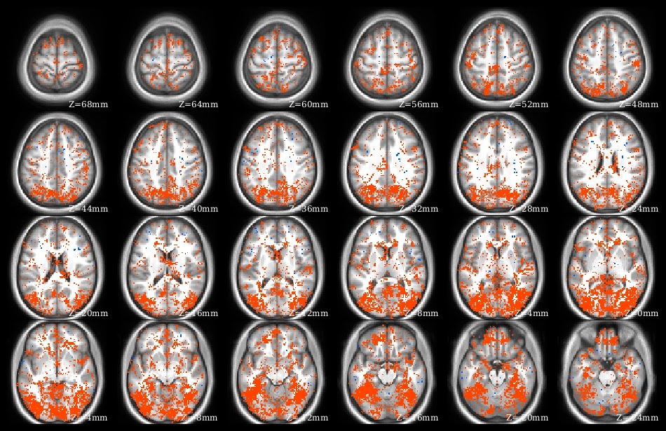
What does knitr do? Yihui has many demonstrations on his web site. I use knitr to create pdf files presenting, summarizing, and interpreting analysis results. Part of the demo pdf is in the image at left to give the idea: I have several paragraphs of explanatory text above a series of overlaid brain images, along with graphs and tables. This entire pdf was created from a knitr .rnw source file, which contains LaTeX text and R code blocks.

Previously, I'd make Word documents describing an analysis, copy-pasting figures and screenshots as needed, and manually formatting tables. Besides time, a big drawback of this system is human memory ... "how exactly did I calculate these figures?." I tried including links to the source R files and notes about thresholds, etc, but often missed some key detail, which I'd then have to reverse-engineer. knitr avoids that problem: I can look at the document's .rnw source code and immediately see which NIfTI image is displayed, which directory contains the plotted data, etc.

In addition to (human) memory and reproducibility benefits, the time saved by using knitr instead of Word for analysis summary documents is substantial. Need to change a parameter and rerun an analysis? With knitr there's no need to spend hours updating the images: just change the file names and parameters in the knitr document and recompile. Similarly, the color scaling or displayed slices can be changed easily.

Using knitr is relatively painless: if you use RStudio. There is still a bit of a learning curve, especially if you want fancy formatting in the text parts of the document, since it uses LaTeX syntax. But RStudio takes care of all of the interconnections: simply click the "Compile PDF" button (yellow arrow) ... and it does! I generally don't use RStudio, except for knitr, which I only do in RStudio.


 to run the demo

We successfully tested this demo file on Windows, MacOS, and Ubuntu, always using RStudio, but with whichever LaTeX compiler was recommended for the system.

Software-wise, first install RStudio, then install a LaTeX compiler; if you'll only be using LaTeX with R I suggest using TinyTeX. Within R, you'll, need the knitr and oro.nifti packages (plus tinytex, if using).


Now, download the files needed for the demo (listed below). These are mostly the low-resolution NIfTI files I've used in previous tutorials, with a new anatomic underlay image, and the knitr .rnw demo file itself. Put all of the image files into a single directory. When knitr compiles it produces many intermediate files, so it is often best to put each .rnw file into its own directory. For example, put all of the image files into c:/temp/demo/, then brainPlotsDemo.rnw into c:/temp/demo/knitr/.

Next, open brainPlotsDemo.rnw in RStudio. The RStudio GUI tab menu should look like in the screenshot above, complete with a Compile PDF button. But don't click the button yet! Instead, go through Tools then Global Options in the top RStudio menus to bring up the Options dialog box, as shown here. Click on the Sweave icon, then tell it to Weave Rnw files using knitr (marked with yellow arrow). Then click Ok to close the dialog box, and everything should be ready. In my experience, RStudio just finds the LaTeX installation - you don't need to set the paths yourself.

In the first code block, change the path to point to where you put the image files. Finally, click the Compile PDF button! RStudio should bring up a  running Compile PDF log, finishing with opening the finished pdf in a separate window. A little reload pdf button also appears to the right of the Compile PDF button (red arrow at left). If the pdf viewer doesn't open itself, try clicking this button to reload.

Good luck!

NOTICE: this post was replaced by a newer version 13 March 2020. I will leave this post here, but strongly suggest you follow the new version instead.


UPDATE 15 January 2019: Here is a post with code for plotting surface (gifti) images in knitr (and R).

UPDATE 31 May 2019: Added a copy of the full text of brainPlotsDemo.rnw in below the jump. Note that this includes the make.plots function to plot a row of NIfTI images.

UPDATE 19 July 2019: Added recommendation to use TinyTeX as the LaTeX compiler. After updating R (3.6.0) and RStudio (to 1.2.1335) on my windows computer I was unable to compile to PDF (compilation would start but not complete, leaving empty .synctex(busy) files) with my previous MikTeX setup; switching to TinyTeX fixed the problems. Also slightly edited the demo text and graphs.


Saturday, November 22, 2014

free advice of the day: is it brain-shaped?

Here's some advice: when starting a new analysis, and especially when troubleshooting problematic code, always open up a few of the input images and make sure they are brain-shaped. Many, many hours have been spent on complicated debugging when the problem was faulty input images.

At left is a screenshot from MRIcroN, my go-to program for quickly looking at images: yep, got data in the ranges I expected and in the shape of a brain.

Monday, November 10, 2014

SfN: Wanna talk MVPA?

I'll be at SfN next week, Sunday (16th) through Tuesday (18th). Drop me an email if you'd like to get together and talk some MVPA, permutation testing, or other exciting methods. I might try to organize a (very informal) gathering of MVPA-interested people; email me if you'd like the details. See you at SfN!

Wednesday, October 29, 2014

demo: transforming from MNI to Talairach (or other atlases)

I generally prefer to spatially normalize to an MNI anatomical template, but sometimes need to work with images that were normalized to a Talairach atlas. This post shows how to warp a NIfTI image (such as a ROI mask) from one space to another. Converting coordinates is a different matter; see  Laird et al, 2010 for more details.

Basic strategy: Use the Normalise function in SPM8 (in SPM12, it's Old Normalise, found in the Batch Editor window under Tools -> Old Normalise), with the Template Image the new atlas, the Source Image the existing atlas, and the Images to Write the mask(s). Then, use ImCalc in SPM to change the transformed mask to the needed dimensionality.

Thus, we need atlas images for both the space we're in (e.g. MNI), and the space we're going to (e.g. Talairach). The atlas images don't need to match in voxel size, but should be similar in overall appearance; for example both skull-stripped (or not), and roughly equivalent brightness. Check that the mask is in the proper location when overlaid on the starting (source) atlas image.


First, warp the image to match the new atlas. Select Normalise: Estimate & Write in SPM8 or Old Normalise: Estimate & Write in SPM12, then add a Subject. Set the Source Image to the atlas image that matches the current space of the mask (MNI, in this example), and the Template Image to the atlas image that matches the new space (here, Talairach). Set the Images to Write to the mask (here, aligned to the MNI atlas), and set the Voxel sizes to the desired output size (here, 3x3x3 mm). Running the function produces files named like the Images to Write, but with the Filename Prefix prefixed.

Check that the output image looks approximately like the original mask. If things look very wrong, try changing the Interpolation, check that the atlas images are similar, and check that the mask was plotted properly on the source atlas image.

If the output image looks ok, check the NIfTI header parameters (e.g. in MRIcroN). Most likely, they will not be exactly what you need. For example, I need my Talairach-ed mask to precisely (bounding box, orientation, voxel size) match some functional images. ImCalc in SPM will do this final transformation.

For ImCalc we need an image to match: one with the NIfTI header information we want the mask to have (it's ok if the template is 4d and the mask 3d). In this case, the functional image (aligned to the Talairach atlas) is TAL_template.nii. Set two Input Images: first, the template, then the mask (here wMNI_mask.nii, the output from Normalise); see screenshot. The order is important: ImCalc will change the second image to match the first, writing a new file Output Filename. Set the Expression to i2.

Finally, compare the original and transformed masks for alignment. Here, I show them both on anatomic images. The original mask had integer values, which have been "blurred" by the warping. I generally correct such blurring manually in R, such as by rounding the voxel values, and then changing individual voxel values as needed to fine-tune the transformed mask. How much fine-tuning is needed varies, depending on the degree of transformation required, initial mask image, etc.

I've found that this combination of Normalise (Old Normalise in SPM12) and ImCalc usually transforms masks well enough that relatively little manual adjustment is needed. Please share if you know of any alternative (or better!) procedures.

UPDATE 24 May 2016: afni 3dresample  can also be used.
UPDATE 18 May 2015: wb_command -volume-affine-resample can be used to do resampling.
UPDATE 26 January 2016: Added a note that these instructions show the Normalise function in SPM8, which is Old Normalise in SPM12.

Wednesday, September 24, 2014

demo: clustering in afni with Clusterize

My go-to program for separating clusters out of an image is the Clusterize routine in AFNI. This little tutorial steps you through getting a NIfTI image into AFNI, using Clusterize, then getting a NIfTI out again. A word of warning: be sure to check laterality in the post-Clusterize NIfTI; sometimes things get flipped when you use multiple analysis programs. Also, I have a Windows box, so run AFNI within NeuroDebian (you should, too, especially if you run Windows), as the screenshots and notes below reflect. 

First, you need to get your NIfTI image into AFNI. Since I use NeuroDebian I started by putting the NIfTI I want to open into the for_afni subdirectory of the shared folder. Then you need to tell AFNI which directory to find the images in, which you do by clicking the Read button in the DataDir window (top red arrow). The Read Session window appears (right side of the screenshot, and, since I'm in NeuroDebian, I find my for_afni subdirectory under /home/brain/host/. Clicking the Set button (bottom red arrow) makes AFNI look for images in the directory.

Now we need to display the image that we want to clusterize. The image needs to be loaded as an OverLay, but AFNI is happiest if it has both an UnderLay and the OverLay, which are loaded via the circled buttons. Clicking the UnderLay button brings up a list of images, from both the for_afni subdirectory (since it was Read in the previous step) and standard anatomies (in my installation). In the screenshot I picked a standard anatomy; it also works if you use the overlay for the underlay (but you need something for the underlay). Then click the OverLay button and select the image you want to cluster. After setting both images you should see colored blobs on top of a greyscale background image: the colored image (the OverLay) will be the one clustered. Then click the Define OverLay button (arrow) to bring up the display shown in the upper right corner of the screenshot.

Next, set the threshold so that only the voxels you want to cluster are shown. Here, my overlay image consists of integers, and I want to identify clusters of at least 10 voxels with the value of 6 or higher. The screenshot shows how to set the threshold of 6: I put the little ** dropdown menu to 1 so that the values in the color slider are the actual numerical values (rather than a statistic). Next, I uncheck the autoRange box, also since I want the slider to be the actual numerical values. Finally, I move the slider (top arrow) to be exactly at 6 (use the up and down arrows for fine-tuning). The overlay changed as I moved the slider: now only voxels with values of 6 or larger are shown, and the overlay color scaling shifted.

Now we can do the clustering. First, click the Clear button (circled), in case any previous clustering is still in memory. Then click the Clusterize button (also circled), which brings up the menu dialog box (shown at left). Adjust the NN level and Voxels boxes to match your clustering parameters; the screenshot is set to find clusters with at least 10 voxels, and voxels must share a side to be in the same cluster. Click the Set button to close the menu dialog box. The main display won't change, except that the Rpt button (circled) will be enabled.

Clicking the Rpt button brings up the AFNI Cluster Results dialog box, as shown here. The display shows that AFNI found 8 clusters in my mask, ranging in size from 277 to 10 voxels. The coordinates are shown for the peak voxel in each cluster (since the XYZ dropdown is set to Peak), and clicking the Jump button in each row changes the coordinates in the display accordingly. To save the clustered version of the image, type a name into the box to the left of the SaveMsk button (marked with an arrow), then click the SaveMsk button. It doesn't look like anything happened, but there should now be a pair of images in the AFNI output directory (/brain/ by default in NeuroDebian) starting with the name specified.

Last, we need to convert the clustered mask back in NIfTI. I do this at the command line with 3dcopy. Not liking to mess about with configuration files, when I first open up the terminal I run . /etc/afni/afni.sh so that it can find 3dcopy. In the screenshot the terminal window opened up in the /brain/ directory, which is where the AFNI files are, so running 3dcopy outImage_mask+tlrc outImage.nii.gz writes the NIfTI file in /brain/ as well. Then I copy-paste outImage.nii.gz into /host/for_afni/ so that I can get to the file in Windows.

None of these steps are particularly difficult, but navigating back and forth can be a bit tricky, and the steps need to be done in the proper order. Good luck!


UPDATE 19 November 2015: You can also use afni at the command prompt for clustering; try the different options of 3dmerge and 3dmask_tool.

Thursday, September 18, 2014

demo: R code to perform a voxelwise t-test

It's easy to perform a voxelwise t-test (t-test at each voxel individually). Programs for mass-univariate analysis (like SPM and fsl) of course do this (and much more), but sometimes you just want to do a simple t-test across subjects at each voxel.

The demo code linked in this post does a voxelwise t-test in R. It takes as input a set of 3d NIfTI files, where each NIfTI is assumed to come from a different person, each voxel of which contains a statistic describing effect strength (for example, accuracy resulting from a searchlight analysis). The code reads the 3d NIfTI images into a 4d array (people in the fourth dimension), then performs a t-test at each voxel, saving the t-values for each voxel in a new NIfTI image. This figure shows the t-value image produced by the demo code.


UPDATE 4 June 2021:

The original version of this post continues below. I wrote a new version of the code to 1) avoid aaply (memory usage a bit better), and 2) use the RNifti instead of oro.nifti library (RNifti functions can be dramatically faster, and have some nice features; I now use RNifti exclusively for nifti image R input/output). I also added the files to the MVPA Meanderings OSF site, under the "voxelwise" subdirectory (direct link to R script).

Both versions of this code loop through all of the image voxels, which is most assuredly not the most efficient (or foolproof) way to perform a voxelwise t-test (I would recommend 3dttest++ instead, perhaps following 3dbucket; calling afni functions directly from R can make things quite smooth for those of us that are not bash fluent). I rewrote rather than removed this demo, however, because sometimes looping through all the voxels like this is the most straightforward way to get something done. 


Monday, September 15, 2014

Connectome Workbench: 1st Steps


Here's my advice for getting started with the Connectome Workbench:
  1. First, go through my tutorial on getting started with Workbench: it describes downloading Workbench, starting it, loading images, and viewing overlay and underlay images.
  2. This tutorial introduces wb_command, and shows how to use it to create a surface file from a volumetric NIfTI (for quick-viewing purposes, not for further analysis).
  3. Read my summary of the different file types.
  4. Try the official Workbench tutorial (or at least look through the manual to get an idea of the possibilities).
  5. Look at my post on using the Workbench with volumetric images.
And why bother learning Workbench? Setting aside all its surface and CCF/HCP functionality (and that's a lot to set aside), I think the ability to create "scenes" justifies the time spent learning the software.

This screenshot shows scenes in action: clicking the little button marked with yellow arrows brings up the scene dialog box. I have three scenes stored in this file, and selecting one for display changes Workbench to recreate exactly how it was when the scene was created: window size, colors and scaling, loaded images, tab layout. Creating scenes for each image that might be used in a publication can save massive amounts of time: need to adjust a threshold or change a color? Just bring up the scene and make the change, no need to start from the beginning.


 UPDATE 26 March 2020: linked to the new getting-started tutorial.
UPDATE 8 February 2018: linked to the new volume to surface tutorial; fixed the official tutorial link.
UPDATE 2 August 2017: removed the (very outdated!) mention of the release of Connectome Workbench 1.0; renamed this post to the more general "Connectome Workbench: 1st Steps".

Monday, September 8, 2014

nice methods: Manelis and Reder 2013, "He Who is Well Prepared ..."

It's always great to read a paper with interesting methodology clearly explained, and Manelis and Reder 2013, "He Who Is Well Prepared Has Half Won The Battle: An fMRI Study of Task Preparation" is one of those papers (full citation below). As usual, I'm not going to fully describe the paper (go read it!), but just comment on a few things that caught my eye.


First, I was struck again by the strength and consistency of the activations and deactivations associated with the n-back task; they seem as reliable as those from some motor and somatosensory tasks. The authors used a mass-univariate analysis to identify a set of ROIs to use for the MVPA, shown in this part of Figure 2 (warm colors for regions that increased with n-back level, and cool colors for regions that decreased). As the authors properly point out, doing MVPA on the task blocks with these ROIs would be somewhat circular (since a mass-univariate analysis of the task blocks was used to create the ROIs), but their main MVPA avoids circularity, since it was done on a different part of the task.


Next, I appreciated the discussions of possible confounds in the results section: the authors report pairwise accuracies, not just the three-way, explaining that they want to make sure one very accurate pair is not driving the results, and they performed a nice control analysis using randomly-selected rest volumes.

Finally, they found a correlation between classification accuracy (MVPA during task preparation periods) and behavioral performance (participant speed on the n-back task); there are still relatively few reports tying fMRI analyses to behavior, and it's nice to see another one.


ResearchBlogging.orgManelis, A., & Reder, L. (2013). He Who Is Well Prepared Has Half Won The Battle: An fMRI Study of Task Preparation Cerebral Cortex DOI: 10.1093/cercor/bht262

Friday, August 22, 2014

quick recommendation: pre-calculate permutation test schemes

A quick recommendation: I strongly suggest pre-calculating the relabeling schemes before running a permutation test. In other words, prior to actually running the code doing all the calculations necessary to generate the null distribution, determine which relabeling will be used for each iteration of the permutation test, and store these new labels so that they can be read out again. To be clear, I think the only alternative to pre-calculating the relabeling scheme is to generate them at run time, such as by randomly resampling a set of labels during each iteration of the permutation test; that's not what I'm recommending here.

There are several reasons I think this is a good principle to follow for any "serious" permutation test (e.g. one that might end up in a publication):

Safety and reproducibility. It's a lot easier to confirm that the relabeling scheme is operating as expected when it can be checked outside of debug mode/run time. At minimum, I check that there are no duplicate entries, and that the randomization looks reasonable (e.g. labels chose at approximately equal frequencies?). Having the relabeling stored also means that the same permutation test can be run at a later time, even if the software or machines have changed (built-in randomization functions are not always guaranteed to produce the same output with different machines or versions of the software).

Easy of separating the jobs. I am fortunate to have access to an excellent supercomputing cluster. Since my permutations are pre-calculated, I can run a permutation test quickly by sending many separate, non-interacting jobs to the different cluster computers. For example, I might start one job that runs permutations 1 to 20, another job running permutations 21 to 30, etc. In the past I've tried running jobs like this by setting random seeds, but it was much more buggy than explicitly pre-calculating the labelings. Relatedly, if a job crashes for some reason it's a lot better to be able to start after the last-completed permutation if they've been pre-calculated.

Thursday, August 21, 2014

more on the LD-t

In a previous post I wrote a bit about  A Toolbox for Representational Similarity Analysis, and my efforts at figuring out the LD-t statistic. Nikolaus Kriegeskorte kindly pointed me to some additional information, and cleared up some of my confusion. Note that I'll be using the term "LD-t" in this post for consistency (and since it's short); it's a "cross-validated, normalized variation on the Mahalanobis distance", as phrased in Nili (2014).

First, the LD-t has been described and used previously (before Nili et al 2014), though (as far as I can tell) not in the context of representational similarity analysis (RSA). It is summarized in this figure (Figure S8a from Kriegeskorte et al. (2007 PNAS)); the paper's supplemental text has additional explanation ("Significance testing of ROI response-pattern differences" section). A bit more background is also on pages 69-71 of Niko's thesis.

To give a high-level picture, calculating the LD-t involves deriving a t-value from Fisher linear discriminant test set output. The linear discriminant is fit (weights calculated from the training data) with the standard algorithms, but using an error covariance matrix calculated from the residuals of fitting a GLM to the entire training dataset (time-by-voxel data matrix), which is then run through the Ledoit-Wolf Covariance Shrinkage Estimator function.

This isn't a procedure that can be dropped into an arbitrary MVPA workflow. For example, for my little classification demo I provided a single-subject 4D dataset, in which each of the 20 volumes is the temporally-compressed version (averaging, in this case) of an experimental block; the first ten class A, the second ten class B. The demo then uses cross-validation and an SVM to get an accuracy for distinguishing class A and B. It is trivial to replace SVM in that demo with LDA, but that will not produce the LD-t. One reason is that the LD-t procedure requires splitting the dataset into two parts (a single training and testing set), not arbitrary cross-validation schemes, but there are additional differences.

Here's a description of the procedure; many thanks to Carolina Ramirez for guiding me through the MATLAB! We're assuming a task-based fMRI dataset for a single person.
  • Perform "standard" fMRI preprocessing: motion correction, perhaps also slice-timing correction or spatial normalization. The values resulting from this could be output as a 4d data matrix of the same length as the raw data: one (preprocessed) image for each collected TR. We can also think of this as a (very large) time-by-voxel data matrix, where time is the TR.
  • Create design matrices (X) for each half of the dataset (A and B, using the terms from the Toolbox file fisherDiscrTRDM.m). These are as usual for fMRI mass-univariate analysis: the columns generally includes predictors for motion and linear trends as well as the experimental conditions, which have been convolved with a hemodynamic response function.
  • Create data matrices (Y) for each half of the dataset (training (A) and testing (B)), structured as usual for fMRI mass-univariate analysis, except including just the voxels making up the current ROI.
  • Now, we can do the LD-t calculations; this is function fishAtestB_optShrinkageCov_C, also from the Toolbox file fisherDiscrTRDM.m. First, fit the linear model to dataset A (training data): 
eBa=inv(Xa'*Xa)*Xa'*Ya; % calculate betas
eEa=Ya-Xa*eBa; % calculate error (residuals) matrix
  • Use the training set residuals matrix (eEa) to estimate the error covariance, and apply the Ledoit-Wolf Covariance Shrinkage Estimator function to the covariance matrix.This is Toolbox file covdiag.m, and returns the the shrinkage estimate of the covariance matrix, Sa.
  • Use the inverse of that covariance matrix (invSa) and the training-set PEIs (eBa) to calculate the Fisher linear discriminant (C is a contrast matrix, made up of -1, 0, and 1 entries, corresponding to the design matrix). Fitting the discriminant function produces a set of weights, one for each voxel.
was=C'*eBa*invSa; % calculate linear discriminant weights
  • Now, project the test dataset (Yb) onto this discriminant: yb_was=Yb*was'; 
  • The final step is to calculate a t-value describing how well the discriminant separated the test set. t-values are a number divided by its standard error, which is the purpose of the final lines of the fishAtestB_optShrinkageCov_C function. The values are adjusted before the t-value calculation; it looks like this is intended to compensate for differing array dimensions (degrees of freedom). I don't fully understand each line of code, but here they are, for completeness:
invXTXb=inv(Xb'*Xb);
ebb_was=invXTXb*(Xb'*yb_was); 
eeb_was=yb_was-Xb*ebb_was;  
nDFb=size(yb_was,1)-size(Xb,2);
esb_was=diag(eeb_was'*eeb_was)/nDFb;
C_new=C(1:min([size(ebb_was,1),size(C,1)]),:);
ctb_was2=diag(C_new'*ebb_was);
se_ctb_was2=sqrt(esb_was.*diag(C_new'*invXTXb*C_new));
ts=ctb_was2./se_ctb_was2;
  • Once the t-value is calculated it can be converted to a p-value if desired, using the standard t-distribution.

This procedure is for a single subject. For group analysis, in Kriegeskorte et al. (2007) they did a group analysis by "concatenating the discriminant time courses of all subjects and fitting a composite design matrix with separate predictors for each subject." Nili et al. (2014, supplemental) suggests a different approach: averaging the LD-t RDMs cell-wise across people, then dividing by the square root of the number of subjects.

The statistic produced by these calculations is related to the cross-validated MANOVA described by Carsten Allefeld; I hope to compare them thoroughly in the future.

Wednesday, August 6, 2014

King 2014: MEG MVPA and temporal generalization matrices

Last week at ICON I attended an interesting talk by Stanislas Dehaene, in which he described some work in recent papers by Jean-Rémi King; I'll highlight a few aspects (and muse a bit) here.

First, MVPA of MEG data. I've never worked with MEG data, but this paper (citation below) describes classifying (linear SVM, c=1!) trial type within-subjects, using amplitude in each of the 306 MEG sensors instead of BOLD in voxels (using all the MEG sensors is a whole-brain analysis: features span the entire brain). I should go back to (as the authors do here) referring to "MVPA" as an acronym for "multivariate pattern analysis" instead of "multi-voxel pattern analysis" to not exclude MEG analyses!

Second, I was quite taken with what they call "temporal generalization matrices", illustrated in their Figure 1, shown at left. These matrices succinctly summarize the results of what I'd call "cross-timepoint classification": rather than doing some sort of temporal compression to get one summary example per trial, they classify each timepoint separately (e.g. all the images at onset - 0.1 seconds; all the images at onset + 0.1 seconds). Usually I've seen this sort of analysis plotted as  accuracy at each timepoint, like Figure 3 in Bode & Haynes 2009.

"Temporal generalization matrices" take timepoint-by-timepoint analyses a step further: instead of training and testing on images from the same timepoint, they train on images from one timepoint, then test on images from every other timepoint, systematically. The axes are thus (within-trial) timepoint, training-set timepoint on the y-axis and testing-set timepoint on the x-axis. The diagonal is from training and testing on the same timepoint, same as the Bode & Haynes 2009-style line graphs.

Since this is MEG data, there are a LOT of timepoints, giving pretty matrices like these, taken from Figure 3. In the left-side matrix the signal starts around 0.1 seconds (bottom left corner of the red blotch) and lasts until around 0.4 seconds, without much generalization - a classifier trained at timepoint 0.2 won't accurately classify timepoint 0.4. The right-side matrix has much more generalization: a classifier trained at timepoint 0.2 classified all the way to the end of the trial. Altogether, these matrices are nice summaries of a huge number of classifications.

Finally, note the dark blue blotch in the left-side matrix: they found clear below-chance accuracy for certain combinations of timepoints, which they discuss quite a bit in the manuscript. I'm pointing this out since below-chance accuracies are a persistent issue, and they (properly) didn't over-interpret (or hide) it in this case.


ResearchBlogging.orgKing JR, Gramfort A, Schurger A, Naccache L, & Dehaene S (2014). Two distinct dynamic modes subtend the detection of unexpected sounds. PLoS One, 9 (1) PMID: 24475052

Monday, July 7, 2014

A toolbox for representational similarity analysis (and some RSA musings)

An interesting new paper about RSA, A Toolbox for Representational Similarity Analysis (Nili et al 2014, see citation below), shifted my picture of RSA a bit, making me realize I haven't always used the technique quite properly.

First, as you'd guess from the title, the paper mostly describes a MATLAB package for performing RSA. I could easily download the package and start looking at the demos and documentation, but there is a lot in the package, and understanding what all it's capable of (and how exactly it's doing everything) is not a job for an hour or two. It certainly looks worth careful examination, though; I'm particularly interested in the statistical inference functions.

The part I mostly want to comment on is separate from the MATLAB package: the paper suggests using a linear discriminant analysis t-value as a distance (dissimilarity) metric measure of discriminability instead of Pearson correlation (1 - Pearson correlation was suggested in Kriegeskorte 2008). Here's how they describe the method (there's a bit more in the supplemental):
"We first divide the data into two independent sets. For each pair of stimuli, we then fit a Fisher linear discriminant to one set, project the other set onto that discriminant dimension, and compute the t value reflecting the discriminability between the two stimuli. We call this multivariate separation measure the linear-discriminant t (LD-t) value."
This is dense. To unpack it a bit, the idea is that you're using a statistic derived from a classification analysis for the distance metric. They suggest using Fisher linear discriminant analysis (LDA) for the classification algorithm, with two-fold cross-validation, averaging results across the folds. LDA strikes me as a reasonable suggestion, and I assume any sort of reasonable cross-validation scheme (e.g. leave-one-run-out) would be fine.

But, how to derive the a t-value from the cross-validated LDA? The paper's description wasn't detailed enough for me, so I poked around in the toolbox code, and found the fishAtestB_optShrinkageCov_C function in /Engines/fisherDiscrTRDM.m. It looks like they're fitting the discriminant to the training dataset, projecting the test dataset onto the discriminant, then doing a t-test on the "error variance" computing a t-value from the test data projected on the discriminant. The function code does everything with linear algebra; my MATLAB (and linear algebra) is too rusty for it to all be obvious (e.g. which step, if any, corresponds to the coefficients produced by the R lda command? Is it a two-sided t-test against zero?). Please comment or email if you can clarify and I'll update this post. See this new post.

Anyway, the idea of using a classification-derived distance metric for RSA is appealing, particularly to get a consistent and predictable zero when stimuli are truly unrelated (fMRI examples are often a bit correlated, making correlation-based RSA comparisons sometimes between "not that correlated" and "somewhat correlated", rather than the more interpretable "nothing" and "something").

Which brings me to what I realized I had wrong about RSA. To do cross-validation, you need multiple examples of the same stimulus, and at the end you have a single number (accuracy, LD-t, whatever). RSA is accordingly not done between examples (e.g. individual trials) but between stimulus types (classes with lots of examples; what we classify).

This RSA matrix (the official term is "RDM") is from a previous post, which I described as "an RSA matrix for a dataset with six examples in each of two classes (w and f)." While the matrix is sensible (w-f cells are oranger - less correlated - than w-w and f-f cells), the matrix should properly be a single value: the distance between w and f.

In other words, to make an RSA matrix (RDM) I needed at least three classes; not multiple examples of two classes. Say the new class is 'n'. Then, my RSA matrix would have w, f, and n along each axis, and we can ask questions like, "is w is more similar to f or n?". That RSA matrix would have just three numbers: the distances between w and f, w and n, and f and n. If using Pearson correlation, we'd calculate those three numbers by averaging (or some other sort of temporal compression, such as fitting a linear model) across the examples of each class (here, w1, w2, w3, w4, w5, w6) to get one example per class, then correlating these vectors (e.g. w with f). If using LDA, we'd (for example) use the first three w and f examples to train the classifier, then test on the last three of each (and the reverse), then calculate the LD-t. (To be clear, you can calculate LD-t with just two classes, it won't really look like an RDM since you just have one value (w-f).)


ResearchBlogging.org Nili H, Wingfield C, Walther A, Su L, Marslen-Wilson W, & Kriegeskorte N (2014). A toolbox for representational similarity analysis. PLoS computational biology, 10 (4) PMID: 24743308

UPDATE 17 July 2014: Changed a bit of the text (strikeouts) in response to helpful comments from Hamed Nili. He also pointed out this page, which describes a few other aspects of the paper and toolbox.

UPDATE 21 August 2014: see this post for a detailed description of how to calculate the LD-t.

Monday, May 19, 2014

HCP: extracting timecourses from the surface files

UPDATE (29 May 2017): The new wb_command -cifti-convert -to-text function can drastically streamline this process in some cases, see this post.

----

In a previous post about viewing functional data from the Human Connectome Project (HCP) I described downloading the images then viewing them with the Connectome Workbench. This post describes a way to extract the timecourses for specific surface vertices using code, rather than one-at-a-time in the Workbench.

First, working with surfaces means working with GIFTI and CIFTI files. Many developers are creating functions that can read these files, but software is less mature and harder to find than for reading NIfTI files (MATLAB, FSL and NiBabel seem furthest along; I couldn't find one for R). The GIFTI library for MATLAB worked great ... except with HCP-derived files.Guillaume Flandin very kindly (and quickly!) changed his code to work with HCP files, making it ignore the spec-inconsistent part of those headers. By the time you read this, the files might be fixed, but for now (19 May 2014), if the GIFTI library for MATLAB gives you errors with HCP files (but not others), ask Guillaume for a copy of make sure you have version 1.4 (or newer) of the @gifti library.


Here is an overview of the process. The logic is the simple: figure out which voxels/vertices are needed, then get the timecourses for those voxels/vertices. For HCP functional surface images there are two preliminary steps: extracting the part of the brain we want from the CIFTI file (green), and finding which vertices we want (such as by constructing a surface ROI mask, blue).

Note that it's not necessary to create a ROI to extract the timecourses; if you know which vertices you need by some other means you can read them directly in MATLAB once the GIFTI has been loaded.

unpack the CIFTI

It works best for me to think of HCP CIFTI files as archives containing the functional data for the whole brain, as a mixture of surfaces (for the cortical sheet) and volumes (for sub-cortical structures). Before reading the functional data we need to unpack the CIFTI, making GIFTI or NIfTI files, as appropriate for the part of the brain we want; the wb_command -cifti-separate program does this "unpacking" (see this post for notes about downloading HCP data, and this one about working with the Workbench wb_command command-line program). For example, if we want the functional time courses for a ROI on the left hemisphere surface, we run this at the command line:
wb_command -cifti-separate in.dtseries.nii COLUMN -metric CORTEX_LEFT out.func.gii 
where in.dtseries.nii is the path and filename of an HCP tfMRI CIFTI file (e.g. tfMRI_MOTOR_LR_Atlas.dtseries.nii), and out.func.gii is the path and filename of the GIFTI we want the program to create. The command's help has more options and explanation; in brief CORTEX_LEFT  indicates which anatomical structure to unpack, COLUMN gets timecourses, and -metric is because CORTEX_LEFT  is stored as a surface.

identify the desired vertices

There is not a one-to-one correspondence between volumetric voxels and surface vertices in the HCP functional datasets, nor a way (that I could find) to translate between the two coordinate schemes (if you know differently, please let me know!)(see update below). As a work-around, I used wb_command -volume-to-surface-mapping to translate a volumetric ROI to a surface ROI, in the same way as before:
wb_command -volume-to-surface-mapping roi.nii.gz atlas.surf.gii roi.func.gii -enclosing
where roi.nii.gz is the volumetric ROI mask, atlas.surf.gii is an atlas surface for the hemisphere containing the ROI, and roi.func.gii is the GIFTI metric file that will be created. This only works if the surface atlas, volumetric ROI, and functional CIFTI are all aligned to the same space. For the HCP data, the MNINonLinear images for each person are aligned to the MNI atlas, specifically matching the conte69 32k atlas. Thus, I made the volumetric ROI on an MNI template brain, then used Conte69.L.midthickness.32k_fs_LR.surf.gii for the atlas.surf.gii in the -volume-to-surface-mapping call. So long as the headers are correct in roi.nii.gz (i.e. the voxel size, origin, etc are correct) the ROI should be in the correct place in roi.func.gii, but view it in Workbench to be sure.

extract the vertex timecourses

Finally, we can read both the ROI and functional data GIFTI files into MATLAB, reading the vertex indices from the ROI then saving the timecourses as text:

addpath 'C:/Program Files/MATLAB/gifti-1.4';   % path to GIFTI library
roi = gifti(['d:/temp/roi.func.gii']);   % load the ROI GIFTI
inds = find(roi.cdata > 0);    % find is like which: get the vertex indices
wm = gifti([inpath 'out.func.gii']);  % load the functional GIFTI
tmp = wm.cdata(inds,:);    % get those indices' timcourses
csvwrite(['d:/temp/out.csv'], tmp);   % write as a csv text file

Now, out.csv has one column for each timepoint and one row for each vertex in the ROI.

confirming the match

We can check that the values match by opening out.func.gii in both Workbench and MATLAB:
In the image I clicked on vertex 5336 in Workbench (red arrow), which is the vertex at position 5337 in the MATLAB .cdata array (purple arrow), since MATLAB is one-based but Workbench is zero-based. The first two values of the data series shown in the Workbench Information window (red underline) match those shown in MATLAB (purple underline).

Note: I could only get Workbench to show the first two values of the timeseries if I set the little blue-arrowed button to 2; otherwise it would display only the first value. Clicking through the little blue-arrow box changes the display to different timepoints, but doesn't change the Information window that I could tell (I'm using Workbench 0.85). Note also that the "charting" interface has changed from my previous post; now you need to go through the "Chart" radio button on the upper left of the View window (right under the first tab name on my screen); I couldn't get it to write out the full timeseries in Workbench itself.


UPDATE (20 May 2014): Tim Coalson suggested that by convention the output files should be named roi.func.gii and out.func.gii, not roi.shape.gii and out.dtseries.gii as I originally wrote; I changed the commands accordingly. Tim also pointed me to the program wb_command -surface-closest-vertex, which will return the closest vertex to an arbitrary 3d coordinate. He suggests that to go the other way (from a vertex in a .surf.gii to 3d coordinates) you "could look at the coordinate of a particular vertex, and back-convert through the nifti sform to get the real-valued voxel "indices" it resides at (real-valued because it could be a third of a voxel to the right of a voxel center, etc)."

Tuesday, May 6, 2014

clever RSA: "Hippocampal Activity Patterns Carry Information about Objects in Temporal Context"

There's an interesting use of RSA (representational similarity analysis) in a recent paper by Hsieh et al. This bit of Figure 1 summarizes the dataset: in each scanning run people were shown the same set of object images, each image shown for 1 sec, followed by a 5 sec inter-stimulus interval. The people pushed a button to answer a semantic question about each image (e.g. "Is the presented object living?"), with a different semantic question each run. A key part of the experimental design is the sequences in which the objects were presented.

The images made up six sequences, which were learned right before scanning, then shown three times in each of the five scanning runs. As shown here, different objects were used in the Fixed, X, Y, and Random sequences; two objects were shared between the X sequences, and three between the Y sequences. Each sequence had the images shown in the order in the figure, except for the Random sequence, which was randomly different each time (the camel could be first one time, then third the next).

This set of sequences made it possible to look for order and identity effects: once you saw the rake, you would know (since the participants memorized the sequences before scanning) that you would see the truck next, followed by the cabinet, etc. If you saw the rhino you would know the drill and strawberry would be next, but not whether the chair or elk would be in the fourth position. Seeing the camel first would have you expect the tractor, shears, stand, or pineapple to be next, but not which one (though by the fourth object you'd know which of the Random set hadn't yet been shown).

The presented results are all ROI-based, with the hippocampus, parahippocampal cortex (PHc), and perirhinal cortex (PRc). The ROIs were individually drawn for each person,  but I didn't see a list of how many voxels went into the ROIs for each person, or a mention of how much variability there was in the size across people and ROIs. If they kept the voxels at the acquired 3.2×3.2×3.0 mm, I'd guess there'd be less than 20 voxels in each ROI, but it would be nice to have had the exact counts. (And I wonder if they looked outside the ROIs; seems likely, since they acquired whole-brain images.)

Anyway, they created parameter estimate images (fit a canonical HRF) for each image presentation (90 per run), then created an RSA matrix (with Pearson correlation) for each same-sequence repetition within a run, then averaged those three matrices to get one matrix per sequence per run, then averaged across runs, then across people (Figure 3).

I'm not going to mention everything they presented, just the analysis summarized in Figure 4, which is copied in part here. The left pane shows the RSA matrix when everything except the Random sequence goes into the average: nice dark red colors (high correlation) along the diagonal, dropping off moving away from the diagonal (note the weird matlab-default color scheme: yellow, green, and cyan are near zero).

The clever bit is how they made the RSA matrices for the Random sequences: based on position or object (Figure 3). For position, they did the RSA with the true sequences: correlating the first-presented image against the first, even though they were different images. There's very little correlation in the upper left corner of this matrix, but more in the lower right - perhaps because the last few images could be guessed. Then, they did the RSA based on object: correlating the same images together (camel to camel), regardless of order. They used these three RSA matrices to test their hypotheses (Figure 8): which ROIs had information about object identity? Which about the order? Which had both?

One last comment: Figure 5 makes me wish for more supplemental information ... these are very strong correlations for the noisiness of the data (and the small size of the correlations making up the "similarity change" metric). It would have been nice to see error bars on these points, or something like the range across the five runs for each person. The individual graphs ("same obj+pos" and "same obj") separately, rather than just the difference, would also be interesting, and perhaps explain why some people have a negative similarity change.


ResearchBlogging.orgHsieh, L., Gruber, M., Jenkins, L., & Ranganath, C. (2014). Hippocampal Activity Patterns Carry Information about Objects in Temporal Context Neuron, 81 (5), 1165-1178 DOI: 10.1016/j.neuron.2014.01.015

Tuesday, April 15, 2014

not having fun with R: as.integer, truncating, and rounding

I had a very unpleasant R debugging experience this morning: when is what you see not what you actually have?

The screenshot at left reproduces what I was seeing: inds1 and inds2 both are shown as the vector 2, 4, but inds2 selects the 2nd and 3rd array elements, not the 2nd and 4th, as expected.

The code I used to create inds1 and inds2 makes the problem clear - the second number is just a bit larger than 4 in inds1, but just a bit smaller than 4 in inds2:
inds1 <- c(2, 4.00000001);
inds2 <- c(2, 3.99999999999);

So, what happened?

The  inds1 and inds2 arrays are type numeric (double), but they are shown on the screen rounded, in this case, not showing any numbers past the decimal. They look like integers, but are not. When used to specify array indices R coerces the arrays to integers. as.integer() does not round, but rather truncates. Thus, inds2[2] becomes 3.


I will now be including tests in my code to be sure what I think are integers are actually integers, such as all.equal(inds, as.integer(inds)).

Friday, March 28, 2014

connectome workbench: working with volumes

I think of plotting surfaces when I think of the Connectome Workbench, but Workbench can do quite a few nice things with volumes as well. If you haven't already read my previous HCP tutorial posts, read those first, because I'm going to be skipping quite a bit of the introductory info. I'm using the most recent version of the Workbench, 0.84.

I'm very pleased with these screenshots in this post and will describe how I made them. The pictures show both a surface and volume-slices view of the accuracy map resulting from my searchlight demo.

Before firing up the Workbench, you'll need both the volumetric (NIfTI) and surface (*.shape.gii or *.funct.gii) versions of the file you want to plot, plus the corresponding anatomical underlays. In this case, the demo searchlight accuracy map is aligned to the MNI anatomical template, so we'll use the atlas_Conte69_74k_pals anatomy, as before. Thankfully, the atlas download includes both surface and volumetric versions, so that's ready to go. The demo volumetric NIfTI can be downloaded here, and the wb_command -volume-to-surface-mapping program will create the corresponding *shape.gii file, also as before.

Now that we have all the files we need,we can plot them in Workbench. I started a new .spec file based off the Conte69 anatomy so that I could skip loading the files I didn't need (e.g. borders) and save the ones I do need, but that's not essential (see here for explanation).

Once Workbench is open, we need to load in the images, both volume and surface, that we want to overlay, plus the volume anatomy, since that isn't included in the default Conte69_atlas-v2.LR.32k_fs_LR.wb.spec. These four files (searchlightAccuracies_rad2.nii.gz, Conte69_AverageT1w.nii.gz, searchlight_right.shape.gii, and searchlight_left.shape.gii) can all be loaded (as Volume Files and Metric Files) through repeated use of the File -> Open File dialog.

Finally, we can start making nice pictures. I found it convenient to work with just two Workbench tabs, one for the surface and one for the volume version of the dataset. You can close extra tabs by clicking the little red boxes at the top of each, and open new ones with File -> New Tab.

Go to the first tab and click the "All" radio button in the "View" part of the Toolbar. The window will change to show the surface of both hemispheres, but not the searchlight map; change the bottom two METRIC entries in the Overlay ToolBox to searchlight_right.shape.gii and searchlight_left.shape.gii. You can turn the brain around with the mouse to see the overlay (adjust the color scaling via the little wrench icon). Now, switch the top dropdown box to VOLUME searchlightAccuracies_rad2.nii.gz. This will plot the volume data inside the surface, projected onto planes (twist the brain around to see the planes). You can adjust the planes' location in the "Slice Indices/Coords" part of the Toolbar.

Go to the other tab and click the "Volume" radio button in the "View" part of the Toolbar. Set the bottom dropdown box to VOLUME Conte69_AverageT1w.nii.gz (the anatomic template), then the upper dropdown box to VOLUME searchlightAccuracies_ rad2.nii.gz.When both of these layers are checked On the view should look something like the right side part of this image.

Now we have two tabs open, one with a surface, and one with a volume. To view both side-by-side like in the screenshot, click View -> Enter Tile Tabs. There are a lot of neat things you can do in the "Tile Tabs" view; play around with it and check out the tutorial.

Another feature of the Workbench I really like for volumetric data is making "montages": views of many slices at once, like the top screenshot in this post. To make these, click the "M" button in the "Slice Plane" part of the Toolbar. You can then switch the number of slices shown by adjusting the boxes in the "Montage" part of the Toolbar, and where it starts showing slices in the "Slice Indices/Coords" part of the Toolbar. The montage view doesn't have to be axial slices, but any type - just click the buttons in the Slice Plane part of the toolbar.

So, this was an overview of what I thought was pretty nice when using the Workbench with volumetric images. I did find a few things frustrating, particularly the Yoking; I just couldn't make yoking work. Also, volume-only montage view is rather like MRIcron ... but the view doesn't recenter on clicked coordinates; you adjust the position through the "Slice Indices/Coords" part of the Toolbar. It would also be neat to plot horizontal lines on the surface when viewing data like in the top screenshot, where the horizontal lines indicate the slices shown in the volume montage. But, some nice features, and I'll probably be using the Workbench with volumetric data quite a bit more in the future.

UPDATE (7 May 2014): Tim Coalson told me how to get Workbench to recenter on clicked coordinates: depress the Volume ID button (yellow arrow) in the Information box (red arrow button makes it appear). He said they might make this the default in future versions of Workbench, which would help.

Note that if you click the red-arrow i button again (so it is popped-out, rather than depressed) the Information window won't keep appearing every time you click in the volume.