UPDATE 13 May 2020: I'm now quite sure that the high variability wasn't due to the multiple fmriprep runs, but rather the way I picked the training/testing examples. I'm leaving this post here, but put most of it "below the fold" since my initial interpretation was incorrect. I will eventually release code and more details.
UPDATE 24 April 2020: I realized that there was at least one other possible big contributing factor to the difference between the runs: randomness in how I chose the not-button examples. I'll fix this and see what happens to the SVM results. I previously found extremely similar GLM results between fmriprep versions 1.1.2 and 1.3.2, so the variability here is very possibly only from my randomness in setting up the classification.
Showing posts with label fMRIPrep. Show all posts
Showing posts with label fMRIPrep. Show all posts
Wednesday, April 22, 2020
Tuesday, December 3, 2019
comparing fMRIPrep and HCP Pipelines: Resting state matrix correlation
In the previous post I described comparing resting state pipelines by asking blinded people to match functional connectivity matrices by participant. As described in that post, while no one correctly matched all matrices (i.e., pairing up the hcp-Siegel and fmriprep-xcp versions for the 13 people in DMCC13benchmark), most correctly matched many of them, reassuring me that the two pipelines are producing qualitatively similar functional connectivity matrices.
In this post I show the results of correlating the functional connectivity matrices, on the suggestion of Max Bertolero (@max_bertolero, thanks!). Specifically, I turned the lower triangles of each connectivity matrix into a vector then correlated them pairwise. (In other words, "unwrapping" each functional connectivity matrix into a vector then calculating all possible pairwise correlations between the 26 vectors.)
The results are in the figure below. To walk you through it: participants are along the x-axis, matrix-to-matrix correlations on the y-axis. Each person is given a unique plotting symbol, which is shown in black. The first column is for person 150423, whose plotting symbol is a circle. The correlation of 150423's hcp-Siegel and fmriprep-xcp matrices is about 0.75 (location of the black circle). The four colored sets of symbols are the correlation of 150423's hcp or fmriprep matrix with everyone else's hcp or fmriprep matrices, as listed along the top. For example, the bright blue column is listed as "hcp w/others' fp", and the highest symbol is a plus. Looking at the black symbols, the plus sign is 171330, so this means that the correlation of 150423's hcp-Siegel matrix with 171330's fmriprep-xcp matrix is about 0.63.
 There are several interesting parts of the figure. First, the dark blue and dark red points tend to be a bit higher than the bright blue and pink: matrices derived from the same pipeline tend to have higher correlation than those from different pipelines, even from different people.
Next, most people's fmriprep and hcp matrices are more correlated than either are to anyone else's - the black symbols are usually above all of the colored ones. This is not the case for 3 people: 178950, DMCC8033964, and DMCC9478705. 203418 is also interesting, since their self-correlation is a bit lower than most, but still higher than the correlation with all the others.
Finally, I compared the impressions from this graph with those from the blinded matching (summarized in the table below), and it came out fairly consistently, particularly for the hardest to match pairs: No one correctly matched 178950 or DMCC9478705's matrices, two of the people just listed as having their self-correlations in the midst of the others. Only one person correctly matched the third (DMCC8033964).
While the hardest-to-match pairs are easy to see in this graph, the ones most often correctly matched are more difficult to predict. For example, from the height of the self-correlation and distance to the other points I'd predict that 171330 and 393550 would be relatively hard to pair, but they were the most often correctly matched. 203418 has the fourth-lowest self-correlation, but was correctly matched by more than half the testers.
Note: the "correct matches" column is how many of the 9 people doing the blinded matching test correctly matched the person's matrices.
In this post I show the results of correlating the functional connectivity matrices, on the suggestion of Max Bertolero (@max_bertolero, thanks!). Specifically, I turned the lower triangles of each connectivity matrix into a vector then correlated them pairwise. (In other words, "unwrapping" each functional connectivity matrix into a vector then calculating all possible pairwise correlations between the 26 vectors.)
The results are in the figure below. To walk you through it: participants are along the x-axis, matrix-to-matrix correlations on the y-axis. Each person is given a unique plotting symbol, which is shown in black. The first column is for person 150423, whose plotting symbol is a circle. The correlation of 150423's hcp-Siegel and fmriprep-xcp matrices is about 0.75 (location of the black circle). The four colored sets of symbols are the correlation of 150423's hcp or fmriprep matrix with everyone else's hcp or fmriprep matrices, as listed along the top. For example, the bright blue column is listed as "hcp w/others' fp", and the highest symbol is a plus. Looking at the black symbols, the plus sign is 171330, so this means that the correlation of 150423's hcp-Siegel matrix with 171330's fmriprep-xcp matrix is about 0.63.

Next, most people's fmriprep and hcp matrices are more correlated than either are to anyone else's - the black symbols are usually above all of the colored ones. This is not the case for 3 people: 178950, DMCC8033964, and DMCC9478705. 203418 is also interesting, since their self-correlation is a bit lower than most, but still higher than the correlation with all the others.
Finally, I compared the impressions from this graph with those from the blinded matching (summarized in the table below), and it came out fairly consistently, particularly for the hardest to match pairs: No one correctly matched 178950 or DMCC9478705's matrices, two of the people just listed as having their self-correlations in the midst of the others. Only one person correctly matched the third (DMCC8033964).
While the hardest-to-match pairs are easy to see in this graph, the ones most often correctly matched are more difficult to predict. For example, from the height of the self-correlation and distance to the other points I'd predict that 171330 and 393550 would be relatively hard to pair, but they were the most often correctly matched. 203418 has the fourth-lowest self-correlation, but was correctly matched by more than half the testers.
Note: the "correct matches" column is how many of the 9 people doing the blinded matching test correctly matched the person's matrices.
| subject ID | correct pairing (hcp, fmriprep) | correlation of this person’s matrices | correct matches |
| 150423 | h,q | 0.7518 | 4 |
| 155938 | v,i | 0.7256 | 6 |
| 171330 | l,y | 0.7643 | 4 |
| 178950 | b,r | 0.6069 | 0 |
| 203418 | x,d | 0.651 | 5 |
| 346945 | w,j | 0.7553 | 4 |
| 393550 | u,n | 0.7772 | 7 |
| 601127 | c,m | 0.7152 | 1 |
| 849971 | k,t | 0.7269 | 1 |
| DMCC5775387 | s,f | 0.767 | 6 |
| DMCC6705371 | a,p | 0.733 | 6 |
| DMCC8033964 | g,z | 0.5938 | 1 |
| DMCC9478705 | o,e | 0.5428 | 0 |
Together, both the blinded matching and correlation results reassure me that the two pipelines are giving qualitatively similar matrices, but clearly not identical, nor equally similar for all of the test people.
UPDATE 4 December 2019: Checking further, missings have a sensible impact on these results. These functional connectivity matrices were not calculated from the DMCC baseline session only (which are the runs included in DMCC13benchmark), but rather by concatenating all resting state runs for the person in the scanning wave. Concatenating gives 30 minutes of resting state total without missings or censoring.
Two subjects had missing resting state runs: DMCC8033964 is missing one (25 minutes total instead of 30), and DMCC9478705 is missing two (20 minutes). These are two of the lowest-correlation people, which is consistent with the expectation that longer scans make more stable functional connectivity matrices. It looks like the two pipelines diverge more when there's fewer input images, which isn't too surprising. 178950 didn't have missing runs but perhaps had more censoring or something; I don't immediately know how to extract those numbers from the output but expect the pipelines to vary in many details.
UPDATE 4 January 2021: Corrected DMCC13benchmark openneuro links.
Wednesday, November 6, 2019
comparing fMRIPrep and HCP Pipelines: Resting state blinded matching
The previous post has a bit of a literature review and my initial thoughts on how to compare resting state preprocessing pipeline output. We ended up trying something a bit different, which I will describe here. I actually think this turned out fairly well for our purposes, and has given me sufficient confidence that the two pipelines have qualitatively similar output.
First, the question. As described in previous (task-centric) posts, we began preprocessing the DMCC dataset with the HCP pipelines, followed by code adapted from Josh Siegel (2016) for the resting state runs. We are now switching to fmriprep for preprocessing, followed by the xcpEngine (fc-36p) for resting state runs. [xcp only supports volumes for now, so we used the HCP pipeline volumes as well.] Our fundamental concern is the impact of this processing switch: do the two pipelines give the "same" results? We could design clear benchmark tests for the task runs, but how to test the resting state analysis output is much less clear, so I settled on a qualitative test.
We're using the same DMCC13benchmark dataset as in the task comparisons, which has 13 subjects. Processing each with both pipelines gives 26 total functional connectivity matrices. Plotting the two matrices side-by-side for each person (file linked below) makes similarities easy to spot: it looks like the two pipelines made similar matrices. But we are very good at spotting similarities in paired images; are they actually similar?
The test: would blinded observers match up the 26 matrices by person (pairing the two matrices for each subject) or by something else (such as pipeline)? If observers can match most of the matrices by person, we have reason to think that the two pipelines are really producing similar output. (Side note: these sorts of tests are sometimes called Visual Statistical Inference and can work well for hard-to-quantify differences.)

For details, here's a functional connectivity matrix for one of the DMCC13benchmark subjects. There are 400 rows and columns in the matrix, since these were run within the Schaefer (2018) 400-parcels 7-network ordering parcellation. This parcellation spans both hemispheres, the first 200 on left, second 200 right. Both hemispheres are in the matrix figures (labeled and separated by black lines). The number of parcels in each network is not perfectly matched between hemispheres, so only the quadrants along the diagonal have square networks. The dotted lines separate the 7 networks: Visual, SomMot, DorsAttn, SalVentAttn, Limbic, Cont, Default (ordering and labels from Schaefer (2018)). Fisher r-to-z transformed correlations are plotted, with the color range from -1.9 (darkest blue) to 1.9 (darkest red); 0 is white.
Interested in trying to match the matrices yourself? This pdf has the matrices in a random order, labeled with letters. I encourage you to print the pdf , cut the matrices apart, then try to pair them into the 13 people (we started our tests with the matrices in this alphabetical order). I didn't use a set instructional script or time limit, but encouraged people not to spend more than 15-20 minutes or so, and explained the aim similarly to this post. If you do try it, please note in the comments/email me your pairings or number correct (as well as your strategy and previous familiarity with these sorts of matrices) and I'll update the tally. The answers are listed on the last page of this pdf and below the fold on this post.
Several of us had looked at the matrices for each person side-by-side before trying the blind matching, and on that basis thought that it would be much easier to pair the people than it actually was. Matching wasn't impossible, though: one lab members successfully matched 9 of the 13 people (the most so far). At the low end, two other lab members only successfully matched 2 of the 13 people; three members matched 4, one 5, one 7, and one 8.
That it was possible for anyone to match the matrices for most participants reassures me that they are indeed more similar by person than pipeline: the two pipelines are producing qualitatively similar matrices when given the same input data. For our purposes, I find this sufficient: we were not attempting to determine if one version is "better" than the other, just if they are comparable.
What do you think? Agree that this "test" suggests similarity, or would you like to see something else? pdfs with the matrices blinded and not are linked here; let me know if you're interested in the underlying numbers or plotting code and I can share that as well; unpreprocessed images are already on OpenNeuro as DMCC13benchmark.
Assigned pairings (accurate and not) after the jump.
UPDATE 3 December 2019: Correlating the functional connectivity matrices is now described in a separate post.
UPDATE 4 January 2021: Corrected DMCC13benchmark openneuro links.
Wednesday, August 14, 2019
comparing fMRIPrep and HCP Pipelines: Resting state benchmarks?
While I'm not a particular fan of resting state, each DMCC session includes a pair of short resting state runs, so we need to include them in the comparisons of fMRIPrep and the HCP Pipelines. This post collects some of my notes and "meanderings" on how such comparisons have been done by others and what we plan to do.
As previously described, for the task runs we decided to use well-understood task effects as benchmarks to measure quality: larger GLM statistics in the expected direction and brain regions are better. Specifically, a contrast of high - low cognitive control conditions (e.g., in Stroop "high" is a color word printed in a different color, "low" the color word printed in the matching color) should be positive (more BOLD in high than low) in frontoparietal regions. Other positive control tests could be of pushing a button or not (targeting M1) and visual stimulus on screen or not (targeting visual regions).
These task benchmarks are appealing because the ground truth is known: high - low cognitive control contrast results should look a particular way. If they look like they should, then I know that everything worked properly, and so can move to comparing the strength of the results under different preprocessing schemes.
But what is a benchmark test for resting state? How can I tell if the preprocessing and analysis was successful, so that it's valid to compare the statistical outcomes?
My first thought was that the focus would be on resting state connectivity matrices, that these matrices are the analysis target in the same way that GLM statistics are (often) the outcome of interest in task fMRI. This still seems sensible to me: if we have the same set of nodes/parcels in the same person with the same rsfMRI runs, shouldn't larger correlation matrix numbers in stereotypically correlated cells (e.g., those assigned to the same "community" in the Gordon parcellation) be better? It looks like this is done sometimes (e.g., Aquino et al. (2019)), and we will try it, but most resting state processing comparison papers I found use a different strategy, as succinctly stated on a poster at OHBM 2019 (W349, Kayvanrad, Strother, & Chen):
So, what are these alternative reference measures? Table 2 of the useful review/protocol Ciric et al. (2018) summarizes:

It seems that using the relationship between Quality Control and Functional Connectivity ("QC-FC") to evaluate signal quality and denoising efficacy has been around since the huge effect of movement on functional connectivity estimates was described in several papers in 2012 (Power et al.; Satterthwaite, et al.; Van Dijk, Sabuncu, & Buckner).
How exactly these QC-FC indices are calculated appears to vary a bit between groups and over time. For example, Burgess (2016) Figure 3 shows "QC-rsFC" plots from different denoising procedures; the QC measure was "quantified by proportion of time points censored using the combined FD and DVARS criteria", a different quantification than the "mean framewise displacement" in Ciric et al. Table 2 above (and Aquino 2019).
The aim for our preprocessing comparisons is much more modest than most of the papers I've mentioned: we're not developing a new pipeline or validating a new denoising algorithm, just trying to confirm that the reasonable resting state analysis results obtained from HCP Pipeline preprocessing are present after fMRIPrep and XCP; that we're not seeing a big drop in quality with a shift in pipeline. I don't want to attempt to identify the "best possible" versions of the QC-FC indices (there probably isn't an ideal version, regardless), but rather use some that seem in wide recent use and easy to understand and calculate.
Finally, the plan for the DMCC comparisons: 1) we will make functional correlation matrices for the two pipelines for each participant, using the Gordon et al., (2016) parcellation (akin to Aquino, et al. (2019) Figure 10), in the hopes of identifying known structure (i.e., the defined communities) in each (clearer structure and higher correlations better). 2) We will compute the QC-FC correlations for each pipeline (using mean FD), comparing the pipelines as in Aquino et al. (2019) Figure 7b (distribution closer to 0 better). 3) We will compare the QC-FC distance dependence, as in Aquino et al. Figure 8 (flatter better).
Especially those of you more experienced with resting state analyses: does this seem like a sensible set of analyses to compare preprocessing pipelines? Anything I should add (or subtract)?
As a (relative) outsider, the idea of evaluating on the basis of fewer artifacts (for lack of better word - effects we don't want to be present) is rather unsatisfying; analyses and acquisitions can go wrong in so many ways that I find positive controls (e.g., high-low, button-pressing) more convincing. Perhaps an equivalent would be the strength of correlation between brain regions that are accepted as being highly functionally connected (or not)? Is there an accepted set of such regions and relationships?
As previously described, for the task runs we decided to use well-understood task effects as benchmarks to measure quality: larger GLM statistics in the expected direction and brain regions are better. Specifically, a contrast of high - low cognitive control conditions (e.g., in Stroop "high" is a color word printed in a different color, "low" the color word printed in the matching color) should be positive (more BOLD in high than low) in frontoparietal regions. Other positive control tests could be of pushing a button or not (targeting M1) and visual stimulus on screen or not (targeting visual regions).
These task benchmarks are appealing because the ground truth is known: high - low cognitive control contrast results should look a particular way. If they look like they should, then I know that everything worked properly, and so can move to comparing the strength of the results under different preprocessing schemes.
But what is a benchmark test for resting state? How can I tell if the preprocessing and analysis was successful, so that it's valid to compare the statistical outcomes?
My first thought was that the focus would be on resting state connectivity matrices, that these matrices are the analysis target in the same way that GLM statistics are (often) the outcome of interest in task fMRI. This still seems sensible to me: if we have the same set of nodes/parcels in the same person with the same rsfMRI runs, shouldn't larger correlation matrix numbers in stereotypically correlated cells (e.g., those assigned to the same "community" in the Gordon parcellation) be better? It looks like this is done sometimes (e.g., Aquino et al. (2019)), and we will try it, but most resting state processing comparison papers I found use a different strategy, as succinctly stated on a poster at OHBM 2019 (W349, Kayvanrad, Strother, & Chen):
In the absence of a "ground truth" for FC, we can but rely on alternative reference measures such as high-frequency noise contributions.There seems to be a fair amount of consensus on the type of "alternative reference measures" that should be used: ones aimed at measuring the degree to which effects that we think should not be present (e.g., motion correlations) are indeed not present in the data after preprocessing.
So, what are these alternative reference measures? Table 2 of the useful review/protocol Ciric et al. (2018) summarizes:

It seems that using the relationship between Quality Control and Functional Connectivity ("QC-FC") to evaluate signal quality and denoising efficacy has been around since the huge effect of movement on functional connectivity estimates was described in several papers in 2012 (Power et al.; Satterthwaite, et al.; Van Dijk, Sabuncu, & Buckner).
How exactly these QC-FC indices are calculated appears to vary a bit between groups and over time. For example, Burgess (2016) Figure 3 shows "QC-rsFC" plots from different denoising procedures; the QC measure was "quantified by proportion of time points censored using the combined FD and DVARS criteria", a different quantification than the "mean framewise displacement" in Ciric et al. Table 2 above (and Aquino 2019).
The aim for our preprocessing comparisons is much more modest than most of the papers I've mentioned: we're not developing a new pipeline or validating a new denoising algorithm, just trying to confirm that the reasonable resting state analysis results obtained from HCP Pipeline preprocessing are present after fMRIPrep and XCP; that we're not seeing a big drop in quality with a shift in pipeline. I don't want to attempt to identify the "best possible" versions of the QC-FC indices (there probably isn't an ideal version, regardless), but rather use some that seem in wide recent use and easy to understand and calculate.
Finally, the plan for the DMCC comparisons: 1) we will make functional correlation matrices for the two pipelines for each participant, using the Gordon et al., (2016) parcellation (akin to Aquino, et al. (2019) Figure 10), in the hopes of identifying known structure (i.e., the defined communities) in each (clearer structure and higher correlations better). 2) We will compute the QC-FC correlations for each pipeline (using mean FD), comparing the pipelines as in Aquino et al. (2019) Figure 7b (distribution closer to 0 better). 3) We will compare the QC-FC distance dependence, as in Aquino et al. Figure 8 (flatter better).
Especially those of you more experienced with resting state analyses: does this seem like a sensible set of analyses to compare preprocessing pipelines? Anything I should add (or subtract)?
As a (relative) outsider, the idea of evaluating on the basis of fewer artifacts (for lack of better word - effects we don't want to be present) is rather unsatisfying; analyses and acquisitions can go wrong in so many ways that I find positive controls (e.g., high-low, button-pressing) more convincing. Perhaps an equivalent would be the strength of correlation between brain regions that are accepted as being highly functionally connected (or not)? Is there an accepted set of such regions and relationships?
Wednesday, April 24, 2019
comparing fMRIPrep and HCP Pipelines: with version 1.3.2
We've been working on preparing to switch our DMCC preprocessing pipelines over to fMRIPrep. For the resting state component we decided to use the XCP system, which works well with fMRIPrep-preprocessed datasets ... but (as of April 2019) requires fMRIPrep version 1.3.2, not the version 1.1.7 we'd used in our preprocessing comparisons (since that was the current version when we began). A quick check showed that fMRIPrep version 1.3.2 and 1.1.7 produced similar - but not identical - images, so we reran the comparisons, using fMRIPrep version 1.3.2.
As we'd hope, the differences in the preprocessed images and GLM results between fMRIPrep version 1.1.7 and 1.3.2 are very small, much smaller than between either fMRIPrep version and the HCP pipeline, at both the single subject and group level. The conclusions in my previous summary post apply to the 1.3.2 results as well. Here I'll show some group results to parallel the previous summary; contact me if you'd like more of the results, more detail, or the underlying data.
First, the same 20 Schaefer parcels passed the threshold of having t > 1 (uncorrected) in all four tasks and preprocessing combinations when the fp132 (fMRIPrep version 1.3.2) results were substituted for the previous 1.1.7 results (compare with here and here):

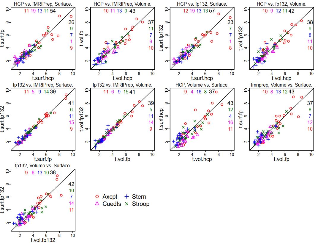
This is not surprising, given the extremely similar GLM results for each person between the two fMRIPrep versions. Using these 20 parcels, I made some scatterplots to show the comparison in coefficients between the various preprocessing styles (the ones for HCP and fMRIPrep ("fp") are the same as in the previous summary, just with tasks overplotted; see that post for more explanation). Note that in these plots "fp132" is fMRIPrep version 1.3.2 and "fp" or "fMRIPrep" is version 1.1.7.
It is clear that the tightest correlations are between the two versions of fMRIPrep preprocessing, surface to surface and volume to volume ("fp132 vs. fMRIPrep"). The plots comparing "HCP vs. fMRIPrep" (1.1.7) and "HCP vs. fp132" are similar, as are the "Volume vs. Surface" plots within each fMRIPrep version.
I also set up mixed models as before, adding the fMRIPrep 1.3.2 results. The contrasts below are from a model including all four tasks, the 20 parcels, and the 13 test people, only estimating the effect of preprocessing combination on the parameter difference. I highlighted the interesting contrasts: red are volume vs. surface within each pipeline (surface better for both fMRIPrep versions); blue show that the two fMRIPrep versions were not different; green shows that the surface estimates were higher with either fMRIPrep than HCP, and volume estimates marginally higher.

As we'd hope, the differences in the preprocessed images and GLM results between fMRIPrep version 1.1.7 and 1.3.2 are very small, much smaller than between either fMRIPrep version and the HCP pipeline, at both the single subject and group level. The conclusions in my previous summary post apply to the 1.3.2 results as well. Here I'll show some group results to parallel the previous summary; contact me if you'd like more of the results, more detail, or the underlying data.
First, the same 20 Schaefer parcels passed the threshold of having t > 1 (uncorrected) in all four tasks and preprocessing combinations when the fp132 (fMRIPrep version 1.3.2) results were substituted for the previous 1.1.7 results (compare with here and here):

This is not surprising, given the extremely similar GLM results for each person between the two fMRIPrep versions. Using these 20 parcels, I made some scatterplots to show the comparison in coefficients between the various preprocessing styles (the ones for HCP and fMRIPrep ("fp") are the same as in the previous summary, just with tasks overplotted; see that post for more explanation). Note that in these plots "fp132" is fMRIPrep version 1.3.2 and "fp" or "fMRIPrep" is version 1.1.7.
It is clear that the tightest correlations are between the two versions of fMRIPrep preprocessing, surface to surface and volume to volume ("fp132 vs. fMRIPrep"). The plots comparing "HCP vs. fMRIPrep" (1.1.7) and "HCP vs. fp132" are similar, as are the "Volume vs. Surface" plots within each fMRIPrep version.
I also set up mixed models as before, adding the fMRIPrep 1.3.2 results. The contrasts below are from a model including all four tasks, the 20 parcels, and the 13 test people, only estimating the effect of preprocessing combination on the parameter difference. I highlighted the interesting contrasts: red are volume vs. surface within each pipeline (surface better for both fMRIPrep versions); blue show that the two fMRIPrep versions were not different; green shows that the surface estimates were higher with either fMRIPrep than HCP, and volume estimates marginally higher.

So, we're still "full steam ahead" with fMRIPrep. I don't know which part of the fMRIPrep pipeline changed between 1.1.7 and 1.3.2 to make our results slightly different, but the differences don't change the interpretation of the comparisons.
UPDATE 6 September 2019: The dataset (raw and preprocessed images) we used for these comparisons is now on openneuro, called DMCC13benchmark.
UPDATE 4 January 2021: Corrected DMCC13benchmark openneuro links.
Friday, January 11, 2019
comparing fMRIPrep and HCP Pipelines: 20 parcels and summary
This post continues the previous; a summary for fMRIPrep 1.3.2 is here; start with the introduction to this series.
 The previous post showed the t-values for each parcel with the different preprocessings, but it's still a lot to absorb, and not all parcels are equally interesting. I thought it'd be useful to concentrate on the parcels with the largest high > low cognitive control effects in all four tasks, so tried a simple threshold: which parcels have t > 1 (uncorrected) in
all four of the tasks, and all four of the preprocessing combinations? The twenty parcels above pass this test, and their anatomic locations are
quite sensible for high > low cognitive control. This parcel-picking strategy is somewhat arbitrary, but seems reasonably unbiased.
The previous post showed the t-values for each parcel with the different preprocessings, but it's still a lot to absorb, and not all parcels are equally interesting. I thought it'd be useful to concentrate on the parcels with the largest high > low cognitive control effects in all four tasks, so tried a simple threshold: which parcels have t > 1 (uncorrected) in
all four of the tasks, and all four of the preprocessing combinations? The twenty parcels above pass this test, and their anatomic locations are
quite sensible for high > low cognitive control. This parcel-picking strategy is somewhat arbitrary, but seems reasonably unbiased.

 The coefficients for each participant were shown in the previous post. To
summarize those distributions, these scatterplots show the t-values for the 20
parcels (each plotting symbol a unique parcel). The number of parcels on
each side of the diagonal are listed in the corners. When analyzing
surfaces, more parcels had higher t-values when preprocessing was with
fMRIPrep in all four tasks, most prominently Cuedts. When analyzing
volumes the story was mixed (equal split of parcels in Axcpt, higher
t-values with fMRIPrep in Cuedts and Sternberg; higher t-values with HCP
on Stroop). Comparing surface and volume within each preprocessing
(second set of scatterplots), there were higher t-values in volumes in three of the
four tasks for HCP; two of the four for fMRIPrep.
The coefficients for each participant were shown in the previous post. To
summarize those distributions, these scatterplots show the t-values for the 20
parcels (each plotting symbol a unique parcel). The number of parcels on
each side of the diagonal are listed in the corners. When analyzing
surfaces, more parcels had higher t-values when preprocessing was with
fMRIPrep in all four tasks, most prominently Cuedts. When analyzing
volumes the story was mixed (equal split of parcels in Axcpt, higher
t-values with fMRIPrep in Cuedts and Sternberg; higher t-values with HCP
on Stroop). Comparing surface and volume within each preprocessing
(second set of scatterplots), there were higher t-values in volumes in three of the
four tasks for HCP; two of the four for fMRIPrep.
The t-values are a rough measure of effect size, but don't consider the entire distribution; another strategy is to fit mixed models, which allows the coefficients for each person to be included. These really can't be sensibly summarized in a few sentences; see the last few pages of this knitr (source here) for the output. But very briefly, I used this setup for the first model (R nlme code): lme(fixed=diff~surf.vol*hcp.fp*task.id, random=list(sub.id=~1, parcel.id=~1, task.id=~1), data=mm.tbl); where surf.vol was "surface" or "volume" and hcp.fp was "HCP" or "fMRIPrep"; sub.id, parcel.id, and task.id labeled the subjects, parcels (20 shown above) and tasks. Consistent with the graphs above, this model had significant interactions of surf.vol:hcp.fp and surf.vol:task.id. Looking only at volumes, the hcp.fp effect was significant, with fMRIPrep > HCP. Within only surfaces there was still an interaction of hcp.fp and task.id, so the dataset had to be subsetted further. In these smaller models, fMRIPrep surfaces > HCP surfaces in all tasks; fMRIPrep surfaces > fMRIPrep volumes in all but Cuedts. Here is the output from this reduced model for Axcpt; the other tasks are here.

My overall impression? fMRIPrep looks preferable for preprocessing, and surface analysis looks good. I was honestly hoping that surfaces wouldn't turn out so well, since I find the formats bothersome, interpolation problematic, and the preprocessing time consuming. Volumes are obviously required for subcortical areas, but for now, we will continue to run cortical surface GLMs.
There are of course many other comparisons that can be made, and some other analyses that I did that aren't in these posts. I made a good faith effort to set up the comparisons to have the final GLM statistics as equivalent and unbiased as possible, but of course not everything can be made equal (e.g., there are more vertices per parcel with the HCP than the fMRIPrep preprocessing because of the different surface meshes).
It's hard to say how well these results will hold for other datasets; for example, I did not fit simple GLMs since the aim was to compare the DMCC's GLMs. Different acquisition parameters may influence the results quite a bit, particularly voxel size for surface analysis (at some larger sizes I would expect surface analysis to fail). I am very curious to hear about the results if anyone else tries comparisons like these, to see how typical they are. But for now, we're using fMRIPrep for new task fMRI experiments.


The t-values are a rough measure of effect size, but don't consider the entire distribution; another strategy is to fit mixed models, which allows the coefficients for each person to be included. These really can't be sensibly summarized in a few sentences; see the last few pages of this knitr (source here) for the output. But very briefly, I used this setup for the first model (R nlme code): lme(fixed=diff~surf.vol*hcp.fp*task.id, random=list(sub.id=~1, parcel.id=~1, task.id=~1), data=mm.tbl); where surf.vol was "surface" or "volume" and hcp.fp was "HCP" or "fMRIPrep"; sub.id, parcel.id, and task.id labeled the subjects, parcels (20 shown above) and tasks. Consistent with the graphs above, this model had significant interactions of surf.vol:hcp.fp and surf.vol:task.id. Looking only at volumes, the hcp.fp effect was significant, with fMRIPrep > HCP. Within only surfaces there was still an interaction of hcp.fp and task.id, so the dataset had to be subsetted further. In these smaller models, fMRIPrep surfaces > HCP surfaces in all tasks; fMRIPrep surfaces > fMRIPrep volumes in all but Cuedts. Here is the output from this reduced model for Axcpt; the other tasks are here.

summary thoughts
This has been a long series of posts, and I hope interesting and useful! I've included quite a few details in these posts, but not the full dataset; we do plan to make it available, but it is obviously quite a lot and not simple to share. It seems most useful to release the preprocessed 4d images along with the afni code and key model output (most of the post-afni model code is in the knitrs linked in these posts); please contact me if you'd like something specific.My overall impression? fMRIPrep looks preferable for preprocessing, and surface analysis looks good. I was honestly hoping that surfaces wouldn't turn out so well, since I find the formats bothersome, interpolation problematic, and the preprocessing time consuming. Volumes are obviously required for subcortical areas, but for now, we will continue to run cortical surface GLMs.
There are of course many other comparisons that can be made, and some other analyses that I did that aren't in these posts. I made a good faith effort to set up the comparisons to have the final GLM statistics as equivalent and unbiased as possible, but of course not everything can be made equal (e.g., there are more vertices per parcel with the HCP than the fMRIPrep preprocessing because of the different surface meshes).
It's hard to say how well these results will hold for other datasets; for example, I did not fit simple GLMs since the aim was to compare the DMCC's GLMs. Different acquisition parameters may influence the results quite a bit, particularly voxel size for surface analysis (at some larger sizes I would expect surface analysis to fail). I am very curious to hear about the results if anyone else tries comparisons like these, to see how typical they are. But for now, we're using fMRIPrep for new task fMRI experiments.
comparing fMRIPrep and HCP Pipelines: parcelwise GLM statistics
As explained in the previous post (the introduction is here) with the target knots and contrasts for each task defined, and with the Schaefer parcellation to identify comparable sets of voxels and vertices, we're now able to see if there's a difference in the GLM between the four preprocessing combinations (surface, volume, fMRIPrep, HCP pipelines).


In the previous post I showed some of the group-average TENT curves. Above are the coefficients going into those curves, but for all 13 test people - the four green dots for AX-CPT parcel 90 above are (almost) the same means as the four lines at knot 4 (shaded) in the previous post ("almost" since the green dots here are normal means, while the previous ones were robust; the individual participant's coefficients are the same). A unique plotting symbol is used for each participant, and the four columns of points at each parcel are the four preprocessings. Plots with the distributions for all 400 parcels are here (source here).
For a simple way to describe the distribution at each parcel I used t-tests: is the across-subjects mean different than zero? These plots have each parcel colored by t, HCP in the first row, then fMRIPrep, then their difference. The differences are HCP - fMRIPrep, so cool colors indicate parcels with larger ts when preprocessed with fMRIPrep. There are a lot of cool colors in the difference images, but it's still a lot of data to absorb; the next (final?) post in this series will summarize these statistics for just 20 of these parcels.


comparing fMRIPrep and HCP Pipelines: GLM TENT curves
As described in the introduction
to this series of posts, the primary goal of these analyses is to
compare the GLM estimates: is there a difference in the high vs. low
cognitive control statistics produced from the different preprocessing
pipelines (HCP, fMRIPrep) and spaces (volume, surface)? The previous step of the analysis confirmed that the whole-brain GLMs produced sensible results, so here I'll start showing the statistics averaged within parcels. As noted before, averaging the statistics within Schaefer parcels is especially useful here, since they are defined in all three results spaces (MNI volume; surface fsaverage5, surface HCP). We've been using the 400-parcel resolution in our lab, so I adopted it here as well; I haven't tried with other resolutions.
Below is a detailed explanation of how to read these figures. They're complex, but the best way I've found (so far!) to sensibly compare sets of GLM results for this dataset. Surface-derived curves are shown in the top pair of figures (with the surface brains), and volume-derived in the lower (with the volume brains). These are group (over the 13 test people) estimates for two informative parcels (90 and 91 in the left hemisphere). Files with all parcels can be downloaded here; this zip contains the compiled pdfs (that I took these images from) as well as the source knitr (.rnw).

 There are five panes in each row. The first has a picture of the parcel and its name, surface for surface statistics (though I need to fix the text label spacing) and volume for volume statistics. The bar graphs by the parcel image show the sustained (block) regressors (robust mean and SEM) for each of the four tasks, in alphabetical order (same as the line graphs). Aside: the volume bar graph has space for "P" and "R" - these are the proactive and reactive DMCC sessions. I adapted this knitr template from one that included all three sessions; please ignore the empty spaces and "PRO" "REA" labels (fMRIPrep preprocessing was only run on Baseline session images).
The other four panes show the event-related part of the model for each task; the two regressors subtracted to make the high-low cognitive control contrast for each task are listed in the title after the task name. In the curve figures, the thick line at each knot (x-axis) is the across-subjects (robust) mean coefficient difference; the thin lines are the (robust) SEMs. Trimming of 0.1 was used in both cases; trimse from the WRS2 package was used for the SEM and base R for the trimmed mean. The solid line is calculated from the HCP-preprocessed images, dashed with fMRIPrep (abbreviated fp). The small bars below each set of lines gives the difference at the corresponding knot; HCP-fMRIPrep (so if the HCP-derived mean coefficient is larger the difference will be positive and the little bar will be above the line, on the side marked with "hcp").
The number of knots (x-axis) in each graph varies, since the tasks vary in duration: Sternberg trials are longest, Stroop trials are shortest. Each knot is 2 TRs (2.4 ms) in all tasks. The Stroop curve looks a bit HRF-ish; since each trial is just a few seconds, as is reasonable. The others are a bit delayed or doubled (in the case of Sternberg) due to the trial dynamics; there's lots more detail on the DMCC website, if you're curious.
For the purpose of the preprocessing comparisons, it's most relevant that we identified one knot for each task that should be most relevant for these high vs. low cognitive control contrasts, which is shaded in grey on the plots. Focusing on a single knot in each task gives a way to summarize the curves - we're not equally interested in all knots' estimates - which will be shown in the next post. Note that which knots are "most relevant" and which contrasts (and GLMs) would be used for high vs. low was determined before these preprocessing comparisons were conceived, primarily on the basis of task design, but also checking against the volumetric HCP-preprocessed GLM results.
I described these two parcels (90 and 91) as "informative" because in all four cases (surface, volume, HCP, fMRIPrep) the TENT curves have a fairly sensible shape (given the task timing) in all tasks, with a positive (high > low cognitive control) mean at the target knot (shaded). These two parcels are also located in areas that are sensible for having more activity in high cognitive control conditions. In the next post I'll show whole-brain results again, but summarized within parcel and at the target knot.
Below is a detailed explanation of how to read these figures. They're complex, but the best way I've found (so far!) to sensibly compare sets of GLM results for this dataset. Surface-derived curves are shown in the top pair of figures (with the surface brains), and volume-derived in the lower (with the volume brains). These are group (over the 13 test people) estimates for two informative parcels (90 and 91 in the left hemisphere). Files with all parcels can be downloaded here; this zip contains the compiled pdfs (that I took these images from) as well as the source knitr (.rnw).


The other four panes show the event-related part of the model for each task; the two regressors subtracted to make the high-low cognitive control contrast for each task are listed in the title after the task name. In the curve figures, the thick line at each knot (x-axis) is the across-subjects (robust) mean coefficient difference; the thin lines are the (robust) SEMs. Trimming of 0.1 was used in both cases; trimse from the WRS2 package was used for the SEM and base R for the trimmed mean. The solid line is calculated from the HCP-preprocessed images, dashed with fMRIPrep (abbreviated fp). The small bars below each set of lines gives the difference at the corresponding knot; HCP-fMRIPrep (so if the HCP-derived mean coefficient is larger the difference will be positive and the little bar will be above the line, on the side marked with "hcp").
The number of knots (x-axis) in each graph varies, since the tasks vary in duration: Sternberg trials are longest, Stroop trials are shortest. Each knot is 2 TRs (2.4 ms) in all tasks. The Stroop curve looks a bit HRF-ish; since each trial is just a few seconds, as is reasonable. The others are a bit delayed or doubled (in the case of Sternberg) due to the trial dynamics; there's lots more detail on the DMCC website, if you're curious.
For the purpose of the preprocessing comparisons, it's most relevant that we identified one knot for each task that should be most relevant for these high vs. low cognitive control contrasts, which is shaded in grey on the plots. Focusing on a single knot in each task gives a way to summarize the curves - we're not equally interested in all knots' estimates - which will be shown in the next post. Note that which knots are "most relevant" and which contrasts (and GLMs) would be used for high vs. low was determined before these preprocessing comparisons were conceived, primarily on the basis of task design, but also checking against the volumetric HCP-preprocessed GLM results.
I described these two parcels (90 and 91) as "informative" because in all four cases (surface, volume, HCP, fMRIPrep) the TENT curves have a fairly sensible shape (given the task timing) in all tasks, with a positive (high > low cognitive control) mean at the target knot (shaded). These two parcels are also located in areas that are sensible for having more activity in high cognitive control conditions. In the next post I'll show whole-brain results again, but summarized within parcel and at the target knot.
comparing fMRIPrep and HCP Pipelines: full-brain GLM images
As described in the introduction to this series of posts, the primary goal of these analyses is to compare the GLM estimates: is there a difference in the high vs. low cognitive control statistics produced from the different preprocessing pipelines (HCP, fMRIPrep) and spaces (volume, surface)? As explained in the introductory post, I've found comparing the statistics within Schaefer parcels most useful, since these are defined in all four results spaces.
But the parcel-averaged statistics were calculated from mass-univariate (every voxel and vertex separately) GLMs, and it's dangerous to make parcel averages without first looking at some of the full-brain GLM results to make sure everything seems sensible. So, here I'll show a few single-subject GLM results, before moving on to group and parcel-averaged in the next post(s).
The "buttons" GLMs are not of direct interest - they only model the button presses, not the cognitive tasks. But they're useful for a positive control: activity should be in motor areas and possibly visual (given the linking of response and visual change in some of our tasks). Below are the "button1" F statistics from the Buttons GLM for the same participant used in the previous posts. (Since these are TENT models, the Fstat provides a single summary of activity across the set of knots.)


First, the volume results. Since they're both in the same output space I can subtract the statistics voxel-wise, for the third row of images for each task. I subtracted HCP-fMRIPrep, so cool colors are voxels where the fMRIPrep-volume-preprocessed statistic was larger than the HCP-volume-preprocessed. As expected, the peaks are generally in grey matter, and pretty similar between the two pipelines: the two AX-CPT images look more similar to each other than do the HCP-preprocessed AX-CPT with the HCP-preprocessed Cued task-switching image. This is very good: I expect some variation between the three tasks (though all should have some motor), but the two pipelines ought to make similar statistics, given that they started with the same DICOMs, event timings, etc. While the two pipelines' images are visually similar, the difference images have quite a bit of blue in sensible brain areas, indicating that the fMRIPrep-preprocessed images had larger Fs in those voxels.


 And here are the same statistics for the HCP and fMRIPrep-preprocessed surfaces. I couldn't subtract the two surfaces, since the two pipelines use different surface targets (so there isn't vertex-to-vertex correspondence; there are about 3x as many vertices in the HCP surface than fsaverage5). The inflation of the two underlays doesn't match exactly, but it's possible to tell that the statistics sort much more by task than preprocessing, which, as noted before, is very reassuring. There's also clear motor activity in all images, less in AX-CPT than the others, consistent with what is seen in the volume images for this person.
This person is quite typical, as are the conclusions drawn from this button1 F statistic: the full-brain statistical images tend to sort much more by statistic (which contrast, which task) than by preprocessing. But there are differences in the statistic magnitudes and cluster boundaries, and these are hard to evaluate qualitatively, particularly on the surfaces. Averaging the statistics within parcels makes it possible to quantify these differences, and so directly compare the four sets of results.
But the parcel-averaged statistics were calculated from mass-univariate (every voxel and vertex separately) GLMs, and it's dangerous to make parcel averages without first looking at some of the full-brain GLM results to make sure everything seems sensible. So, here I'll show a few single-subject GLM results, before moving on to group and parcel-averaged in the next post(s).
The "buttons" GLMs are not of direct interest - they only model the button presses, not the cognitive tasks. But they're useful for a positive control: activity should be in motor areas and possibly visual (given the linking of response and visual change in some of our tasks). Below are the "button1" F statistics from the Buttons GLM for the same participant used in the previous posts. (Since these are TENT models, the Fstat provides a single summary of activity across the set of knots.)


First, the volume results. Since they're both in the same output space I can subtract the statistics voxel-wise, for the third row of images for each task. I subtracted HCP-fMRIPrep, so cool colors are voxels where the fMRIPrep-volume-preprocessed statistic was larger than the HCP-volume-preprocessed. As expected, the peaks are generally in grey matter, and pretty similar between the two pipelines: the two AX-CPT images look more similar to each other than do the HCP-preprocessed AX-CPT with the HCP-preprocessed Cued task-switching image. This is very good: I expect some variation between the three tasks (though all should have some motor), but the two pipelines ought to make similar statistics, given that they started with the same DICOMs, event timings, etc. While the two pipelines' images are visually similar, the difference images have quite a bit of blue in sensible brain areas, indicating that the fMRIPrep-preprocessed images had larger Fs in those voxels.


This person is quite typical, as are the conclusions drawn from this button1 F statistic: the full-brain statistical images tend to sort much more by statistic (which contrast, which task) than by preprocessing. But there are differences in the statistic magnitudes and cluster boundaries, and these are hard to evaluate qualitatively, particularly on the surfaces. Averaging the statistics within parcels makes it possible to quantify these differences, and so directly compare the four sets of results.
Thursday, January 10, 2019
comparing fMRIPrep and HCP Pipelines: tSNR images
See this for the introduction to this series of posts. Yesterday I showed that the motion regressors produced by the two programs are nearly identical (as we'd hope, since they started with the same DICOMs!). But how do the preprocessed images compare? Short version: the preprocessed images are qualitatively similar in appearance (and standard QC images), with differences between people more obvious than differences between the pipeline. But only "similar", not "nearly identical" (which is how I described the motion regressors).
(Much) Longer version: The main goal of these preprocessing tests is to compare the GLM estimates (described a bit in the introduction and more later), not to perform QC on the images from the pipelines. This adds a complication, however, because the images that go into the GLMs are not exactly the same as the images that come out of the pipelines. It strikes me as most useful to look at the images as ready to go into the GLMs, since that's the final step at which things vary - identical GLMs were performed at every voxel and vertex.
We wanted to make the GLM estimate comparisons as direct and fair as possible, so aimed to do equivalent transformations of the surface and volume preprocessed images from each pipeline. If you think we missed that target, please let me know. We use afni for the after-preprocessing steps, as summarized here. First, both fMRIPrep and the HCP pipelines produce MNI-normalized volumes, but the bounding box is a bit different, so we used 3dresample to match the fMRIPrep images to the HCP, as well as to reorient to LPI. Both the fMRIPrep and HCP pipeline volumes are then smoothed (3dBlurToFWHM, -FWHM 4); surfaces are NOT smoothed with afni commands, since they were smoothed in the preprocessing pipelines. Finally, the timeseries at each voxel (or vertex) was scaled (in the usual way for afni, see this or this), using 3dcalc -a full.timeseries -b mean.timeseries -expr 'min(200, a/b*100)*step(a)*step(b)', where mean.timeseries is an image of the voxel (or vertex)-wise means, calculated with 3dTstat.

Single frames (this is #100 from the same run as in the previous post) from the ready-for-afni images look similar; an obvious difference is that the HCP pipelines mask the brain, while fMRIPrep does not. I have the color scaling the same in both images (90 to 100) and the intensity in the brain is similar (as it should be, given the scaling); the voxel under the crosshairs has the value 99.8 after fMRIPrep and 98.6 after the HCP pipelines.The frontal dropout (yellow arrow) is obvious in both, but looks like weird striping in the HCP image because of the masking; without masking it blends into the background. Spot-checking frames of the images I can't say that I've found one preprocessing consistently "better" than the other; by eye, sometimes one looks a bit better, sometimes the other.

Here's the same frame, from the surfaces. The HCP pipelines project to a different underlay surface anatomy than fMRIPrep, so the brain shapes are a bit different (fMRIPrep to fsaverage5, 10242 vertices/hemisphere; HCP with 32492 vertices/hemisphere). To be honest, I find these harder to interpret ... swirly colors.

 If the single frames look similar, what about QC images? Well, by eye they also strike me as "different but similar", without an overwhelming preference for one being better than the other. The above are tSNR images of the same test run, all with the same color scaling.
Is the story in this whole series of comparison posts going to be "similar"? No, differences turn up in the GLM results, especially when summarizing within parcels ... stay tuned.
Note: the movement graphs and tSNR images were made with R knitr code. The full pdf (four tasks for this person) is here, and its source here. The paths/etc. won't work to compile the knitr (unless you're on our network!), but the plotting code and afni commands may prove useful; the sourced gifti plotting functions are here.
(Much) Longer version: The main goal of these preprocessing tests is to compare the GLM estimates (described a bit in the introduction and more later), not to perform QC on the images from the pipelines. This adds a complication, however, because the images that go into the GLMs are not exactly the same as the images that come out of the pipelines. It strikes me as most useful to look at the images as ready to go into the GLMs, since that's the final step at which things vary - identical GLMs were performed at every voxel and vertex.
We wanted to make the GLM estimate comparisons as direct and fair as possible, so aimed to do equivalent transformations of the surface and volume preprocessed images from each pipeline. If you think we missed that target, please let me know. We use afni for the after-preprocessing steps, as summarized here. First, both fMRIPrep and the HCP pipelines produce MNI-normalized volumes, but the bounding box is a bit different, so we used 3dresample to match the fMRIPrep images to the HCP, as well as to reorient to LPI. Both the fMRIPrep and HCP pipeline volumes are then smoothed (3dBlurToFWHM, -FWHM 4); surfaces are NOT smoothed with afni commands, since they were smoothed in the preprocessing pipelines. Finally, the timeseries at each voxel (or vertex) was scaled (in the usual way for afni, see this or this), using 3dcalc -a full.timeseries -b mean.timeseries -expr 'min(200, a/b*100)*step(a)*step(b)', where mean.timeseries is an image of the voxel (or vertex)-wise means, calculated with 3dTstat.

Single frames (this is #100 from the same run as in the previous post) from the ready-for-afni images look similar; an obvious difference is that the HCP pipelines mask the brain, while fMRIPrep does not. I have the color scaling the same in both images (90 to 100) and the intensity in the brain is similar (as it should be, given the scaling); the voxel under the crosshairs has the value 99.8 after fMRIPrep and 98.6 after the HCP pipelines.The frontal dropout (yellow arrow) is obvious in both, but looks like weird striping in the HCP image because of the masking; without masking it blends into the background. Spot-checking frames of the images I can't say that I've found one preprocessing consistently "better" than the other; by eye, sometimes one looks a bit better, sometimes the other.

Here's the same frame, from the surfaces. The HCP pipelines project to a different underlay surface anatomy than fMRIPrep, so the brain shapes are a bit different (fMRIPrep to fsaverage5, 10242 vertices/hemisphere; HCP with 32492 vertices/hemisphere). To be honest, I find these harder to interpret ... swirly colors.


Is the story in this whole series of comparison posts going to be "similar"? No, differences turn up in the GLM results, especially when summarizing within parcels ... stay tuned.
Note: the movement graphs and tSNR images were made with R knitr code. The full pdf (four tasks for this person) is here, and its source here. The paths/etc. won't work to compile the knitr (unless you're on our network!), but the plotting code and afni commands may prove useful; the sourced gifti plotting functions are here.
Wednesday, January 9, 2019
comparing fMRIPrep and HCP Pipelines: motion regressors
See this post for the introduction to this series of posts. Here, I'll describe and compare the motion regressors produced by the fMRIPrep and HCP Pipelines. Short version: the file formats are a bit different, but the estimated motion is nearly identical.
Long version: the first step is figuring out where the motion regressors are put by the two pipelines. If you kept the HCP file structure, there will be one Movement_Regressors.txt file for each preprocessed run. The files are always called Movement_Regressors.txt; you track which one goes with which run and person by the directory structure. For example, the file for subject 203418, run SternBas2_PA is /MINIMALLY_PREPROCESSED/203418/MNINonLinear/Results/tfMRI_SternBas2_PA/Movement_Regressors.txt.

The above image is the first bit of the file, read into R. It has 12 columns: x, y, z, roll, pitch, yaw, then their six derivatives (stated on page 75 of HCP_S900_Release_Reference_Manual.pdf). The rotation columns are in degrees, translation in mm. There are 600 rows in this particular text file, matching the number of volumes acquired in the run.
fMRIPrep outputs a file ending in _confounds.tsv for each run, with its location and name following the BIDS naming conventions. For example, the motion regressors file for the same subject and run as above is /sub-203418/fMRIPrep_output/fmriprep/sub-203418/ses-01/func/sub-203418_ses-01_task-Stern_acq-MB42p4PA_run-02_bold_confounds.tsv.

The above is the first bit of the file, read into R. As you can tell in the screenshot, this file has many more columns than the HCP version: 35 instead of 12 (the same number of rows, though: one per acquired volume). The columns are named, and the documentation gives details on each. The motion regressors I want are in six columns, called X, Y, Z, RotX, RotY, and RotZ. "RotX","RotY","RotZ" correspond to roll, pitch, and yaw, but are in radians; translation is in mm.
UPDATE (24 April 2019): fMRIPrep version 1.3.2 names the columns "trans_x", "trans_y", "trans_z", "rot_x", "rot_y", "rot_z".
Now I can plot both sets of motion parameters to see if they vary. I converted the fMRIPrep rotations to degrees, then plotted the six estimates from each program in the top of this figure. (TRs (1.2 ms) are along the x-axis; the vertical grey lines give 1-minute intervals.) As you hopefully can see (click the figure to enlarge), it's actually hard to tell that there are 12 lines in the top - those from fMRIPrep and the HCP pipelines are so close that it mostly looks like there are only 6 lines.
 The lower frame has the FD version of the same two sets of motion estimates; HCP Pipelines in black and fMRIPrep in green (this is unfiltered FD, and our censoring threshold of 0.9 is shown in red). A little separation between the two FD lines is visible, but again, quite minimal.
I picked this run for this post because there's a bit of actual head motion, and if you zoom in around frame 525 you can see that there is a little separation between the translation estimates. I had to check a few runs to find one with any visible separation; in our 13 test people (with 8 runs each) this is pretty much as large as the discrepancy gets, which is why at this time I'm describing the motion estimates from fMRIPrep and the HCP pipeline as essentially identical.
Note: The figure above is from a knitr template that I made for doing these QC comparisons; see note at the end of this post.
Long version: the first step is figuring out where the motion regressors are put by the two pipelines. If you kept the HCP file structure, there will be one Movement_Regressors.txt file for each preprocessed run. The files are always called Movement_Regressors.txt; you track which one goes with which run and person by the directory structure. For example, the file for subject 203418, run SternBas2_PA is /MINIMALLY_PREPROCESSED/203418/MNINonLinear/Results/tfMRI_SternBas2_PA/Movement_Regressors.txt.

The above image is the first bit of the file, read into R. It has 12 columns: x, y, z, roll, pitch, yaw, then their six derivatives (stated on page 75 of HCP_S900_Release_Reference_Manual.pdf). The rotation columns are in degrees, translation in mm. There are 600 rows in this particular text file, matching the number of volumes acquired in the run.
fMRIPrep outputs a file ending in _confounds.tsv for each run, with its location and name following the BIDS naming conventions. For example, the motion regressors file for the same subject and run as above is /sub-203418/fMRIPrep_output/fmriprep/sub-203418/ses-01/func/sub-203418_ses-01_task-Stern_acq-MB42p4PA_run-02_bold_confounds.tsv.

The above is the first bit of the file, read into R. As you can tell in the screenshot, this file has many more columns than the HCP version: 35 instead of 12 (the same number of rows, though: one per acquired volume). The columns are named, and the documentation gives details on each. The motion regressors I want are in six columns, called X, Y, Z, RotX, RotY, and RotZ. "RotX","RotY","RotZ" correspond to roll, pitch, and yaw, but are in radians; translation is in mm.
UPDATE (24 April 2019): fMRIPrep version 1.3.2 names the columns "trans_x", "trans_y", "trans_z", "rot_x", "rot_y", "rot_z".
Now I can plot both sets of motion parameters to see if they vary. I converted the fMRIPrep rotations to degrees, then plotted the six estimates from each program in the top of this figure. (TRs (1.2 ms) are along the x-axis; the vertical grey lines give 1-minute intervals.) As you hopefully can see (click the figure to enlarge), it's actually hard to tell that there are 12 lines in the top - those from fMRIPrep and the HCP pipelines are so close that it mostly looks like there are only 6 lines.

I picked this run for this post because there's a bit of actual head motion, and if you zoom in around frame 525 you can see that there is a little separation between the translation estimates. I had to check a few runs to find one with any visible separation; in our 13 test people (with 8 runs each) this is pretty much as large as the discrepancy gets, which is why at this time I'm describing the motion estimates from fMRIPrep and the HCP pipeline as essentially identical.
Note: The figure above is from a knitr template that I made for doing these QC comparisons; see note at the end of this post.
Friday, January 4, 2019
comparing fMRIPrep and HCP Pipelines: introduction
This is the first in a series of posts describing a set of comparisons we've done between fMRIPrep and the HCP Pipelines: if the same task fMRI dataset is run through both pipelines, extracting surfaces and volumes from each, how do the eventual GLM results compare?
These sorts of comparisons are conceptually easy but tricky to design and time-consuming to complete. I submitted this as a poster for OHBM 2019, we will likely write this up as a paper, and plan to release the code and images. But these blog posts are a start, and feedback is most welcome. Let me know if you want additional details or files and I can try to get them to you sooner than later.
roadmap
The DMCC is a big dataset (currently around 80 people with at least 3 scanning sessions, and we're not done). To keep the preprocessing comparisons tractable I picked just 13 of the participants to include, requiring that they have complete Baseline session data (two runs of each of the four tasks), be unrelated, have acceptable movement (a qualitative judgement), and have visible motor activity in their single-subject Buttons GLMs (with HCP Pipeline preprocessing). This last is an effort for an unbiased QC estimate: in three of our tasks the participants push a response button, so GLMs using these button-pushes as the only events of interest (ignoring all of the cognitive conditions) should show motor activation if the signal quality is acceptable. I used the volumetric HCP Pipeline preprocessing for screening because that's what we've been using (and so have results for all people); that may introduce a bit of bias (favoring people that did well with the volumetric HCP Pipelines).
These sorts of comparisons are conceptually easy but tricky to design and time-consuming to complete. I submitted this as a poster for OHBM 2019, we will likely write this up as a paper, and plan to release the code and images. But these blog posts are a start, and feedback is most welcome. Let me know if you want additional details or files and I can try to get them to you sooner than later.
roadmap
- This post describes the dataset, preprocessing, tasks, GLMs, and parcellation (for ROIs).
- The next post(s) will show the output of the two pipelines, as motion regressors, QC metrics, and images.
- Then posts will describe and compare the GLM statistics calculated from each set of images: full-brain images, parcel-wise curves, by target knots in the parcels, and a subset of the parcels.
dataset
I am particularly interested in how the preprocessing would affect the statistics for the Dual Mechanisms of Cognitive Control (DMCC) project since that's the project I'm most involved with. I've previously shown bits from this dataset and described the acquisition parameters; briefly, each DMCC scanning session includes two runs each of four cognitive control tasks (AX-CPT, Cued task-switching, Sternberg, and Stroop). Task runs were each approximately 12 minutes, alternating AP/PA. All scanning was with a 3T SIEMENS Prisma scanner with a 32 channel head coil, 2.4 mm isotropic voxels, TR = 1.2 s, and an MB4 CMRR sequence.The DMCC is a big dataset (currently around 80 people with at least 3 scanning sessions, and we're not done). To keep the preprocessing comparisons tractable I picked just 13 of the participants to include, requiring that they have complete Baseline session data (two runs of each of the four tasks), be unrelated, have acceptable movement (a qualitative judgement), and have visible motor activity in their single-subject Buttons GLMs (with HCP Pipeline preprocessing). This last is an effort for an unbiased QC estimate: in three of our tasks the participants push a response button, so GLMs using these button-pushes as the only events of interest (ignoring all of the cognitive conditions) should show motor activation if the signal quality is acceptable. I used the volumetric HCP Pipeline preprocessing for screening because that's what we've been using (and so have results for all people); that may introduce a bit of bias (favoring people that did well with the volumetric HCP Pipelines).
pipelines, GLMs, and parcels
These analyses use version 3.17.0 of the HCP Pipelines (adapted several years ago for the DMCC acquisitions) and fMRIPrep version 1.1.7; each pipeline began with the same DICOM images.
The same GLMs (event onsets, model types, etc.) were run on the images from each version (surface, volume) of each pipeline; all with AFNI. The "standard" DMCC GLMs are not particularly simple because the task runs are mixed (block and event), and we're fitting GLMs to model both "sustained" (block) and event-related activity. The GLMs use 3dDeconvolve and 3dREMLfit, with TENTzero (FIR-type) for the events (one knot for two TRs). Most of the GLM model parameters were dictated by the experimental design, but tweaking (e.g., how long to make the TENT knots, whether to include regressors for the block onsets and offsets) was done with the HCP pipeline preprocessed images.
To keep these preprocessing comparisons tractable at the GLM level, we only included Baseline session images, and focused on contrasting high and low cognitive control. Which trials correspond to high and low cognitive control varies across the four tasks, and we don't expect identical levels of difficulty or brain activity in the tasks. Regardless, high vs. low cognitive control conditions gives a fairly "apples to apples" basis, and is a reasonably strong effect.
Another complication for preprocessing comparisons is working out the anatomical correspondence: every voxel does not have a single vertex in the surface representation (and each vertex doesn't match a single voxel). While we had both the fMRIPrep and HCP Pipelines output MNI-normalized volumes (so volume-to-volume voxel-level correspondence), the two pipelines use different surface meshes (fsaverage5 vs. HCP), so there isn't an exact match between the vertices (see this thread, for example).
For these comparisons I deal with corresponding across the output formats by making qualitative assessments (e.g., if this GLM output statistic is thresholded the same, do the same areas tend to show up in the volumes and surfaces?), but more practically by summarizing the statistics within anatomic parcels. The parcellation from (Schaefer et al. 2017) is ideal for this: they released it in volume (MNI) and surface (both fsaverage5 and HCP) formats.We used the 400-area version here, allowing direct comparisons: a mean of parcel #6 can be computed in all four output images (HCP volume, HCP surface, fMRIPrep volume, fMRIPrep surface). The number of voxels or vertices making up each parcel varies between the volume and surfaces, of course.
UPDATE 10 January 2019: Here's the command actually used to run fMRIPrep; thanks Mitch Jeffers!
singularity run \
--cleanenv \
-B ${MOUNT}:/tmp \
/home/ccp_hcp/fmriprep/SingularityImages/fmriprep-1.1.7.simg \
--fs-license-file /tmp/.license/freesurfer/license.txt \
-w /tmp \
/tmp/${INPUT} /tmp/${OUTPUT} \
participant --participant_label ${SUBJECT} \
--output-space fsaverage5 \
-n-cpus 16 --omp-nthreads 4 \
--mem-mb 64000 -vvvv \
--use-plugin /tmp/plugin.yml
UPDATE 6 September 2019: The raw and preprocessed images of the dataset we used for these comparisons is now on openneuro, called DMCC13benchmark.
UPDATE 4 January 2021: Corrected DMCC13benchmark openneuro links.
Subscribe to:
Posts (Atom)