Friday, February 22, 2013

pyMVPA normal_feature_dataset function


 In a previous post I explained how I thought the pyMVPA normal_feature_dataset function works, drawing from the description in the documentation. But Ben Acland dug through the function and was able to clarify it for me; my previous R code and description isn't right. So here is what mvpa2.misc.data_generators.normal_feature_dataset really seems to be doing (followed by my R version).

normal_feature_dataset description

We first specify snr, which gives the amount of signal in the simulated data (larger number corresponds to more signal) and nonbogus_features, which lists the indices of the voxels which will be given signal.

We start making the dataset by generating a number from a standard normal distribution for every cell (all examples, not just ones of a single class). We then divide all values by the square root of the snr. Next, we add signal to the specified nonbogus voxels in each class by adding 1 to the existing voxel values. Finally, each value is divided by the largest absolute value of the for "normalization."

my R version

Here is my R implementation of the pyMVPA normal_feature_dataset function, using the previous code for easy comparison. The code here assumes we have 2 classes, 4 runs, and 10 examples, for 80 rows in our final dataset.

num.nonbogus <- c(2,2); # number of voxels to be given signal in each class
temp.vox <- rnorm(40*2, mean=0, sd=1);
temp.vox <- temp.vox / sqrt(pymvpa.snr);  
Which voxels get the +1 is specified a bit differently here than in the pyMVPA code; I added it to the first num.nonbogus[1] voxels in class A and the next num.nonbogus[2] in class B. If num.nonbogus[1] + num.nonbogus[2] = (the total number of voxels) then all voxels will be informative, if smaller, some will be "bogus" in the final simulated dataset.
 
i is the voxel index (which voxel we're generating data for in this iteration). The rows are arranged so that the first 40 rows are class A and the last 40 rows class B.
if (i <= num.nonbogus[1]) { 
  temp.vox[1:40] <- temp.vox[1:40] + 1;  # add to class A
}
if (i > num.nonbogus[1]) & (i <= (num.nonbogus[1] + num.nonbogus[2]))) {  
  temp.vox[41:80] <- temp.vox[41:80] + 1;  # add to class B
} 

tbl[,i] <- temp.vox / max(abs(temp.vox));

null distributions

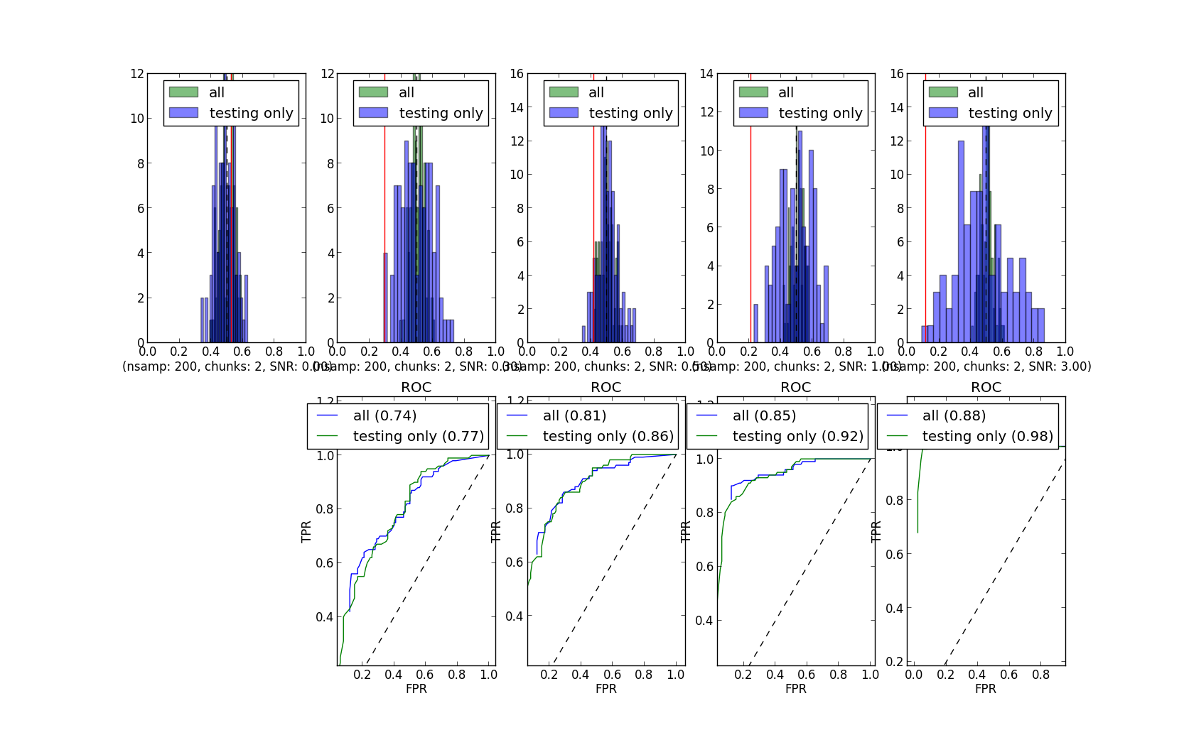
These null distributions are much more "normal" appearing than the ones with my first "pymvpa" way of simulating data, but still become wider at higher snr (particularly when permuting the training data only).


So, this is the third set of null distributions (compare with these and these), in which only the way of simulating the data was varied. How we simulate the data really matters.

Wednesday, February 20, 2013

pyMVPA null distributions, different simulated data

Ben Acland recently joined our lab, and knows python. He's been exploring the pyMVPA code, and was able to run the permutation code from Michael and Yaroslav, but generating the datasets using two normal distributions, instead of with the pyMVPA normal_feature_dataset function.

Here is the command he wrote to generate the dataset, where "mean" is what I previously called the "bias": class A is generated by a normal distribution of with mean "mean", class B by a normal distribution of mean (-1 * "mean").


Here are the curves he generated for different numbers of examples, chunks, and means ("bias"). This is using Michael and Yaroslav's code, except for using the above line of code to generate the simulated data (and having to set "mean", and having all the voxels "non-bogus").
The curves obviously change a lot, lot less than these or these; they are pretty much the same even though the true-labeled accuracy changes drastically.

So, yep, how we simulate the data really makes a difference. But how should we simulate data for MVPA purposes? Do we need a few standards? I doubt any single simulation method will be sufficient.

Friday, February 15, 2013

comparing null distributions: changing the snr

This post could also be titled: "how you simulate the data really matters". In my previous post about changing the difference between the two classes (how much information, how easy to classify) I found that fairly large changes to the "bias" changed the accuracy (and so p-values) drastically, but not the null distributions.

Changing how I generated the simulated data causes the null distributions to change a lot as the difference between the classes increases. These simulations are the same as the previous set (same seeds, number of examples, cross-validation schemes, relabeling schemes, linear svms, etc), except for how the simulated data was generated.

In these examples, higher "snr" corresponds to easier classification (so the dark lines have more signal). When permuting the training set labels only the null distribution changes dramatically (and very strangely), becoming wider as the snr increases.


What is the difference?

In my original simulations the variance increased minimally with signal. I made the values for one voxel with the R code
tbl[,i] <- c(rnorm(40, mean=-0.15, sd=1), rnorm(40, mean=0.15, sd=1));
which generates 40 entries at random from a standard normal distribution with standard deviation 1 and mean -0.15 to be the 40 values for that voxel in class A, and 40 entries from a normal distribution with standard deviation 1 and mean 0.15 to be the values for that voxel in class B. (This is for 4 runs with 10 examples in each run, and a "bias" of 0.15.)

I set up the simulation for this post to mimic the description of the pyMVPA normal_feature_dataset function, which was used in the simulations on the pyMVPA message list. I kept the parameters similar to my previous simulation (all voxels have signal), but used this R code to generate data for one voxel:
temp.vox <- rnorm(40, mean=0, sd=1);
temp.vox2 <- temp.vox / pymvpa.snr; 

temp.vox <- c(temp.vox, temp.vox2);
tbl[,i] <- temp.vox / max(abs(temp.vox));

Where pymvpa.snr is 0.3, 3, 10, or 30. In words, I choose 40 entries from a standard normal distribution with standard deviation 1 and mean 0 to be the 40 values for that voxel in class A. I then divided each of the 40 values by the signal-to-noise ratio (e.g. 0.3), and set those values for class B. Finally, I divided each value by the largest absolute value of any of the 80 values.

Dividing by a constant (the signal-to-noise) makes fairly large differences in the variance of the A and B samples as the constant changes, even after normalization, and I think that might be driving the "widening" of the null distribution with increased signal, and certainly makes large differences to the null distributions.

So ...

If such effects of how datasets are simulated are widespread, we'll have to be much more careful in explaining how simulations were conducted, and perhaps try to decide on a standard. Which methods are actually closest to fMRI data? Or can we even determine a general case, given how much fMRI preprocessing can vary?

UPDATE: this is not an accurate description of the normal_feature_dataset function. See this post for details.

Thursday, February 14, 2013

What makes a pattern?

I like that the recent article by Kragel, Carter, & Huettel point out what is detected by linear classifiers, but it didn't convince me that linear algorithms should be be abandoned for fMRI MVPA (or MVPC, to use their acronym); or even that we should run non-linear classifiers for comparison to linear results as general practice.

Linear classifiers require (at least some) individual voxels to have a bias; a difference in BOLD over the conditions. The fourth example from Kragel, Carter, & Huettel (Figure 2, clipped at right) shows a case in which linear classifiers fail (but nonlinear succeed): in class A the informative voxels take value x in half of the examples and -x in the other half of the examples (red and black squares), and 0 in all class B examples. The average value for the voxel across all examples is thus 0, there is no overall bias, and linear classifiers perform at chance.


Here is another example of a case in which linear classifiers fail, showing the problem in a different way: you can't draw a line to separate the blue and pink points in the 2D graph. A nonlinear classifier could distinguish the blue and pink cases, using a rule as simple as if voxel 1 is equal to voxel 2, then the blue class, otherwise, the pink class.

So I fully agree that linear classifiers only detect linearly-seperable patterns; and suggest that a clearer way to think about what is being found by a linear classifier is a pooling of biases over many voxels (or how to combine weak signals), rather than a "pattern".

But I do not agree that all this means that we need to use both linear and nonlinear classifiers.Setting aside the methodological difficulties (including how the model comparisons should be done), would we want to detect nonlinear patterns in task-related BOLD data? And would such a pattern occur? Linear classifiers fail in cases like those shown here (i.e. XOR-type) when the examples are exactly balanced, which I suspect does not happen in noisy fMRI data: even a small bias (such as having most of the examples x and fewer -x in the interactive example) will lead to some detection.


ResearchBlogging.orgKragel, P., Carter, R., & Huettel, S. (2012). What Makes a Pattern? Matching Decoding Methods to Data in Multivariate Pattern Analysis Frontiers in Neuroscience, 6 DOI: 10.3389/fnins.2012.00162

Sunday, February 10, 2013

where to start with MVPA?

I was recently asked for suggestions about starting with MVPA, so here are some ideas. This is certainly not an exhaustive list, feel free to submit others.

literature

  • Pereira, F., Mitchell, T., Botvinick, M., 2009. Machine learning classifiers and fMRI: A tutorial overview. Neuroimage 45, S199-S209.
  • Etzel, J.A., Gazzola, V., Keysers, C., 2009. An introduction to anatomical ROI-based fMRI classification analysis. Brain Research 1282, 114-125.
  • Mur, M., Bandettini, P.A., Kriegeskorte, N., 2009. Revealing representational content with pattern-information fMRI--an introductory guide. Soc Cogn Affect Neurosci, nsn044.
  • Haynes JD. 2015. A Primer on Pattern-Based Approaches to fMRI: Principles, Pitfalls, and Perspectives. Neuron, 87 (2), 257-70. doi: 10.1016/j.neuron.2015.05.025 PMID: 26182413
  • Mitchell, T.M., Hutchinson, R., Niculescu, R.S., Pereira, F., Wang, X., 2004. Learning to Decode Cognitive States from Brain Images. Machine Learning 57, 145-175.
  • Norman, K.A., Polyn, S.M., Detre, G.J., Haxby, J.V., 2006. Beyond mind-reading: multi-voxel pattern analysis of fMRI data. Trends In Cognitive Sciences 10, 424-430.

software

There are a few software packages specifically for MVPA, though many people (myself included) use quite a bit of their own code. A nice comparison of packages is towards the end of Hebart2015.

workshops/conferences

publicly-available fMRI datasets

other things


updated 15 October 2013: added a link to PRoNTO; added the workshops section
updated 16 January 2015: added the link to The Decoding Toolbox and Hebart 2015.
updated 4 February 2015: added the public datasets section.
updated 11 September 2015: changed the reference from Haynes 2006 to Haynes 2015.
updated 21 March 2017: added a link to CCN.
updated 25 September 2017: added BrainIAK

Friday, February 8, 2013

comparing null distributions: changing the bias

Here is another example in this series of simulations exploring the null distributions resulting from various permutation tests. In this case I changed the "bias": a higher bias makes the samples easier to classify since the random numbers making up each class are drawn from a normal distribution with standard deviation 1 and mean either bias or (-1 * bias). The random seeds are the same here as in the previous examples, so the distributions are comparable.

As before, here are the null distributions resulting from ten simulations using either a bias of 0.05 or 0.15.

These are from using two runs:

and these from using four runs:

The null distributions within each pane pretty much overlap: the curves don't change as much with the different biases as they do with changing the number of runs or the permutation scheme.

The true-labeled accuracy and so the p-values change quite a lot, though:
with two runs, bias = 0.05
with four runs, bias = 0.05
As in the simulations with more signal (bias = 0.15), there is more variability in true-labeled accuracy in the dataset with two runs than the one with four runs. Some of the two-run simulations (#5 and #8) have accuracy below chance, and so p-values > 0.9. But two other two-run simulations (#3 and #7) have accuracy above 0.7 and p-values of better than 0.05. The best four-run simulation accuracy is 0.6, and none have p-values better than 0.05 (looking at permuteBoth).

So, in these simulations, changing the amount of difference between the classes did not substantially change the null distributions (particularly when permuting the entire dataset together). Is this sensible? I'm still thinking, but it does strike me as reasonable that if the relabeling fully disrupts the class structure then the amount of signal actually in the data should have less of an impact on the null distribution than other aspects of the data such as number of examples.

comparing null distributions: 2 or 4 runs

Carrying on the previous example, this post shows the null distributions resulting from running the simulation with two or four runs. Since the bias (difference between the classes) and number of examples per run per class (10) is kept constant, increasing the number of runs makes the classification easier since there are more training examples.

The null distributions are narrower when four runs are included:

Since both the null distributions are wider for two runs and the classification accuracy is worse, the p-values are less significant for two runs than four (below; they should get bigger if you click on them). For example, repetition #9 had an accuracy of 0.72 with two runs, which resulted (when permuting the training data only) in a rank of 10. Repetition #6 with four runs also had an accuracy of 0.72, but this time had a rank of 0 (the true-labeled data was more accurate than all permutations).
with two runs
with four runs


The true-labeled data accuracy (given as "real" in the tables) varies quite a bit more over the ten repetitions with only two runs compared to four runs (.57 to .9 with two runs, .69 to .84 with four runs). This strikes me as expected: the classification with only two runs is much more difficult - we have much less statistical power - and so is less stable. The permutation distributions should also be wider (have more variance) when we have less power.

which labels to permute: with 4 runs

There has been an interesting thread about permutation testing on the pyMVPA mailing list recently. In a previous blog post about permutation testing I used two runs with partitioning on the runs, for two-fold cross-validation. In that simulation the null distributions were quite similar regardless of whether the training set only, testing set only, or entire dataset (training and testing, as a unit) were relabeled.

The pyMVPA discussion made me suspect that the overlapping null distributions are a special case: when there are only two runs (used for the cross-validation), permuting either the training set only or the testing set only is permuting half of the data. When there are more than two runs, permuting the training set only changes the labels on more examples than permuting the testing set only.

I repeated that simulation creating four runs of data instead of just two. This makes the classification easier, since it is trained on (in this case) 60 examples (3 runs * 10 examples of each class in each run) instead of just 20 examples. As before, I ran each simulation ten times, and did 1000 label rearrangements (chosen at random).

I plan more posts describing permutation schemes, but I'll summarize here. I always permute the class labels within each run separately (a stratified scheme). In this example, partitioning is also done using the runs, so the number of trials of each class in each cross-validation fold is always the same. I precomputed the relabelings and try to keep as much constant across the folds as possible. For example, when permuting the testing set only I use the same set of relabelings (e.g. permutation #1 = aabbbaab when the true labeling is aaaabbbb) for all test sets (when run 1 is left out for permutation 1, when run 2 is left out for permutation 1, etc.). This creates (maintains) some dependency between the cross-validation folds.

Here are the null distributions that resulted from running the simulation 10 times. Only the accuracy > chance side is shown (they're reasonably symmetrical), with the dotted vertical line showing the accuracy of the true-labeled dataset. The lines are histogram-style: the number of samples falling into the 0.05-wide accuracy bins. This is a fairly easy classification, and would turn out highly significant under all permutation schemes in all repetitions.


Permuting the training sets only tends to result in the lowest-variance null distributions and permuting the testing sets only the highest, with permuting both often between. This is easier to see when density plots are overplotted:
This pattern is consistent with Yaroslav's suggestion that permuting the training set only may provide better power - a narrower null distribution means you're more likely to find your real accuracy in the extreme right tail, and so significant. But I don't know which scheme is better in terms of error rates, etc. - which will get us closer to the truth?

While very much still in progress, the code I used to make these graphs is here. It lets you vary the number of runs, trials, bias (how different the classes are), and whether the relabelings are done within each run or not.

UPDATE: see the post describing simulating data pyMVPA-style for dramatically different curves.