Monday, January 13, 2020

working with surfaces: musings and a suggestion

First, some musings about surface datasets. I'm not convinced that surface analysis is the best strategy for human fMRI, particularly task-based fMRI. I don't dispute that the cortex is a sheet/ribbon/surface; what I'm skeptical about is whether fMRI resolution is (or could be) anywhere close to good enough to accurately keep track of the surface over hours of scanning. (More grey matter musings here.)

I also have concerns about how exactly to do the surface interpolation: MRI collects volumes, from which surfaces must be interpolated, and there are multiple algorithms for finding the surface (in the anatomical images) and performing the transformation (including of the corresponding fMRI images). None of these are remotely trivial procedures, and I have a general bias against adding complexity (and experimenter degrees of freedom) to preprocessing pipelines/analyses.

For a practical issue, quality control and interpreting results on the surface is more difficult than in the volume. I prefer omitting masking during volumetric analysis, which allows checking if the "blobs" fall in an anatomically-sensible way (e.g., are the results stronger in the grey matter or the ventricles?). This type of judgment is not possible on the surface, because it only includes grey matter. For a more extreme example, in the image below the top row is from buggy code that randomized the vertex assignments, while the second row are results with a weak effect, but correct assignments (ignore the different underlay surfaces). The two images don't look all that different on the surface, but a parallel error in the volume would make salt-and-pepper all over the 3d frame: something clearly "not brain-shaped" and so easier to spot as a mistake.

Even with those reservations, I often need to use surface images (and the benchmark GLM results look reasonable, so it does seem to work ok); here are some suggestions if you need to as well.

Key: surfaces are surfaces (made up of vertices) and volumes are volumes (made up of voxels), do not transform back and forth. If you want surface GLM results, conduct GLMs on vertex timeseries; for volume GLM results, conduct GLMs on voxel timeseries.

It is possible to quickly make a surface from a volume (e.g., with a couple of wb_command -volume-to-surface-mapping commands), but that is a very rough process, and should be used only for making an illustration (e.g., for a poster, though even that's not great - see below), NOT for data that will be analyzed further. Instead, generating the surfaces should be done during preprocessing (e.g., with fmriprep), so that you have a pair of gifti timeseries files (one for each hemisphere) in your chosen output space (e.g., subject space, fsaverage5) along with the preprocessed 4d NIfTI file (e.g., subject space, MNI). (Note: I have found it easiest to work with surfaces as gifti files; cifti files can be separated into a pair of giftis and a NIfTI.)

Why this emphasis on keeping surfaces as surfaces and volumes as volumes? The main reason is related to the fuzziness and complexity in creating the surfaces. In both the fmriprep and HCP surface preprocessing pipelines vertices and voxels do not correspond at the end: you can't find a voxel timeseries to match each vertex timeseries (or the reverse). Instead, the vertex timeseries are a weighted mix of voxels determined to correspond to each bit of cortical ribbon, perhaps followed by parcel-constrained (or other) smoothing. It may be theoretically possible to undo all that weighting and interpolation, but no documented method or program currently exists, as far as I know. More generally, information is lost when transforming volumes to surfaces (and the reverse), so it should be done as rarely as possible, and the "rarest" possible is once (during preprocessing).

What can you do with giftis? Pretty much everything you can do with NIfTIs (plotting, extracting stats, running GLMs, etc.), though a bit of tweaking may be needed. For example, we use afni for GLMs, and many of its functions can now take gifti images. I use R for nearly all gifti plotting and manipulation, as in this tutorial, which includes my plotting function, and turning vertex vectors into surface images.

This snippet of code illustrates working with giftis in R (calculating vertex-wise mean, standard deviation, and tsnr for QC): in.fname is the path to a gifti timeseries (such as produced by fmriprep). It is read with readGIfTI from the gifti library, than rearranged into a vertex x frame matrix. Once in that form it's trivial to calculate vertex-wise statistics, which this code writes out in plain text; they could also be plotted directly.

      in.img <- readGIfTI(in.fname)$data;  # just save the vertex timeseries part  
      in.tbl <- matrix(unlist(in.img), nrow=length(in.img), byrow=TRUE); # now vertices in rows, timepoints in columns  
   
      out.tbl <- array(NA, c(ncol(in.tbl), 3));  # one row for each vertex  
      colnames(out.tbl) <- c("sd", "mean", "tsnr");  
   
      out.tbl[,1] <- apply(in.tbl, 2, "sd");  
      out.tbl[,2] <- apply(in.tbl, 2, "mean");  
      out.tbl[,3] <- out.tbl[,2]/out.tbl[,1];  # tsnr: mean/sd  
      write.table(out.tbl, out.fname);  

I try to carry this "surfaces as surfaces and volumes as volumes" strategy throughout the process, to keep the distinction obvious. For example, if a parcel-average timecourse was derived from surface data, show it next to a surface illustration of the parcel. If a GLM was run in the volume, show the beta maps on volumetric slices. Many people (myself included!) have made surface versions of volume data for a final presentation because they look "prettier". This was perhaps acceptable when only volumetric analyses were possible - we knew the surface image was just an illustration. But now that entire analyses can be carried out in the surface or volume I think we should stop this habit and show the data as it actually is - volumes can be "pretty", too!

Tuesday, December 3, 2019

comparing fMRIPrep and HCP Pipelines: Resting state matrix correlation

In the previous post I described comparing resting state pipelines by asking blinded people to match functional connectivity matrices by participant. As described in that post, while no one correctly matched all matrices (i.e., pairing up the hcp-Siegel and fmriprep-xcp versions for the 13 people in DMCC13benchmark), most correctly matched many of them, reassuring me that the two pipelines are producing qualitatively similar functional connectivity matrices.

In this post I show the results of correlating the functional connectivity matrices, on the suggestion of Max Bertolero (@max_bertolero, thanks!). Specifically, I turned the lower triangles of each connectivity matrix into a vector then correlated them pairwise. (In other words, "unwrapping" each functional connectivity matrix into a vector then calculating all possible pairwise correlations between the 26 vectors.)

The results are in the figure below. To walk you through it: participants are along the x-axis, matrix-to-matrix correlations  on the y-axis. Each person is given a unique plotting symbol, which is shown in black. The first column is for person 150423, whose plotting symbol is a circle. The correlation of 150423's hcp-Siegel and fmriprep-xcp matrices is about 0.75 (location of the black circle). The four colored sets of symbols are the correlation of 150423's hcp or fmriprep matrix with everyone else's hcp or fmriprep matrices, as listed along the top. For example, the bright blue column is listed as "hcp w/others' fp", and the highest symbol is a plus. Looking at the black symbols, the plus sign is 171330, so this means that the correlation of 150423's hcp-Siegel matrix with 171330's fmriprep-xcp matrix is about 0.63.
There are several interesting parts of the figure. First, the dark blue and dark red points tend to be a bit higher than the bright blue and pink: matrices derived from the same pipeline tend to have higher correlation than those from different pipelines, even from different people.

Next, most people's fmriprep and hcp matrices are more correlated than either are to anyone else's - the black symbols are usually above all of the colored ones. This is not the case for 3 people: 178950, DMCC8033964, and DMCC9478705. 203418 is also interesting, since their self-correlation is a bit lower than most, but still higher than the correlation with all the others.

Finally, I compared the impressions from this graph with those from the blinded matching (summarized in the table below), and it came out fairly consistently, particularly for the hardest to match pairs: No one correctly matched 178950 or DMCC9478705's matrices, two of the people just listed as having their self-correlations in the midst of the others. Only one person correctly matched the third (DMCC8033964).

While the hardest-to-match pairs are easy to see in this graph, the ones most often correctly matched are more difficult to predict. For example, from the height of the self-correlation and distance to the other points I'd predict that 171330 and 393550 would be relatively hard to pair, but they were the most often correctly matched. 203418 has the fourth-lowest self-correlation, but was correctly matched by more than half the testers.

Note: the "correct matches" column is how many of the 9 people doing the blinded matching test correctly matched the person's matrices.
subject ID correct pairing (hcp, fmriprep) correlation of this person’s matrices correct matches
150423 h,q 0.7518 4
155938 v,i 0.7256 6
171330 l,y 0.7643 4
178950 b,r 0.6069 0
203418 x,d 0.651 5
346945 w,j 0.7553 4
393550 u,n 0.7772 7
601127 c,m 0.7152 1
849971 k,t 0.7269 1
DMCC5775387 s,f 0.767 6
DMCC6705371 a,p 0.733 6
DMCC8033964 g,z 0.5938 1
DMCC9478705 o,e 0.5428 0


Together, both the blinded matching and correlation results reassure me that the two pipelines are giving qualitatively similar matrices, but clearly not identical, nor equally similar for all of the test people.


UPDATE 4 December 2019: Checking further, missings have a sensible impact on these results. These functional connectivity matrices were not calculated from the DMCC baseline session only (which are the runs included in DMCC13benchmark), but rather by concatenating all resting state runs for the person in the scanning wave. Concatenating gives 30 minutes of resting state total without missings or censoring.

Two subjects had missing resting state runs: DMCC8033964 is missing one (25 minutes total instead of 30), and DMCC9478705 is missing two (20 minutes). These are two of the lowest-correlation people, which is consistent with the expectation that longer scans make more stable functional connectivity matrices. It looks like the two pipelines diverge more when there's fewer input images, which isn't too surprising. 178950 didn't have missing runs but perhaps had more censoring or something; I don't immediately know how to extract those numbers from the output but expect the pipelines to vary in many details.

UPDATE 4 January 2021: Corrected DMCC13benchmark openneuro links.

Wednesday, November 6, 2019

comparing fMRIPrep and HCP Pipelines: Resting state blinded matching

The previous post has a bit of a literature review and my initial thoughts on how to compare resting state preprocessing pipeline output. We ended up trying something a bit different, which I will describe here. I actually think this turned out fairly well for our purposes, and has given me sufficient confidence that the two pipelines have qualitatively similar output.

First, the question. As described in previous (task-centric) posts, we began preprocessing the DMCC dataset with the HCP pipelines, followed by code adapted from Josh Siegel (2016) for the resting state runs. We are now switching to fmriprep for preprocessing, followed by the xcpEngine (fc-36p) for resting state runs. [xcp only supports volumes for now, so we used the HCP pipeline volumes as well.] Our fundamental concern is the impact of this processing switch: do the two pipelines give the "same" results? We could design clear benchmark tests for the task runs, but how to test the resting state analysis output is much less clear, so I settled on a qualitative test.

We're using the same DMCC13benchmark dataset as in the task comparisons, which has 13 subjects. Processing each with both pipelines gives 26 total functional connectivity matrices. Plotting the two matrices side-by-side for each person (file linked below) makes similarities easy to spot: it looks like the two pipelines made similar matrices. But we are very good at spotting similarities in paired images; are they actually similar?

The test: would blinded observers match up the 26 matrices by person (pairing the two matrices for each subject) or by something else (such as pipeline)? If observers can match most of the matrices by person, we have reason to think that the two pipelines are really producing similar output. (Side note: these sorts of tests are sometimes called Visual Statistical Inference and can work well for hard-to-quantify differences.)

For details, here's a functional connectivity matrix for one of the DMCC13benchmark subjects. There are 400 rows and columns in the matrix, since these were run within the Schaefer (2018) 400-parcels 7-network ordering parcellation. This parcellation spans both hemispheres, the first 200 on left, second 200 right. Both hemispheres are in the matrix figures (labeled and separated by black lines). The number of parcels in each network is not perfectly matched between hemispheres, so only the quadrants along the diagonal have square networks. The dotted lines separate the 7 networks: Visual, SomMot, DorsAttn, SalVentAttn, Limbic, Cont, Default (ordering and labels from Schaefer (2018)). Fisher r-to-z transformed correlations are plotted, with the color range from -1.9 (darkest blue) to 1.9 (darkest red); 0 is white.
 
Interested in trying to match the matrices yourself? This pdf has the matrices in a random order, labeled with letters. I encourage you to print the pdf , cut the matrices apart, then try to pair them into the 13 people (we started our tests with the matrices in this alphabetical order). I didn't use a set instructional script or time limit, but encouraged people not to spend more than 15-20 minutes or so, and explained the aim similarly to this post. If you do try it, please note in the comments/email me your pairings or number correct (as well as your strategy and previous familiarity with these sorts of matrices) and I'll update the tally. The answers are listed on the last page of this pdf and below the fold on this post.

Several of us had looked at the matrices for each person side-by-side before trying the blind matching, and on that basis thought that it would be much easier to pair the people than it actually was. Matching wasn't impossible, though: one lab members successfully matched 9 of the 13 people (the most so far). At the low end, two other lab members only successfully matched 2 of the 13 people; three members matched 4, one 5, one 7, and one 8.

That it was possible for anyone to match the matrices for most participants reassures me that they are indeed more similar by person than pipeline: the two pipelines are producing qualitatively similar matrices when given the same input data. For our purposes, I find this sufficient: we were not attempting to determine if one version is "better" than the other, just if they are comparable.

What do you think? Agree that this "test" suggests similarity, or would you like to see something else? pdfs with the matrices blinded and not are linked here; let me know if you're interested in the underlying numbers or plotting code and I can share that as well; unpreprocessed images are already on OpenNeuro as DMCC13benchmark.

Assigned pairings (accurate and not) after the jump.

UPDATE 3 December 2019: Correlating the functional connectivity matrices is now described in a separate post. 

UPDATE 4 January 2021: Corrected DMCC13benchmark openneuro links.

Wednesday, August 14, 2019

comparing fMRIPrep and HCP Pipelines: Resting state benchmarks?

While I'm not a particular fan of resting state, each DMCC session includes a pair of short resting state runs, so we need to include them in the comparisons of fMRIPrep and the HCP Pipelines. This post collects some of my notes and "meanderings" on how such comparisons have been done by others and what we plan to do.

As previously described, for the task runs we decided to use well-understood task effects as benchmarks to measure quality: larger GLM statistics in the expected direction and brain regions are better. Specifically, a contrast of high - low cognitive control conditions (e.g., in Stroop "high" is a color word printed in a different color, "low" the color word printed in the matching color) should be positive (more BOLD in high than low) in frontoparietal regions. Other positive control tests could be of pushing a button or not (targeting M1) and visual stimulus on screen or not (targeting visual regions).

These task benchmarks are appealing because the ground truth is known: high - low cognitive control contrast results should look a particular way. If they look like they should, then I know that everything worked properly, and so can move to comparing the strength of the results under different preprocessing schemes.

But what is a benchmark test for resting state? How can I tell if the preprocessing and analysis was successful, so that it's valid to compare the statistical outcomes?

My first thought was that the focus would be on resting state connectivity matrices, that these matrices are the analysis target in the same way that GLM statistics are (often) the outcome of interest in task fMRI. This still seems sensible to me: if we have the same set of nodes/parcels in the same person with the same rsfMRI runs, shouldn't larger correlation matrix numbers in stereotypically correlated cells (e.g., those assigned to the same "community" in the Gordon parcellation) be better? It looks like this is done sometimes (e.g., Aquino et al. (2019)), and we will try it, but most resting state processing comparison papers I found use a different strategy, as succinctly stated on a poster at OHBM 2019 (W349, Kayvanrad, Strother, & Chen):
In the absence of a "ground truth" for FC, we can but rely on alternative reference measures such as high-frequency noise contributions.
There seems to be a fair amount of consensus on the type of "alternative reference measures" that should be used: ones aimed at measuring the degree to which effects that we think should not be present (e.g., motion correlations) are indeed not present in the data after preprocessing.

So, what are these alternative reference measures? Table 2 of the useful review/protocol Ciric et al. (2018) summarizes:

It seems that using the relationship between Quality Control and Functional Connectivity ("QC-FC") to evaluate signal quality and denoising efficacy has been around since the huge effect of movement on functional connectivity estimates was described in several papers in 2012 (Power et al.; Satterthwaite, et al.; Van Dijk, Sabuncu, & Buckner).

How exactly these QC-FC indices are calculated appears to vary a bit between groups and over time. For example, Burgess (2016) Figure 3 shows "QC-rsFC" plots from different denoising procedures; the QC measure was "quantified by proportion of time points censored using the combined FD and DVARS criteria", a different quantification than the "mean framewise displacement" in Ciric et al. Table 2 above (and Aquino 2019).

The aim for our preprocessing comparisons is much more modest than most of the papers I've mentioned: we're not developing a new pipeline or validating a new denoising algorithm, just trying to confirm that the reasonable resting state analysis results obtained from HCP Pipeline preprocessing are present after fMRIPrep and XCP; that we're not seeing a big drop in quality with a shift in pipeline. I don't want to attempt to identify the "best possible" versions of the QC-FC indices (there probably isn't an ideal version, regardless), but rather use some that seem in wide recent use and easy to understand and calculate.

Finally, the plan for the DMCC comparisons: 1) we will make functional correlation matrices for the two pipelines for each participant, using the Gordon et al., (2016) parcellation (akin to Aquino, et al. (2019) Figure 10), in the hopes of identifying known structure (i.e., the defined communities) in each (clearer structure and higher correlations better). 2) We will compute the QC-FC correlations for each pipeline (using mean FD), comparing the pipelines as in Aquino et al. (2019) Figure 7b (distribution closer to 0 better). 3) We will compare the QC-FC distance dependence, as in Aquino et al. Figure 8 (flatter better).

Especially those of you more experienced with resting state analyses: does this seem like a sensible set of analyses to compare preprocessing pipelines? Anything I should add (or subtract)?

As a (relative) outsider, the idea of evaluating on the basis of fewer artifacts (for lack of better word - effects we don't want to be present) is rather unsatisfying; analyses and acquisitions can go wrong in so many ways that I find positive controls (e.g., high-low, button-pressing) more convincing. Perhaps an equivalent would be the strength of correlation between brain regions that are accepted as being highly functionally connected (or not)? Is there an accepted set of such regions and relationships?

Friday, June 21, 2019

OHBM 2019 links

It was great seeing many of you at OHBM 2019! I was fortunate to be involved in several sessions. Everything is online elsewhere, but I'll collect the links here since they're rather scattered.

First, a MAJOR thank you to my co-presenters at the Sunday course, "Taking Control of Your Neuroimaging Data: Understanding artefacts and quantifying quality":
  • Pradeep Reddy Raamana (Baycrest Health Sciences, Rotman Research Institute, Toronto, Ontario, Canada) spoke about QC of anatomical images, but also introduced the session with an overview of quality control (QC) and quality assurance (QA) procedures, and listed many relevant programs.
  • Martina Callaghan (University College London, London, United Kingdom) spoke about QC and QA for functional MRI, including many facility and scanner-related issues.
  • Esther Kuehn (IKND Magdeburg, Germany) spoke about QC of functional MRI at 7T.
  • I spoke about "Dataset QC" (probably should have called it "Dataset QA!"): ways to summarize QC output for larger datasets, and strategies to maximize the chances that good data will be collected.
  • Alexander Leemans (Image Sciences Institute, UMC Utrecht, Utrecht, Netherlands) spoke about QC for diffusion MRI.
You can download a pdf of the slides of each presentation at Pradeep's site, and view the slides while listening to our presentations at OHBM's site.


I also gave a "lightning" talk in the Open Science Room's Neuroscience toolkit session trying to convince everyone that you should use knitr (or another dynamic report generation program) for summarizing findings instead of copy-pasting images into word. A pdf of the slides can be downloaded from github. My two knitr tutorials (with image plotting code) are here (introductory post, with NIfTI volumetric plotting functions) and here (follow-up with gifti surface plotting functions).


Finally, I presented poster Th580 on comparing the fMRIPrep and HCP prepreprocessing pipelines; as was described in this and related posts. The poster pdf is hosted by OHBM as an "e-poster", but it's a bit tricky to find: to see the OHBM 2019 poster abstracts and e-posters (if the authors uploaded them), go to https://ww5.aievolution.com/hbm1901/ (linked from the OHBM 2019 "Poster Schedule" web page; the link says it's for authors, but it's actually for anyone who wants to search the posters). For my poster, enter Th580 in the Poster No. box, click Search, click on the title, then click the blue E-POSTER button to  get the pdf. Hopefully this link will take you straight to my abstract and poster download page, but the above directions might help if you're hunting for other posters.

Wednesday, April 24, 2019

comparing fMRIPrep and HCP Pipelines: with version 1.3.2

We've been working on preparing to switch our DMCC preprocessing pipelines over to fMRIPrep. For the resting state component we decided to use the XCP system, which works well with fMRIPrep-preprocessed datasets ... but (as of April 2019) requires fMRIPrep version 1.3.2, not the version 1.1.7 we'd used in our preprocessing comparisons (since that was the current version when we began). A quick check showed that fMRIPrep version 1.3.2 and 1.1.7 produced similar - but not identical - images, so we reran the comparisons, using fMRIPrep version 1.3.2.

As we'd hope, the differences in the preprocessed images and GLM results between fMRIPrep version 1.1.7 and 1.3.2 are very small, much smaller than between either fMRIPrep version and the HCP pipeline, at both the single subject and group level. The conclusions in my previous summary post apply to the 1.3.2 results as well. Here I'll show some group results to parallel the previous summary; contact me if you'd like more of the results, more detail, or the underlying data.

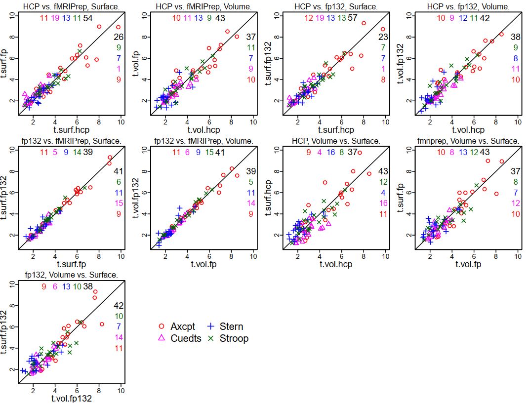
First, the same 20 Schaefer parcels passed the threshold of having t > 1 (uncorrected) in all four tasks and preprocessing combinations when the fp132 (fMRIPrep version 1.3.2) results were substituted for the previous 1.1.7 results (compare with here and here):


This is not surprising, given the extremely similar GLM results for each person between the two fMRIPrep versions. Using these 20 parcels, I made some scatterplots to show the comparison in coefficients between the various preprocessing styles (the ones for HCP and fMRIPrep ("fp") are the same as in the previous summary, just with tasks overplotted; see that post for more explanation). Note that in these plots "fp132" is fMRIPrep version 1.3.2 and "fp" or "fMRIPrep" is version 1.1.7.


It is clear that the tightest correlations are between the two versions of fMRIPrep preprocessing, surface to surface and volume to volume ("fp132 vs. fMRIPrep"). The plots comparing "HCP vs. fMRIPrep" (1.1.7) and "HCP vs. fp132" are similar, as are the "Volume vs. Surface" plots within each fMRIPrep version.

I also set up mixed models as before, adding the fMRIPrep 1.3.2 results. The contrasts below are from a model including all four tasks, the 20 parcels, and the 13 test people, only estimating the effect of preprocessing combination on the parameter difference. I highlighted the interesting contrasts: red are volume vs. surface within each pipeline (surface better for both fMRIPrep versions); blue show that the two fMRIPrep versions were not different; green shows that the surface estimates were higher with either fMRIPrep than HCP, and volume estimates marginally higher.


So, we're still "full steam ahead" with fMRIPrep. I don't know which part of the fMRIPrep pipeline changed between 1.1.7 and 1.3.2 to make our results slightly different, but the differences don't change the interpretation of the comparisons.

UPDATE 6 September 2019: The dataset (raw and preprocessed images) we used for these comparisons is now on openneuro, called DMCC13benchmark.

UPDATE 4 January 2021: Corrected DMCC13benchmark openneuro links.

Tuesday, January 15, 2019

RSA: how to describe with a single number? - update 2

This post is another entry in the occasional series about RSA matrix quantification; the last one described two common methods: one based on differences (mean subtraction; the "contrast" method) and the other on Kendall's tau-a. Another common method is to use Pearson correlation.

I've thought of correlation as a very different quantification metric than mean subtraction. However, Michael Freund, a graduate student in the CCP lab, pointed out that there are connections between them: if you normalize the RSA matrix in the right way, quantification by mean subtraction is equivalent to correlation. This post has examples to illustrate this equivalence, as well as how the two methods (mean subtraction without scaling and correlation-types) vary in what they measure. Code for the examples and figures is at the end of this post.

Here are the 10 example RSA matrices and the reference matrix used for quantification. In the reference matrix, we expect the grey cells (1, the "target" cells) to have higher correlation than the white (0).  The number in the cells of each of the 10 example RSA matrices (e.g., from different participants) are Pearson correlations. Color scaling ranges from dark blue (1) to dark red (-1), with white for 0.

And here are the quantification scores for each matrix, calculated by each of the four methods. First, notice that the ordering of the quantification scores for the 10 example matrices is the same for difference and correlation quantification after vnorm scaling (diff.vnorm and corr.vnorm), and the same as the no-scaling correlation quantification (corr). Calculating the differences without scaling (diff, black) gives a different ordering. This demonstrates the property that Michael Freund pointed out: the distinction between the difference and correlation quantification isn't the metric but whether the RSA matrix is vector-normalized before quantification (see code line 127).

So the quantification scores (and associated interpretation - which example matrix is "best"?) vary between diff and corr (along with diff.vnorm and corr.vnorm, but I'll just use corr as shorthand); but where do the differences come from?

The two methods agree that example 4 is worst (the lowest quantification score of these ten). This strikes me as reasonable: neither of the two "target" cells (with 1 in the reference matrix) are the cells with the highest correlation - example 4 doesn't match the reference at all.

More interesting are examples 1 and 9. diff considers 9 the best by far, with 1 tied for the almost-worst, while corr considers 9 the fourth-best and 1 similar at fifth-best. Looking at the example matrices, in both 9 and 1 the two target cells have higher correlation than all the other cells, but the range of values is much larger in 9 (the not-target cells have negative correlation) than 1 (where all cells have correlation between 0.705 and 0.873). This variance difference contributes strongly to the diff method (so the two matrices have very different quantification scores), but is "undone" by the vector normalization, so corr gives 1 and 9 similar quantification scores. Examples 2 and 7 also illustrate this property.

I'll also point out examples 1 and 2, which are given the same quantification score by the diff method but 2 is better than 1 with corr. Why? 1 and 2 are identical except for the two target cells, which have  different values in 1 but the same value in example 2 - the average (via Fisher's r-to-z). 1 and 2 are identical with the diff quantification because the same number results in when the target cells are averaged. Example 2 is much better than 1 with corr, however, because having the same number in the target cells is a better match to the reference matrix, in which the same number (1) is also in the target cells.

So, which to use? If you want the size of the correlations to matter (9 better than 1), you should use diff (i.e., difference method without scaling). If you want the best quantification scores to be when all of the target cells have the same correlation (2 better than 1), you should use corr (or either of the methods after scaling). But if you just want higher correlation in the target cells, without needing equality, you should use diff.

code below the fold